| Author | Thread |
Comments Made During the Challenge  |
|
|
12/21/2006 07:19:32 PM |
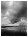
| This is just one great picture. |
|
 Photographer found comment helpful. Photographer found comment helpful. |
|
|
12/21/2006 12:54:44 PM |
|
| Photographer found comment helpful. |
|
|
12/21/2006 05:46:40 AM |
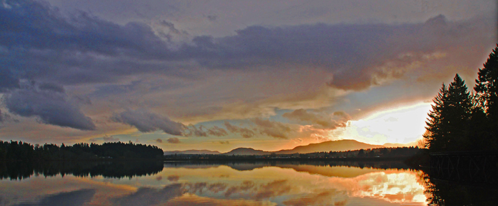
| Nice colors and motiv, but way too much burn on the right there. |
|
| Photographer found comment helpful. |
|
|
12/19/2006 03:24:49 PM |
| this looks like it was taken from LORT ...hehehe... good job! |
|
| Photographer found comment helpful. |
|
|
12/17/2006 07:41:10 PM |
| Nice landscape shot, really like the reflections in the water. Blown out sky hurts just a bit, but non the less a great shot. Nice work. |
|
| Photographer found comment helpful. |
|
|
12/17/2006 12:33:24 PM |
| This is a nice landscape. But there is something in the clouds and the sky that take away from it. I can see pixelation perhaps from shadow/highlights, or saturation problems otherwise its a nice image. 6 |
|
| Photographer found comment helpful. |
|
|
12/16/2006 08:13:01 PM |
| Unfortunately a style that probably won't be received well here. A little more info in the sky without the blowjn highlites would be nice but it does very much remind me of work by the Group of Seven. |
|
| Photographer found comment helpful. |
|
|
12/15/2006 02:49:06 PM |
| The reflected light here is good. The actual "light" is a bit too overpowering for my taste. Overall a pleasant image. |
|
| Photographer found comment helpful. |
|
|
12/15/2006 02:12:40 PM |
| Lovely composition and colours. Nice use of rule-of-thirds for the horizon and trees. |
|
| Photographer found comment helpful. |
|
|
12/15/2006 10:47:49 AM |
| very noisy sky on my monitor ... blown out highlights are distracting also ... |
|
| Photographer found comment helpful. |
|
|
12/15/2006 09:40:29 AM |
| Good colors- it seems to have got a lot of grain in it. Did you start with a lo res photo or under exposed? |
|
| Photographer found comment helpful. |
|
|
12/15/2006 06:55:19 AM |
| beautiful vista and nice colors. I just don't like how large the blown out area is in 'the Light'. |
|
| Photographer found comment helpful. |
|
|
12/15/2006 01:13:38 AM |
| Almost looks like a painting..... |
|
| Photographer found comment helpful. |
|
|
12/15/2006 12:40:55 AM |
| Sheesh,. that's some serious work there. So much potential, but the iredeemably blown hot spot on the right destroys it for me, I am sorry to say. |
|
| Photographer found comment helpful. |
|
|
12/15/2006 12:14:01 AM |
| The bright area seems to bit outside of the normal colorspace. |
|
| Photographer found comment helpful. |
Home -
Challenges -
Community -
League -
Photos -
Cameras -
Lenses -
Learn -
Prints! -
Help -
Terms of Use -
Privacy -
Top ^
DPChallenge, and website content and design, Copyright © 2001-2024 Challenging Technologies, LLC.
All digital photo copyrights belong to the photographers and may not be used without permission.
Current Server Time: 04/19/2024 07:56:53 AM EDT.