| Author | Thread |
|
|
11/28/2006 09:07:07 AM |
Well, she does have a decent sense of humour. I guess it was for a trip down:
 |
|
 Photographer found comment helpful. Photographer found comment helpful. |
|
|
11/27/2006 03:20:49 PM |
I was visiting  kdkaboom! :) kdkaboom! :) |
|
|
|
11/27/2006 01:39:55 PM |
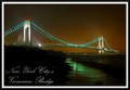
| What was posthumous doing on the Brooklyn Bridge? I did not peg this for a New Jersey-ite's entry. And I was wondering who did this to the view ;-) |
|
| Photographer found comment helpful. |
|
|
11/27/2006 01:19:19 PM |
| The blue is gorgeous!!! Surprising the photo didn't score much higher. A lovely entry for this challenge. Well done. |
|
| Photographer found comment helpful. |
|
|
11/27/2006 11:37:51 AM |
| i can see my work building from here. |
|
| Photographer found comment helpful. |
|
|
11/27/2006 10:00:52 AM |
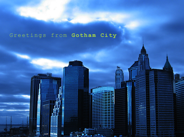
| Tungsten is metal used in filaments for incandescent light bulbs. Presumably they give a yellow sort of light so that the camera invokes a blue cast to compensate for it. If the word comes from Swedish, then it means 'heavy stone' - who knew? As you see it is has magical properties that enable people to score over six. Congrats, and it's a great shot. Where would all this have been without Batman? |
|
| Photographer found comment helpful. |
|
|
11/27/2006 12:34:03 AM |
| Rock on team minus! I think this has to lock in our win for this week. :) |
|
| Photographer found comment helpful. |
|
|
11/27/2006 12:13:14 AM |
| O crap I love this!! U waz ripped off!!!!! |
|
| Photographer found comment helpful. |
Comments Made During the Challenge  |
|
|
11/26/2006 05:42:34 PM |
| Nice composition and moody feel. I like how you highlighted the last two words. |
|
| Photographer found comment helpful. |
|
|
11/26/2006 05:36:54 AM |
| Very nice - love the clouds. 9 |
|
| Photographer found comment helpful. |
|
|
11/26/2006 12:41:07 AM |
The bat symbol should have projected onto the clouds....
Same bat channel, same bat time. |
|
| Photographer found comment helpful. |
|
|
11/25/2006 09:03:50 AM |
| The type chosen is very appropriate for this. |
|
| Photographer found comment helpful. |
|
|
11/22/2006 05:04:41 PM |
| Very good. I'd like this better if it was black and white but I can see why this would be a better choice for the challenge. |
|
| Photographer found comment helpful. |
|
|
11/21/2006 10:10:19 PM |
| love the color, contrast and composition - but the font really needs some work - not modern enough |
|
| Photographer found comment helpful. |
|
|
11/21/2006 08:24:38 AM |
| gotham city seems to be a popular this city this time around hehe |
|
| Photographer found comment helpful. |
|
|
11/20/2006 11:41:27 AM |
| I'd prefer to see the top of this shot cropped to a little above the text. The bright sky above the clouds detracts from the cityscape. And by cropping that portion, you would have a more standard postcard size. I'd also pick a nicer font. Courier doesn't have much appeal. |
|
| Photographer found comment helpful. |
|
|
11/20/2006 11:31:23 AM |
| Good job of using the blue for the moodiness of Gothan City. I'm not sure about the placement of the text, but I don't see a better spot for it. |
|
| Photographer found comment helpful. |
|
|
11/20/2006 10:05:25 AM |
| Nice to see Pier 17 excluded for once. |
|
| Photographer found comment helpful. |
|
|
11/20/2006 08:56:02 AM |
| a bit oversaturated, font doesn't match the atmosphere IMO |
|
| Photographer found comment helpful. |
Home -
Challenges -
Community -
League -
Photos -
Cameras -
Lenses -
Learn -
Prints! -
Help -
Terms of Use -
Privacy -
Top ^
DPChallenge, and website content and design, Copyright © 2001-2024 Challenging Technologies, LLC.
All digital photo copyrights belong to the photographers and may not be used without permission.
Current Server Time: 04/24/2024 12:34:43 AM EDT.