| Author | Thread |
|
|
11/07/2003 05:21:19 AM |
|
|
|
10/11/2003 05:53:15 AM |
| Really a good shot! :-) Made me cheer up this morning. :-) |
|
|
|
10/10/2003 09:13:51 AM |
| Well spotted David. Result! |
|
|
|
10/08/2003 02:11:11 PM |
| Congrat's... Glad to see you back in the winners circle. |
|
 Photographer found comment helpful. Photographer found comment helpful. |
|
|
10/08/2003 02:01:48 PM |
Originally posted by dsidwell:
This would have added some drama and interest, though it would have been more subtle--especially for international folks who don't know what a DO NOT ENTER sign in the U.S. looks like. |
Nice of you to think of us international folks too David :-) |
|
| Photographer found comment helpful. |
|
|
10/08/2003 01:18:03 PM |
| I should of figured this was you. Great job. This was one of my favorites along with the deer picture. Congrats on the ribbon. |
|
| Photographer found comment helpful. |
|
|
10/08/2003 11:51:41 AM |
Thanks all. I really wanted the DO NOT ENTER sign to be larger and out of focus--and perhaps only a corner of it visible, and the River Heights Welcomes You sign to be more distant. This would have added some drama and interest, though it would have been more subtle--especially for international folks who don't know what a DO NOT ENTER sign in the U.S. looks like. But the signs were too close to each other, and I could not get a radical depth of field because of other various obstacles that you can't see: a river, a pole, some trees, etc. But I was pleased that I was able to communicate the irony anyway. Thanks again.
Message edited by author 2003-10-08 15:34:49. |
|
|
|
10/08/2003 07:28:29 AM |
| very clever. congrats david |
|
| Photographer found comment helpful. |
|
|
10/08/2003 07:00:34 AM |
| Way to go David, I was thinking it was about time you got yourself a ribbon :-) |
|
| Photographer found comment helpful. |
|
|
10/08/2003 02:07:42 AM |
| Congratulations on your win. Nice shot. |
|
| Photographer found comment helpful. |
|
|
10/08/2003 01:48:43 AM |
| Funny!!! Now, it would be even more hillarious to take a pic of someone 'scaling' the wall. Congrats! |
|
| Photographer found comment helpful. |
|
|
10/08/2003 01:46:45 AM |
| Really great shot. This sight must have jumped out at you when thinking of IRONY. I would me. It's really funny. Congratulations. |
|
| Photographer found comment helpful. |
|
|
10/08/2003 12:57:27 AM |
| Congratulations on a great shot! |
|
| Photographer found comment helpful. |
|
|
10/08/2003 12:07:10 AM |
| lol...too funny! good job, david! |
|
| Photographer found comment helpful. |
|
|
10/08/2003 12:04:29 AM |
| Congrats, David! Excellent shot! |
|
| Photographer found comment helpful. |
|
|
10/08/2003 12:02:00 AM |
| Once again David Congrats...This did speak Irony! Good Job! |
|
| Photographer found comment helpful. |
|
|
10/08/2003 12:01:10 AM |
| Congratulations! This is fantastic irony, and a great shot. I'll be along to visit any day now...:) |
|
| Photographer found comment helpful. |
Comments Made During the Challenge  |
|
|
10/07/2003 09:13:16 PM |
| LOL-- Nice capture of Irony |
|
|
|
10/07/2003 12:54:01 PM |
|
| Photographer found comment helpful. |
|
|
10/05/2003 08:36:14 PM |
| Lol, one of my favorites so far. I like the overall clarity of the image, but I think more depth of field would make the sign sharper. It seems a tad blurry and a little underexposed to me - as the "punch line" to the image, I just think it should stand out more. Great job -10- |
|
| Photographer found comment helpful. |
|
|
10/05/2003 01:36:29 PM |
| Nice juxtaposition of signs and great texture, color and composition. |
|
| Photographer found comment helpful. |
|
|
10/03/2003 07:37:11 PM |
| Love it when you can get shots like this. |
|
| Photographer found comment helpful. |
|
|
10/03/2003 12:24:23 PM |
| LoL, very nice colors, great detail. |
|
| Photographer found comment helpful. |
|
|
10/03/2003 03:32:50 AM |
|
| Photographer found comment helpful. |
|
|
10/02/2003 11:09:46 PM |
|
| Photographer found comment helpful. |
|
|
10/02/2003 09:59:42 PM |
|
| Photographer found comment helpful. |
|
|
10/01/2003 10:32:31 PM |
| I'm giving an 8 or above to all the ones I get. So you get an 8 |
|
| Photographer found comment helpful. |
|
|
10/01/2003 10:30:46 PM |
| Very Funny! Nice light, very sharp and the DO NOT ENTER doesn't over power the picture, very nice! |
|
| Photographer found comment helpful. |
|
|
10/01/2003 07:36:18 PM |
| LOVE IT! Great crop, composition and humor! Seems a bit bluish tho... |
|
| Photographer found comment helpful. |
|
|
10/01/2003 04:32:16 PM |
base 1: 1/1
challenge: 2/3
technical: 3/3
aesthetics: 1/3
total: 7 |
|
| Photographer found comment helpful. |
|
|
10/01/2003 02:53:06 PM |
| great find and good framing |
|
| Photographer found comment helpful. |
|
|
10/01/2003 02:33:54 PM |
| I like the framing in this image. |
|
| Photographer found comment helpful. |
|
|
10/01/2003 08:56:44 AM |
|
| Photographer found comment helpful. |
|
|
10/01/2003 07:53:09 AM |
|
| Photographer found comment helpful. |
|
|
10/01/2003 06:40:58 AM |
| Very good, and the way you composed the photo is great. |
|
| Photographer found comment helpful. |
|
|
10/01/2003 01:18:27 AM |
|
| Photographer found comment helpful. |
Home -
Challenges -
Community -
League -
Photos -
Cameras -
Lenses -
Learn -
Prints! -
Help -
Terms of Use -
Privacy -
Top ^
DPChallenge, and website content and design, Copyright © 2001-2024 Challenging Technologies, LLC.
All digital photo copyrights belong to the photographers and may not be used without permission.
Current Server Time: 04/18/2024 08:14:51 PM EDT.


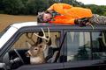


 River Heights Welcomes You


