| Author | Thread |
|
|
10/03/2006 07:37:31 AM |
Hello from the Critique Club,
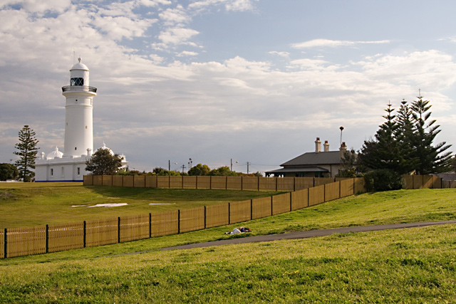
The exposure of this image looks pretty good. The image could use a bit more post processing work to give it more pop. Two suggestions for post processing, first, play around with levels or curves to increase the dynamic range of the image (give the image more contrast and color saturation). After that, boost the color saturation a bit more using Hue/Saturation.
You might also consider cropping just a little off the right side of the image, up to the trees on the right. This will remove the part of the fence that leads to the right edge of the image, thus forcing the viewer's eyes back to the main subject. As is, the fence leads both to the lighthouse and away from the lighthouse and forces the viewer to choose which way to look, which weakens the leading lines aspect of the image.
My final suggestion would be to sharpen the image a little bit more than you did after resizing. It is hard to find a sharply focused area in the image and that generally means that the sharpness was lost during resizing.
I think you found a very strong subject for the leading lines challenge. I really like how the fence takes your eyes to one side of the image then back to the other side to the main subject. A bit more post processing work and this image could have scored in the sixes.
Feel free to PM me if you have any questions regarding this critique.
Tim
|
|
 Photographer found comment helpful. Photographer found comment helpful. |
Comments Made During the Challenge  |
|
|
09/25/2006 10:54:00 AM |
| I agree that the fence is interesting, and the lighthouse looks good, but the foreground and the middle is so scrubby and dull and just messy. |
|
| Photographer found comment helpful. |
|
|
09/20/2006 11:11:49 PM |
|
| Photographer found comment helpful. |
Home -
Challenges -
Community -
League -
Photos -
Cameras -
Lenses -
Learn -
Prints! -
Help -
Terms of Use -
Privacy -
Top ^
DPChallenge, and website content and design, Copyright © 2001-2024 Challenging Technologies, LLC.
All digital photo copyrights belong to the photographers and may not be used without permission.
Current Server Time: 04/16/2024 02:04:00 AM EDT.