| Author | Thread |
|
|
08/21/2006 10:45:51 AM |
| Sometimes that is all it takes is ONE shot...simple and to the point..believe me..alot of my good photo's are one shot.. this pic has a good feel to it..I think everything worked... WTG |
|
|
|
08/21/2006 03:47:56 AM |
| i like the comp, you have a distinctive style. good one judy |
|
|
|
08/21/2006 03:18:32 AM |
| Another top 50 finish well done. |
|
|
|
08/21/2006 12:40:20 AM |
| Nice going Judy! I like this picture alot! |
|
|
|
08/21/2006 12:38:20 AM |
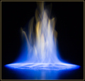
| I actually thought the contrast and grain in this really suited Judy...I read some of the comments below...I think this was a great shot that deserved better... |
|
Comments Made During the Challenge  |
|
|
08/20/2006 06:03:28 PM |
| I like the idea and the composition for the most part but it looks too contrasty for me. Not sure if this is a grunge attempt or not but the effect that the extra darkening adds doesn't seem to enhance the photo in a positive way for me. Perhaps its the subject matter, not sure, just seems like an extra tacked on with no real purpose (I'm sure there is one but the need didn't come across to me as a viewer). I gave a 5 |
|
|
|
08/18/2006 01:26:23 AM |
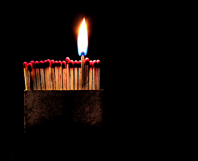
| Oh wow. Awesome concept. Awesome execution. I love how the brown fades into the background... maybe the matches on the left could be a bit less tilted to the left? But that's not a big thing. You have really captured, I think, what your title says, and you definitely evoked emotions from me. |
|
 Photographer found comment helpful. Photographer found comment helpful. |
|
|
08/17/2006 09:43:45 PM |
| Nice composition but the lighting/colours on the matches seems a bit strange 9the red tips seem a funny red) |
|
| Photographer found comment helpful. |
|
|
08/17/2006 01:55:31 PM |
| The matches all tend to blur together at the tips |
|
| Photographer found comment helpful. |
|
|
08/15/2006 10:47:58 AM |
| Flame is a bit blown out while matchheads are underexposed. Bow is a bit too dark for my taste as well. |
|
| Photographer found comment helpful. |
|
|
08/15/2006 07:38:50 AM |
| artistic..shadows and composition are very good... |
|
| Photographer found comment helpful. |
|
|
08/15/2006 05:50:41 AM |
| wish the flame was a little more crisp |
|
| Photographer found comment helpful. |
|
|
08/15/2006 05:47:42 AM |
| Nice composition but for me the flames is a little too blown out |
|
| Photographer found comment helpful. |
|
|
08/14/2006 09:19:08 PM |
| Excellent set up. Bit harsh on the contrast (intentional maybe?) and I think this would have been ok as a centered composition. Nonetheless, great challenge entry :) |
|
| Photographer found comment helpful. |
|
|
08/14/2006 08:36:22 PM |
| I think the oversaturation works here. What works against you is that matches were a very common theme in this challenge. |
|
| Photographer found comment helpful. |
|
|
08/14/2006 05:45:36 PM |
This has some WOW in it. I love the negative space and the concept it killer. Perhaps the flame is a tad overexposed. Really neat image. 7
Wazz |
|
| Photographer found comment helpful. |
|
|
08/14/2006 05:43:57 PM |
| lovely. I like the mood of this. 9 |
|
| Photographer found comment helpful. |
|
|
08/14/2006 03:43:40 PM |
| Nice take on the matches theme. I like the off center composition too. |
|
| Photographer found comment helpful. |
|
|
08/14/2006 03:33:03 PM |
| Cool really like the idea and composition. Smart named picture. |
|
| Photographer found comment helpful. |
|
|
08/14/2006 12:20:50 PM |
| A nice idea, but the flame seems to white to be natural to me. |
|
|
|
08/14/2006 07:51:14 AM |
Great lighting. Great processing. Great title. Gets a GR8 score from me.
Apologies for the lame comment. |
|
| Photographer found comment helpful. |
|
|
08/14/2006 01:34:04 AM |
| great title for this...there's a little bit if grittiness in the shot, but it suits this |
|
| Photographer found comment helpful. |
Home -
Challenges -
Community -
League -
Photos -
Cameras -
Lenses -
Learn -
Prints! -
Help -
Terms of Use -
Privacy -
Top ^
DPChallenge, and website content and design, Copyright © 2001-2024 Challenging Technologies, LLC.
All digital photo copyrights belong to the photographers and may not be used without permission.
Current Server Time: 04/18/2024 07:40:00 PM EDT.