DPChallenge: A Digital Photography Contest You are not logged in. (log in or register
 
Challenge Entries
Portfolio Images
This image is not part of a public portfolio.
Lighthouse on the HIll - revisited
ShutterPug


Photograph Information Photographer's Comments
Challenge: Take Two (Advanced Editing IV*)
Camera: Canon EOS-20D
Lens: Sigma 28-105mm f/2.8-4.0 Aspherical for Canon
Location: Marquette, MI
Date: Jun 5, 2006
Aperture: f13
ISO: 100
Shutter: 1/100
Galleries: Still Life, Seascapes
Date Uploaded: Jun 5, 2006

Convereted from Raw to JPEG
Cloned small sensor dust spot out of sky
Cropped to rule of thirds as original entry was
Adjusted Hue/Sats
Burned a few shadows
USM

Statistics
Place: 72 out of 161
Avg (all users): 5.9161
Avg (commenters): 7.5000
Avg (participants): 5.7213
Avg (non-participants): 6.0426
Views since voting: 856
Views during voting: 209
Votes: 155
Comments: 4
Favorites: 0


Please log in or register to add your comments!

AuthorThread
06/20/2006 08:43:33 PM
The colors are what makes this such a "pop" image. The red simply just stands out among the blues. A great reshoot Linda.
  Photographer found comment helpful.
06/15/2006 02:49:04 PM
==Greetings from the Critique Club==
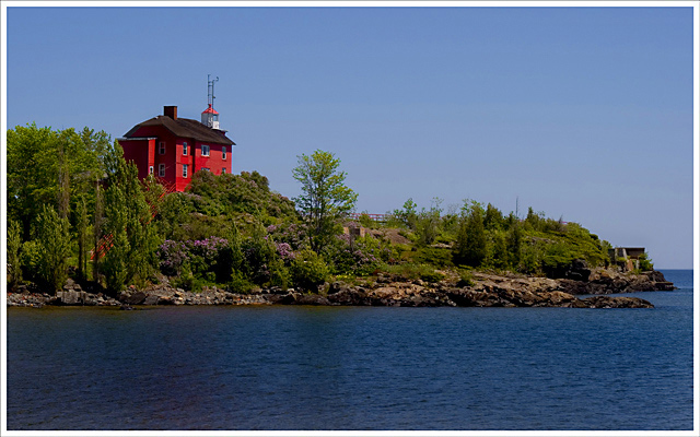
Composition
I really like this composition. My eye goes immediately to the subject, and the lines make me look around. I like the fact that the red contrasts so completely with the other colors.

Camera Technicals
Trees always frustrate me when it comes to focus. They never look to really be in focus, especially at a distance, and JPEG compression is never friendly to them. I think you were "bit" by that a little bit, and the rocks have a bit of the same problem. The exposure is perfect.

Post Processing
I like the burning that I think you've done. Bringing out the shadows makes the picture feel deep, and helps establish the feeling of distance while also making me feel close to the subject.

Challenge
Obviously it's a retake of your shot, so I don't think there's any question here.

Overall Impression
The shadows on the water bother me. Not that they are "wrong", just that I keep wondering "what caused them?" The colors seem a bit muted, but just slightly. This is a HUGE improvement over your original, by a factor of 2 to 1, IMHO. Very good "redux".

These are just my impressions and thoughts; I hope you find them to be helpful, constructive, and instructional. Thanks for entering; keep up the good work.
  Photographer found comment helpful.
 Comments Made During the Challenge
06/10/2006 12:39:58 AM
Very pretty scene.
  Photographer found comment helpful.
06/07/2006 02:29:24 AM
Wow, that is definitely an improvement!
  Photographer found comment helpful.


Home - Challenges - Community - League - Photos - Cameras - Lenses - Learn - Prints! - Help - Terms of Use - Privacy - Top ^
DPChallenge, and website content and design, Copyright © 2001-2024 Challenging Technologies, LLC.
All digital photo copyrights belong to the photographers and may not be used without permission.
Current Server Time: 04/24/2024 09:09:06 AM EDT.