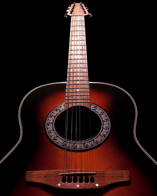
This is a reshoot of Heaven's Light, my entry for 'Single Light Source II'. It scored a 5.356 in that challenge. Almost all of the comments pointed out the blown out lighting on the neck and headstock. I like the original shot very much, and have a nice 8 x 10 print of it. I was going for the brighter light coming from 'heaven', or above, but yeah :-), detail was blown. So I used very similar set up, but worked with distance, and used some tracing paper for a diffuser, and tried to get same effect, but still hold some detail, and not be totally blown. Also, decided to go with just a slightly tighter framing.
In ps-slight rotation to straighten, crop,cloned out some little dust spots and a scratch on the guitar, levels, curves, selective color, hue/sat, little more levels and an 's' curve, smart sharpen, resize and sfw
Thanks for checking out my pic :-)
Statistics
Place: 50 out of 161 Avg (all users): 6.2500 Avg (commenters): 6.8889 Avg (participants): 6.0000 Avg (non-participants): 6.4316 Views since voting: 1558 Views during voting: 221 Votes: 164 Comments: 11 Favorites: 0
This is a beautiful image, full of symmetry, flowing lines and dramatic lighting. You've been able to pull off sharing the beauty of the guitar with a near spiritual quality to the lighting. It is an image worth printing.
Composition: The symmetry works very well here, adding to the impact of the image. The Point of View is strong and adds to the ascending feeling. There are some very minor ticks that show because of the strong symmetry. Your guitar edge on the left is slightly higher on the left than the right, leading to the feeling the image is slightly twisted to the right. The bridge at the base of the guitar is also slightly off kilter. Most would not notice it, I'm just one of those that does. I also prefer a slightly looser crop, with a bit more space above the guitar and below the bridge. The sides feel right.
Technicals: You have done a wonderful job of choosing aperature, shutter speed and ISO to bring out the color, tone, detail and DOF to make this image shine. You've been able to keep the strong lighting on the frets, leading upward, yet maintaining detail on the frets. Very nice. A small detail, probably caused by the reduction of size, is the artifacting on the curves of the guitar edge. I have found this to be reduced by using Bicubic Smoother when reducing an image with diagnal lines.
Tie to Challenge: This is definately a reshoot of a previous image and you have really taken the comments to heart. You have also been able improve your score over your previous entry.
Overall: A wonderful image which has been improved technically from the original. There is a magic to this image that shines through to most, but not all.
hello gene. Way better this time. The frets are clear and crisp unlike the original where they were blwon out. I do like the crop of the original though as there is a bit more space underneath where the strings are. Either way, this is a better shot technically than the original ;)