| Author | Thread |
|
|
05/15/2006 10:19:52 AM |
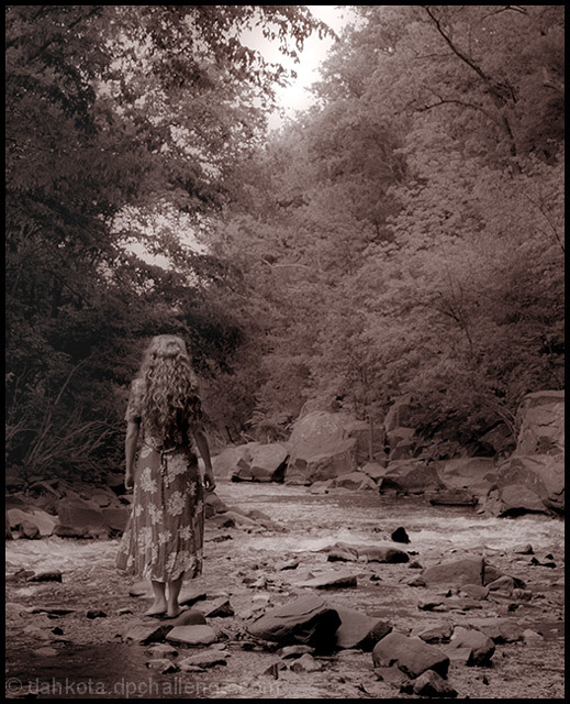
| Beautiful shot Courtenay. Congrats on the high scoring finish. (I figured someone else would have a similar idea to mine and do it much better - LOL!) |
|
 Photographer found comment helpful. Photographer found comment helpful. |
|
|
05/15/2006 10:15:33 AM |
| There isn't a thing wrong with this shot. Lovely tones, lovely title, and gorgeous composition. One of my top pics at a 9. Glad to see it was 22nd, but should have been at least top 10. It has all the elements to draw one to a seat in a cinema. Great job! |
|
| Photographer found comment helpful. |
|
|
05/15/2006 06:03:06 AM |
| Very well done, Courtenay ... I gave it a 10. Actually, I recognized it as yours during voting ... great hair :) |
|
| Photographer found comment helpful. |
|
|
05/15/2006 02:04:55 AM |
| This is a beautiful photograph! I don't see how in the world it could have been better, so the annoying fisherman really didn't hurt you at all! Great story too :) |
|
| Photographer found comment helpful. |
|
|
05/15/2006 12:15:03 AM |
| Beautiful work. I'd like to see some dodging on that wonderful hair and perhaps on the dress to draw the eye. |
|
| Photographer found comment helpful. |
Comments Made During the Challenge  |
|
|
05/14/2006 11:42:49 PM |
| Romantic feel to this well done photo |
|
| Photographer found comment helpful. |
|
|
05/14/2006 08:39:13 PM |
| Great. This draws one into the picture - and the story. One of the best in the challenge. |
|
| Photographer found comment helpful. |
|
|
05/14/2006 07:09:24 PM |
| Really love the feel of this image. Reminds me a bit of the siren scene in 'Oh Brother...'. Might have worked on hilighting her hair a bit more just to add a bit more of a surrealistic feel but in the end, it's just really good... :) |
|
| Photographer found comment helpful. |
|
|
05/14/2006 01:12:27 PM |
| Nicely done. It needs a bit of contrast to make the shadows and highlights punch through. Otherwise, I think it's a wonderful image. |
|
| Photographer found comment helpful. |
|
|
05/14/2006 02:17:12 AM |
|
| Photographer found comment helpful. |
|
|
05/13/2006 06:13:03 AM |
|
| Photographer found comment helpful. |
|
|
05/13/2006 02:26:41 AM |
Best one so far and gets a 10 from me I just love this image
Well done I have added it to my favorites |
|
| Photographer found comment helpful. |
|
|
05/11/2006 04:08:56 PM |
| Very good, could really work as a poster of a psycolological thiller. well done. 10 |
|
| Photographer found comment helpful. |
|
|
05/10/2006 09:15:45 PM |
|
| Photographer found comment helpful. |
|
|
05/09/2006 03:22:06 PM |
| Yes, this works. One imagines something really bad happened on this creek, and it's being covered up. Nice sculptural light and regal trees. |
|
| Photographer found comment helpful. |
|
|
05/09/2006 06:09:32 AM |
| I love the mood in this one. Could use a bit more contrast though. |
|
| Photographer found comment helpful. |
|
|
05/09/2006 04:49:34 AM |
| creepy ... nice compo, i would make it in other duotone combination, maybe something like yellow/black |
|
| Photographer found comment helpful. |
|
|
05/09/2006 02:31:09 AM |
|
| Photographer found comment helpful. |
|
|
05/09/2006 12:01:56 AM |
| Great title, perhaps a weaker image because of low contrast and maybe a little soft |
|
| Photographer found comment helpful. |
|
|
05/08/2006 09:58:35 PM |
| very effective..the tones are wonderful... |
|
| Photographer found comment helpful. |
|
|
05/08/2006 01:10:40 PM |
| potentially very nice shot, but less than perfect B/W conversion (strong reddish cast and somwhat mudded tonal range) don't realize its full potential. |
|
| Photographer found comment helpful. |
|
|
05/08/2006 12:39:48 PM |
| Good title. Well composed. Post processing makes the image look flat. Perhaps a bit more contrast would help. |
|
| Photographer found comment helpful. |
|
|
05/08/2006 12:18:42 PM |
| very moody. the tile and the photo really work well together and tell a story. I like that she is barefoot it adds some desperation. the middle at the top is a little bright. fantastic |
|
| Photographer found comment helpful. |
|
|
05/08/2006 04:24:14 AM |
| what I am looking for in this challenge is for a creative 'wow' shot that would go on a movie poster. I think that's what the challenge is all about...this shot would work and your title is fantastic...well done |
|
| Photographer found comment helpful. |
|
|
05/08/2006 01:17:20 AM |
| For this challenge I think more contrast would have been better and also having it in b/w. I could definitely see text added in the top right corner with dark burn from the top down. Gets a 7 in the first run through. |
|
| Photographer found comment helpful. |
Home -
Challenges -
Community -
League -
Photos -
Cameras -
Lenses -
Learn -
Prints! -
Help -
Terms of Use -
Privacy -
Top ^
DPChallenge, and website content and design, Copyright © 2001-2024 Challenging Technologies, LLC.
All digital photo copyrights belong to the photographers and may not be used without permission.
Current Server Time: 04/25/2024 01:41:14 AM EDT.