| Author | Thread |
Comments Made During the Challenge  |
|
|
05/16/2006 07:04:28 PM |
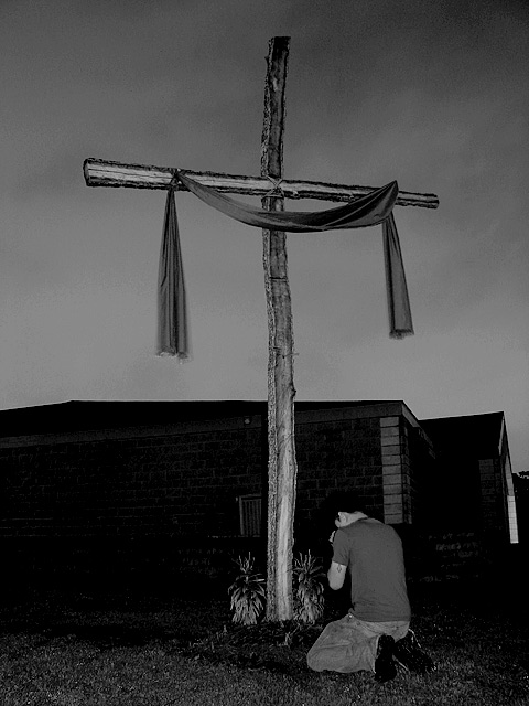
| I like the simplicity of this, in that it appears to be in a yard or residence as opposed to a church. Almost would prefer the person not there, or a little more in shadow perhaps. |
|
|
|
05/16/2006 07:00:53 PM |
| very nice, but a more intresting sky would be preferable, but thats not your falt its the skys |
|
|
|
05/16/2006 01:58:24 PM |
| I like this--it's just a little too dark for me. |
|
|
|
05/15/2006 10:11:32 AM |
| Simple and heartfelt but maybe a little grainy (maybe the B&W conversion?) Moody pic though. |
|
|
|
05/15/2006 06:44:20 AM |
| Great crop but too dark in middle and on the bottom. |
|
|
|
05/12/2006 03:05:36 AM |
| Nicely put together, but the praying person in the foreground comes over as idiot-obvious to me, sorry. |
|
|
|
05/11/2006 11:54:25 AM |
| Image is a bit dull (needs brightening up and contrast). House seems tilted to the left. |
|
|
|
05/11/2006 10:31:42 AM |
|
|
|
05/11/2006 08:23:10 AM |
|
|
|
05/10/2006 07:55:59 PM |
| A little too dark. I would have liked to see more detail |
|
|
|
05/10/2006 04:17:16 PM |
| Idea is great.. composition is nice.. B&W was a good thought but needs more contrast.. - |
|
|
|
05/10/2006 04:13:09 PM |
| It is hard to tell what is in background and image mage looks flat to me. I like the concept though. |
|
Home -
Challenges -
Community -
League -
Photos -
Cameras -
Lenses -
Learn -
Prints! -
Help -
Terms of Use -
Privacy -
Top ^
DPChallenge, and website content and design, Copyright © 2001-2024 Challenging Technologies, LLC.
All digital photo copyrights belong to the photographers and may not be used without permission.
Current Server Time: 04/24/2024 02:07:22 AM EDT.