| Author | Thread |
|
|
05/17/2006 11:16:27 PM |
Hi from the Critique Club!
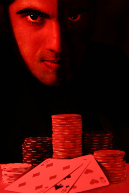
One of the benefits of giving critiques is that you are 'forced' to spend longer than the usual 5 seconds looking at an image before passing judgement. The longer I look at this image, the more hypnotised I become by those eyes! They demand that I look into them and then dare me to look away. The menace is enhanced by the strong facial expression.
I think the effect you have created with the lighting on the face is very clever:It seems to hint at the two sides of man's nature - light and dark, reminding us that we are not always 100% good and not always 100% bad. Rather we are somewhere in between and fight a life long battle with ourselves and temptation.
Just having the white of the eye showing in the right side is so effective, so menancing, so dramatic.And the fact that the highlight in each eye appears in a different place adds to the effect of duality.
The poker chips and cards are symbolic of our obsession with materialistic gain even to the detrement of our spiritual nature, and that we often gain one at the expense of the other.
I personally love the red tones against the black, for a poster it is eyecatching and dramatic. I would also love to see what a black and white version looks like.
Whilst the focus does seem a little soft on the cards, I think it does not take anything away from the rest of the image.
A bold, dramatic, well executed image, that perhaps should have scored higher;) |
|
 Photographer found comment helpful. Photographer found comment helpful. |
|
|
05/15/2006 12:23:23 AM |
Originally posted by MTPixels:
Great idea and well composed. 3 6s.... not bad ... but... Jesus has a full house! |
Hoped to do better. I really thought this could make a really good movie poster. And don't worry, I am a strong Christian...but sometimes to take a photo you have to go to extra lengths! |
|
Comments Made During the Challenge  |
|
|
05/14/2006 02:28:50 AM |
| Great idea and well composed. 3 6s.... not bad ... but... Jesus has a full house! |
|
| Photographer found comment helpful. |
|
|
05/14/2006 01:27:00 AM |
| good, it's special and commercial, thought. |
|
| Photographer found comment helpful. |
|
|
05/13/2006 06:10:00 AM |
| Very well executed and wicked expression! |
|
| Photographer found comment helpful. |
|
|
05/13/2006 02:26:26 AM |
| Everything works in this shot.... the models fae does look demonic... the colors are perfect and the final finishing touch of the cards shown really gives credence to the title. This would make a great movie poster - highest vote to date - 9 |
|
| Photographer found comment helpful. |
|
|
05/12/2006 08:37:24 PM |
| I like this in an odd sort of way - not the image, me being odd. Anyway, for me the strength of this is that I could see it as a movie poster. Good job with editing the lights and darks. 8 |
|
| Photographer found comment helpful. |
|
|
05/12/2006 05:57:27 PM |
| The red tones are a bit overdone, I think. I would have tried to use it only for the face. However it is a good idea, well done. |
|
| Photographer found comment helpful. |
|
|
05/12/2006 05:56:27 PM |
Very nicely done! The placement of the face looks a little off to me though. Like it SHOULD be more centered (just the way it feels to me...) You're also a little tight at the top and bottom. Where's the title and all the crap they have to put on the poster gonna go?
TC |
|
| Photographer found comment helpful. |
|
|
05/10/2006 12:59:05 PM |
| red and black works well. Nice bold composition. Good job. |
|
| Photographer found comment helpful. |
|
|
05/09/2006 05:29:26 PM |
| I think you had a great idea here and pulled it off nicely. I think I would have lightened the cards and kept them closer to white as it is a little too overwhelming all in the same red tone. Nonetheless it's very good and a true representation of the spirit of the challenge. |
|
| Photographer found comment helpful. |
|
|
05/09/2006 09:26:21 AM |
| nice idea, maybe too red in my opinion |
|
| Photographer found comment helpful. |
|
|
05/09/2006 06:11:04 AM |
| Good shot. I like the red lighting which fits well with your idea and the shadow on the right side of his face. |
|
| Photographer found comment helpful. |
|
|
05/09/2006 05:05:35 AM |
|
| Photographer found comment helpful. |
|
|
05/09/2006 01:30:36 AM |
|
| Photographer found comment helpful. |
|
|
05/08/2006 12:07:25 PM |
| a little too overboard on the red, cool idea. |
|
| Photographer found comment helpful. |
|
|
05/08/2006 05:37:07 AM |
| the cards in the foreground are a bit fuzzy, nice composition |
|
| Photographer found comment helpful. |
|
|
05/08/2006 01:39:58 AM |
| focus seems too shallow in my mind. |
|
| Photographer found comment helpful. |
Home -
Challenges -
Community -
League -
Photos -
Cameras -
Lenses -
Learn -
Prints! -
Help -
Terms of Use -
Privacy -
Top ^
DPChallenge, and website content and design, Copyright © 2001-2024 Challenging Technologies, LLC.
All digital photo copyrights belong to the photographers and may not be used without permission.
Current Server Time: 04/24/2024 11:33:40 PM EDT.