| Author | Thread |
Comments Made During the Challenge  |
|
|
05/02/2006 09:52:39 PM |
Kind of cool, put it on a calendar or a poster for the sierra club...hee hee!
I'm so mean... |
|
|
|
05/02/2006 05:38:17 PM |
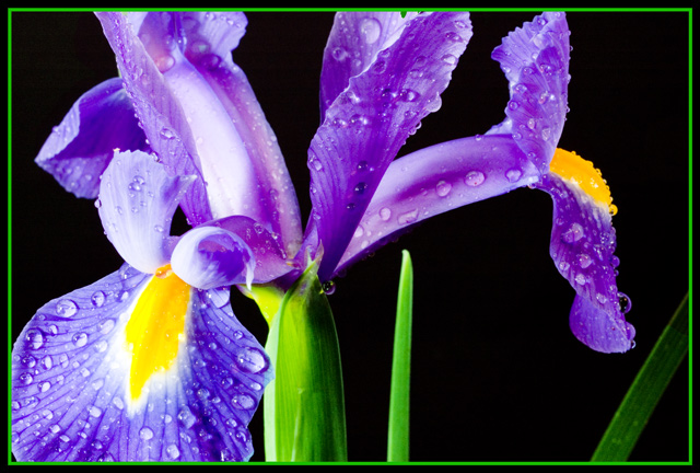
| One of the better iris photos in this challenge. Colors are very vibrant. |
|
 Photographer found comment helpful. Photographer found comment helpful. |
|
|
05/02/2006 12:17:39 PM |
| Crisp and clean but I'd like to see more of a balance between the colours in question. Also the composition is a bit questionable - too much weight visually on low-left corner |
|
| Photographer found comment helpful. |
|
|
05/02/2006 08:47:01 AM |
| i grow hundreds of iris and photograph them often.you captured this beauty just right,i love the angle.10 |
|
| Photographer found comment helpful. |
|
|
04/30/2006 11:39:44 PM |
|
|
|
04/30/2006 11:22:51 PM |
|
|
|
04/30/2006 10:43:16 PM |
|
|
|
04/30/2006 09:16:03 PM |
| The border really detracts from this, I'm sorry. |
|
| Photographer found comment helpful. |
|
|
04/30/2006 06:59:57 PM |
|
|
|
04/30/2006 05:38:24 PM |
|
| Photographer found comment helpful. |
|
|
04/30/2006 11:15:59 AM |
| Well exposed and excellent DOF. |
|
| Photographer found comment helpful. |
|
|
04/29/2006 08:52:12 PM |
| how refreshing is this! great job! |
|
| Photographer found comment helpful. |
|
|
04/29/2006 04:38:29 PM |
| I think a yellow border would have enhanced the theme of complimentary colors more. And I get a sense the black background is not totally black, or is it just my monitor? Maybe try a curves adjustment layer? |
|
| Photographer found comment helpful. |
|
|
04/29/2006 03:47:22 PM |
| Wonderful crisp sharp image. Great contrast. Great crop. Very nice job. |
|
| Photographer found comment helpful. |
|
|
04/29/2006 03:06:20 PM |
| exceptional flower study - 8 |
|
| Photographer found comment helpful. |
|
|
04/29/2006 03:00:13 PM |
| great shot. the drops really add depth and dimension to this flower and visyual interest too |
|
| Photographer found comment helpful. |
|
|
04/29/2006 02:22:45 PM |
| Lovely picture but the border kills it for me, so i will pretend it isnt there. |
|
| Photographer found comment helpful. |
|
|
04/29/2006 01:03:51 PM |
*I am only commenting, and not voting on this challenge*
Ahh, the classic flower on black. Now with water drops!
Pretty nice. Interesting to look at, but the green over-powers the yellow for me, really taking away from the impact of the complementary issue. Of course, that's just me, and since I'm not voting, I guess it doesn't matter much :)
Interestingly enough, the border also contributes to that, and had it been a deeper yellow color.. maybe a bit stronger. Had you tried that? |
|
| Photographer found comment helpful. |
|
|
04/29/2006 12:19:14 PM |
| good impact good colors 6 |
|
| Photographer found comment helpful. |
|
|
04/29/2006 09:23:30 AM |
|
|
|
04/29/2006 05:34:21 AM |
| Love the lighting, crispness and colours. Good work. |
|
| Photographer found comment helpful. |
|
|
04/29/2006 04:10:01 AM |
| Nice bright colours...I dont think it needs the border though. |
|
| Photographer found comment helpful. |
|
|
04/28/2006 05:18:27 PM |
| Beautiful detail and clarity, water droplets are a nice touch |
|
| Photographer found comment helpful. |
|
|
04/27/2006 09:49:36 PM |
|
|
|
04/27/2006 08:33:26 PM |
| This is a great shot. Wonderful coloring, great lighting, very pretty! I'm not sold on the boarder but still a job very well done. |
|
| Photographer found comment helpful. |
|
|
04/27/2006 10:12:43 AM |
| Love the colors and contrast...the brite lite to the left distracts it a bit |
|
| Photographer found comment helpful. |
|
|
04/26/2006 09:23:07 PM |
| One of the "best" in this challenge.....I love it, and I hope it wins a ribbon..... |
|
| Photographer found comment helpful. |
|
|
04/26/2006 06:37:35 PM |
| 3 - Good potential. Less greeen, variation in angle, composition and focal point(s), make this better in my opinion. Some of the colors look 'blown'. Also, I see blue/yellow and purple/orange here, so concentrating on one or ther other and slightly adjusting the hue if necessary also. Frame detracts, especially for this Challenge, in my opinion. |
|
| Photographer found comment helpful. |
|
|
04/26/2006 08:25:15 AM |
| maybe to much water, and if it is croped i would have done it larger.. intresting lighting.. |
|
| Photographer found comment helpful. |
|
|
04/26/2006 06:11:33 AM |
| frame is distracting as well as the leaf at right, image is oversaturated, too much green, too littl yellow |
|
| Photographer found comment helpful. |
|
|
04/26/2006 05:43:35 AM |
| wow...this deserves a top 5 or 10 finish...only criticism is I would have liked to have seen the whole petal on the left hand side...bit lovely and sharp with great lighting, well done |
|
| Photographer found comment helpful. |
|
|
04/26/2006 01:28:48 AM |
| I think there might be TOO much to look at and no real point of focus. Perhaps a more shallow DOF with focus on the bottom left flower would've had a stronger impact. |
|
| Photographer found comment helpful. |
Home -
Challenges -
Community -
League -
Photos -
Cameras -
Lenses -
Learn -
Prints! -
Help -
Terms of Use -
Privacy -
Top ^
DPChallenge, and website content and design, Copyright © 2001-2024 Challenging Technologies, LLC.
All digital photo copyrights belong to the photographers and may not be used without permission.
Current Server Time: 04/19/2024 02:37:25 AM EDT.