| Author | Thread |
|
|
05/03/2006 08:15:58 PM |
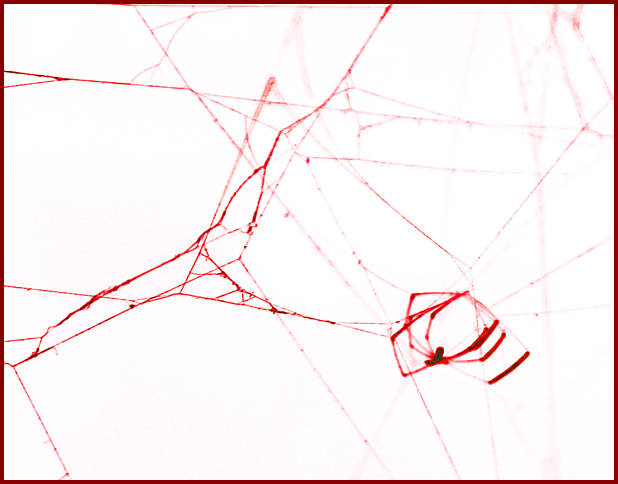
| Nice graphic effect. Spider is a bit blurry that's why I gave it an 8. |
|
 Photographer found comment helpful. Photographer found comment helpful. |
Comments Made During the Challenge  |
|
|
05/02/2006 03:37:38 AM |
| I had to look it up: the word does apply to the color and to its negative implications, but the photo falls short. |
|
| Photographer found comment helpful. |
|
|
05/01/2006 09:36:42 PM |
| Interesting abstract in a "Jackson Pollack" sort of way. But not a photo I am resonating with much. Sorry. |
|
| Photographer found comment helpful. |
|
|
04/30/2006 10:52:37 PM |
| Looks like there's some noise on the spider, but otherwise a very nice photo. |
|
| Photographer found comment helpful. |
|
|
04/30/2006 09:57:22 PM |
| cool, actually okks like a negative |
|
| Photographer found comment helpful. |
|
|
04/29/2006 03:31:24 PM |
| spider looks a little out of focus |
|
| Photographer found comment helpful. |
|
|
04/27/2006 08:25:23 PM |
| Great title. Really does look like streams of blood. |
|
| Photographer found comment helpful. |
Home -
Challenges -
Community -
League -
Photos -
Cameras -
Lenses -
Learn -
Prints! -
Help -
Terms of Use -
Privacy -
Top ^
DPChallenge, and website content and design, Copyright © 2001-2024 Challenging Technologies, LLC.
All digital photo copyrights belong to the photographers and may not be used without permission.
Current Server Time: 04/19/2024 10:05:21 AM EDT.