| Author | Thread |
|
|
10/25/2006 03:20:43 AM |
This is an awesome composition, the colours really pack�@a punch.
This was one of the challenges I didn't have time to vote on, so I'm having the pleasure of viewing this one only now. |
|
 Photographer found comment helpful. Photographer found comment helpful. |
|
|
10/05/2006 02:25:11 AM |
| This is just excellent - and I love the story about how it was created. |
|
| Photographer found comment helpful. |
|
|
07/25/2006 12:15:35 AM |
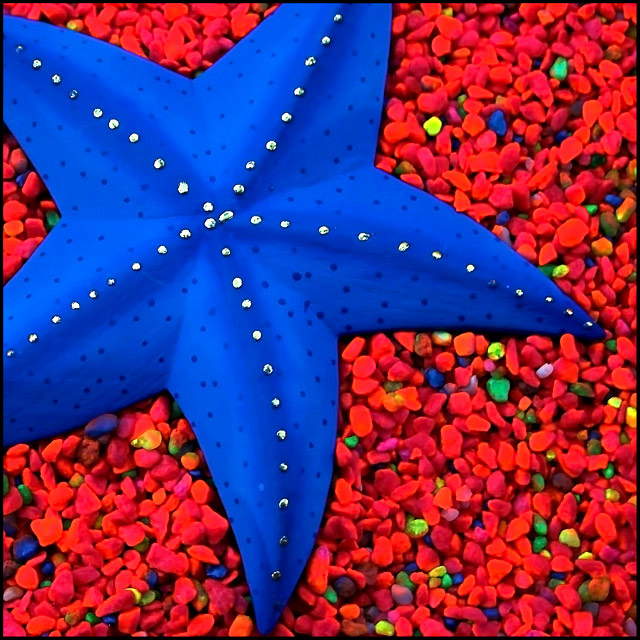
| ohh i love these two colors together. this is such a vibrant shot. i think the red is a bit oversaturated... otherwise, wonderful job! |
|
| Photographer found comment helpful. |
|
|
07/14/2006 08:30:19 PM |
| The colours are really amazing in this shot and the detail combined with such a nice composition make this a very pleasing shot :) |
|
| Photographer found comment helpful. |
|
|
05/30/2006 07:09:11 PM |
| I love the strong colors in this shot, and I think the composition works very well. The silver dots running along the ridges are so neat. I like the sharp focus and excellent smooth lighting over the whole image. |
|
| Photographer found comment helpful. |
|
|
05/08/2006 05:47:37 AM |
| Good Finish, and well done,the colors are great. |
|
| Photographer found comment helpful. |
|
|
05/03/2006 10:53:30 AM |
| I love this photo for I collect starfish and I love bright colours, great idea! |
|
| Photographer found comment helpful. |
|
|
05/03/2006 08:01:39 AM |
| This is so bright and beautiful. Not too bad of a finish, but I would have loved to see it a little higher :) Great job, Shez |
|
| Photographer found comment helpful. |
Comments Made During the Challenge  |
|
|
05/02/2006 09:45:24 PM |
| This would be a cool photo, but it looks kind of....playdo-ey.... |
|
| Photographer found comment helpful. |
|
|
05/02/2006 12:16:26 PM |
| nice composition but the colors seem over the top to me--the gravel is not nearly as sharp as it should be and looks totally oversaturated to the point where it's working against the image. |
|
| Photographer found comment helpful. |
|
|
05/01/2006 08:04:45 PM |
| Nice effect, the orange looks red though |
|
| Photographer found comment helpful. |
|
|
05/01/2006 06:59:40 AM |
| The colors grab you first. Awesome combination. Some blown highlights around the star detract the eye. |
|
| Photographer found comment helpful. |
|
|
04/30/2006 11:40:19 PM |
|
| Photographer found comment helpful. |
|
|
04/30/2006 09:52:05 PM |
| The red seems oversaturated and blown out. Nice graphic design and nice composition. |
|
| Photographer found comment helpful. |
|
|
04/30/2006 08:05:15 PM |
|
| Photographer found comment helpful. |
|
|
04/30/2006 03:51:04 PM |
| Great use of vibrant colors! 8 from me |
|
| Photographer found comment helpful. |
|
|
04/30/2006 02:03:18 PM |
|
| Photographer found comment helpful. |
|
|
04/30/2006 09:56:20 AM |
|
| Photographer found comment helpful. |
|
|
04/29/2006 11:01:42 AM |
|
| Photographer found comment helpful. |
|
|
04/29/2006 09:43:37 AM |
|
| Photographer found comment helpful. |
|
|
04/29/2006 06:27:41 AM |
| Nice use of colors and crop. Also I like the lighting. Really nice |
|
| Photographer found comment helpful. |
|
|
04/28/2006 03:41:51 AM |
| I feel this photo lacks sharpness and is a bit oversaturated. The rocks seem to be more red and pink than orange. Nice shot. 6 |
|
| Photographer found comment helpful. |
|
|
04/27/2006 08:45:05 AM |
| those are some really bright shades |
|
| Photographer found comment helpful. |
|
|
04/27/2006 03:41:12 AM |
| red/blue is not complimentary |
|
| Photographer found comment helpful. |
|
|
04/26/2006 11:21:00 PM |
|
| Photographer found comment helpful. |
|
|
04/26/2006 07:56:37 PM |
| Ohmygoodness!! This photo is incredible! I've never seen such a vibrant blue. And contrasted with that vibrant red, the starfish looks 3-dimensional. I hope this does well because it is an amazing, strking photo!!! |
|
| Photographer found comment helpful. |
|
|
04/26/2006 06:53:18 PM |
| 4 - Like the concept, composition and detail in the star. The 'orange' (which looks like you've tried pp to tweak) not working in my opinion. The pebbles also look a little grainy or 'something'. |
|
| Photographer found comment helpful. |
|
|
04/26/2006 03:03:41 PM |
| This is an awesome composition and coloring. Only problem I see is that it's Blue / Red instead of Blue / Orange. 8 |
|
| Photographer found comment helpful. |
|
|
04/26/2006 12:57:31 PM |
| humm.. the colours look to fake for me.. and its blue and orange not red. Im sorry this isn't doing it for me.. edit: hope you are ok with me giving you a low rate, nothing personal! |
|
| Photographer found comment helpful. |
|
|
04/26/2006 12:00:26 PM |
| Pebbles don't seem orange enough for me (too red) for this to really meet the challeng well. Great shot though, with nice lighting and modeling. |
|
| Photographer found comment helpful. |
|
|
04/26/2006 11:32:12 AM |
| Nice colors but maybe a bit oversaturated |
|
| Photographer found comment helpful. |
|
|
04/26/2006 10:03:23 AM |
| Beautiful composition and great clarity. The granules look red on my monitor instead of orange. Super image tho.. |
|
| Photographer found comment helpful. |
|
|
04/26/2006 08:39:35 AM |
| Great colors but looks a little over processed. |
|
| Photographer found comment helpful. |
|
|
04/26/2006 06:25:10 AM |
| quite saturated...quite out of focus as well, sorry |
|
Home -
Challenges -
Community -
League -
Photos -
Cameras -
Lenses -
Learn -
Prints! -
Help -
Terms of Use -
Privacy -
Top ^
DPChallenge, and website content and design, Copyright © 2001-2024 Challenging Technologies, LLC.
All digital photo copyrights belong to the photographers and may not be used without permission.
Current Server Time: 04/19/2024 03:49:11 PM EDT.