| Author | Thread |
|
|
04/04/2006 12:24:33 PM |
Greetings from the Critique Club!
First, let me say that I am not a professional or even a good amature photographer, so you may want to take my comments with a grain of salt. In addition, you're my very first critique, so keep the saltshaker handy ;-)
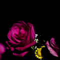
Meeting the Challenge: To my eye you met the challenge, but others said that your photo was underexposed. I decided to go to the forums for help, and found this::
------
You need to understand that fundamentally low-key means there is a broad range of tonality on the left side of histogram in the shadows, but not on the right side in the highlights. The left side will have a fairly high number of pixels spread throughout the whole range of shadows. The right side will have only narrow spikes. The image therefore is properly exposed, it simply lacks any tonality on the highlights side of the histogram.
The highlight, or right side of the histogram of a typical low-key image will have a few well defined spikes in it. That is what I believe fotoman_forever is talking about when he says, "a lighting technique that emphasizes the highlighted areas". In other words, there are highlights but there is little or no tonality in them at all. You see it all the time in low-key where an image has bright, well defined edges but no highlight tones.
The most important ingredient of low-key is a full range of tones on the left side of the histogram, sometimes with spikes but those spikes generally occur on the far left side. That means you see a lot of detail in the shadows and maybe some very strong near-black tones. That makes a low-key image look "powerful" and that is why it is sometimes used in male portraits. That is also, I believe, what is meant in the book where it says, "...shift mid-tones into shadow areas." You are taking mid-tones and shifting them left. What is important to remember is that tonality in low-key images is in the shadows regardless how it gets there. In the camera that can be as simple as metering just off a very bright area of a scene to create bright edges and capture shadow tones.
This is where low-key differs from "underexposed". Underexposed images are low contrast, lack tonality and often have no true highlights or shadows. Looking at their histogram you would see spikes on the left side with large gaps between where there are no pixels at all. That is because they lack shadow tonality. Some might argue that "underexposed" images are low-key and they may even be right but, lacking tones, they just aren't very good low-key images.
------
Here is an image somewhat similar to yours that you may want to look to as an example: 
Again, I do not see a problem here but I do not have as much knowledge about the difference between low-key and underexposed.
Composition: I think this is a huge strong point for your image. I love how you mirrored the same basic shape, the double-oval, several times. The positioning of the shapes gives the image a great depth, as it does not show matching shapes head-on. I like the crop. A looser crop on the top and right may have helped balance out the negative space at the bottom left, but then again it might have left your image too centered. I am a huge fan of the background, as it is free from distractions, drawing all the attention to the flower.
Lighting / Color: For me, the colors are a HUGE draw for this photo. Not only do the two colors work well together, but the blue-purple surrounds the other color on each figure, lending continuity to the repeated double-oval shapes. In addition to any problems with low-key vs underexposed, I feel that the shadow on the left figure may be a little distracting, because it breaks up the continuity of the colors, but this does not seem like a huge problem.
Camera Work / Post Processing: Since there are no photographer's comments, I can't say what this is from, but the image should be less blurry. You can try this thread for info about focusing macro shots, or if this occured in post processing, try to find the balance between reducing noise and keeping details.
Title: The title flows nicely off the tongue and I believe it fits the photo very well.
Misc / My subjective thoughts: I really admire what you have done with keeping the background incredibly distraction-free as that is one thing I have not yet been able to achieve and it can be so important to the look of a photo. I've done some nit-picking about your photo, but my feeling is that if this had been in focus, I would have loved it to death. With the blur, I see it as a photo with so much potential but ultimately not reaching that potential. However, it is still a very pleasant image for me to look at - very soft, delicate, and peaceful.
I hope this helps! Feel free to PM me if you have any questions.
Thank you for being my first critique!
edit: Looking at some of your other pictures, I'm thinking maybe you did the blurryness deliberately? If so, it definitely added to the soft and delicate nature, but probably didn't help the score.
Message edited by author 2006-04-04 14:08:44. |
|
 Photographer found comment helpful. Photographer found comment helpful. |
Comments Made During the Challenge  |
|
|
03/28/2006 07:43:57 AM |
| Speaks for itself. Very Nice |
|
| Photographer found comment helpful. |
|
|
03/26/2006 09:33:38 PM |
| would like this a lot if it were sharper |
|
| Photographer found comment helpful. |
|
|
03/24/2006 03:43:16 PM |
|
| Photographer found comment helpful. |
|
|
03/24/2006 11:27:49 AM |
| I like the colors used but the slight blur doesn't allow me to enjoy the image. |
|
| Photographer found comment helpful. |
|
|
03/23/2006 05:03:44 PM |
| Just doesn't work for me. Not enough detail or sharpness. |
|
| Photographer found comment helpful. |
|
|
03/23/2006 04:59:18 PM |
| this looks less low key and more underexposed... |
|
| Photographer found comment helpful. |
|
|
03/23/2006 03:58:53 AM |
| it just looks like an out of focus, blurry shot of a flower, sorry |
|
| Photographer found comment helpful. |
|
|
03/22/2006 09:35:09 PM |
| Underexposed, and oof, not "low key". |
|
| Photographer found comment helpful. |
|
|
03/22/2006 03:23:26 PM |
| under-exposed. not low-key. |
|
| Photographer found comment helpful. |
|
|
03/22/2006 07:54:58 AM |
|
| Photographer found comment helpful. |
Home -
Challenges -
Community -
League -
Photos -
Cameras -
Lenses -
Learn -
Prints! -
Help -
Terms of Use -
Privacy -
Top ^
DPChallenge, and website content and design, Copyright © 2001-2024 Challenging Technologies, LLC.
All digital photo copyrights belong to the photographers and may not be used without permission.
Current Server Time: 04/24/2024 10:06:59 PM EDT.