| Author | Thread |
Comments Made During the Challenge  |
|
|
07/21/2003 09:40:37 PM |
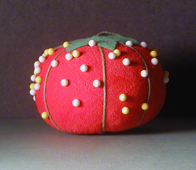
| Good concept. Focused well. These pen heads are very difficult - I tried them once and gave up. I think a consistent background and floor is better in this situation - or put the background way, way back so that it is not in focus and not lighted. The reds seem off also - might want to check the color balance. Hope I have not offended you with the suggestions. |
|
 Photographer found comment helpful. Photographer found comment helpful. |
|
|
07/21/2003 08:29:57 PM |
| My Mom has a pin cushon just like that........2 points just for nostalgia. It's sharp, colorful, well lit and the deadcenter composition even works well here. |
|
| Photographer found comment helpful. |
|
|
07/19/2003 07:07:14 PM |
| idea is ok but the background good have been a better color |
|
|
|
07/17/2003 05:24:46 PM |
| I like it.. Little bit barren.. the white on the pinheads are a little too bright for my taste |
|
| Photographer found comment helpful. |
|
|
07/16/2003 01:38:04 PM |
| You should have made a circle with the pins, or atleast looked at what that would have looked like. |
|
|
|
07/16/2003 12:08:24 PM |
| Hey....good idea. The light is way too harsh. Hard to control at times. I do think your idea is excellent and I like the composition. |
|
| Photographer found comment helpful. |
|
|
07/16/2003 10:54:05 AM |
| cute! the overexposure steals texture away, but the resulting contrast shadows give attention to the pin ends. interesting dillemma. The shadow on the right is too dark for my taste. it's a visual void. makes the picture look off centered when it actually isn't. 4 |
|
|
|
07/16/2003 02:19:17 AM |
| the lighting washes out the colors. I think adding some constrast to darken the background would have allowed the pincushin to stand out more. perhaps having some pins sticking halfway out would add more interest also. :o) |
|
|
|
07/16/2003 12:49:26 AM |
| White pins overexposed,next time focus on yellow to speed up the camera,5 from me! |
|
Home -
Challenges -
Community -
League -
Photos -
Cameras -
Lenses -
Learn -
Prints! -
Help -
Terms of Use -
Privacy -
Top ^
DPChallenge, and website content and design, Copyright © 2001-2024 Challenging Technologies, LLC.
All digital photo copyrights belong to the photographers and may not be used without permission.
Current Server Time: 04/19/2024 01:58:56 AM EDT.