| Author | Thread |
|
|
03/16/2006 01:19:25 AM |
| Horizon looks tilted to me. ;-) Cool Shot GE. |
|
 Photographer found comment helpful. Photographer found comment helpful. |
|
|
03/06/2006 04:52:28 AM |
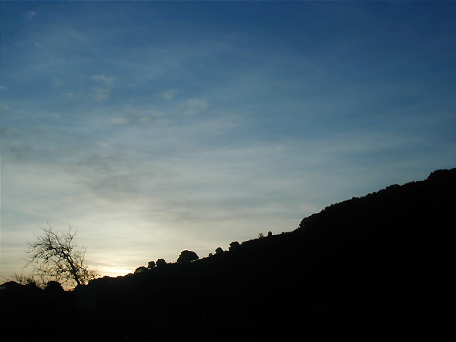
Hi. You've some lovely processed color images in your portfolio so you must have found a good way around the color-blindness :) Very gracious of you to ask to see what I did with your photo. Thank you. I guess the subtle color changes might not do too much for you ;-) The cropping is drastic, I guess... hate to lose that nice big slope but I really wanted to make the tree be more prominent.

Thanks for providing the incentive to play and good luck in the challenges :) |
|
| Photographer found comment helpful. |
|
|
03/03/2006 06:27:14 PM |
Originally posted by meanwile:
Hi again... you know, there are some lovely magentas and reds that could be brought out a little in this shot... I actually played with it a bit and pulled out a nice pastel, realistic-looking sunrise (IMO, haha). Just used curves, selective color adjustment, and hue/sat. Cropped a bit to let the little tree shine.
I can't believe you shot this blind from a car... that's remarkable! |
Thanks! You're welcome to post your alternate it you want -- if you're short on space email it to me and I'll post it in my portfolio.
I have a common red-green type of color-blindness, so messing around with curves carries a greater-than-usual risk of ending up "un-natural-looking" -- for example, this very early entry of mine:
 |
|
|
|
02/24/2006 02:49:39 AM |
Hi again... you know, there are some lovely magentas and reds that could be brought out a little in this shot... I actually played with it a bit and pulled out a nice pastel, realistic-looking sunrise (IMO, haha). Just used curves, selective color adjustment, and hue/sat. Cropped a bit to let the little tree shine.
I can't believe you shot this blind from a car... that's remarkable!
|
|
| Photographer found comment helpful. |
|
|
02/08/2006 02:38:17 PM |
Originally posted by meanwile:
... If a different composition or a better defined/esthetically-pleasing tree were not available, I'd probably do as you did and mess with the sky color/texture, although not quite as extremely. Better luck next time ;-) |
Thanks! I was kind-of stuck as far as compositional choices go, since this was taken from the middle of the freeway at 60 MPH, without using either the viewfinder or the video screen.
I guess I thought that getting this quality of framing, lighting, timing, and (almost) focus under the circumstances was an accomplishment which deserved the opportunity to stand on its own. Someplace I have yet another version which has tonal adjustment but not the radical color shift of the currently-posted alternates -- I'll post that one too. |
|
|
|
02/08/2006 02:33:45 AM |
| I applaud your inclination to go natural. I wish photos didn't have to be radioactive to get a decent score on this site. The yellow in your alts seems like a little too much (to me), however, the submitted photo does appear to need some oomph. Not enough going on. If a different composition or a better defined/esthetically-pleasing tree were not available, I'd probably do as you did and mess with the sky color/texture, although not quite as extremely. Better luck next time ;-) |
|
| Photographer found comment helpful. |
|
|
02/08/2006 02:30:25 AM |
| Paul, I am sure your alternates would have done better just on the color wow factor alone. But I like this one better. Perhaps if you did a little more work with the sky. The darker clouds almost look like a defective/dirty area here. This is one of those that would do better with some more sky detail--the clouds are very faint here. Maybe they could have been brought out with PP, maybe not. |
|
| Photographer found comment helpful. |
|
|
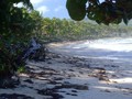
02/08/2006 01:57:00 AM |
I guess I should have submitted one of the "enhanced" versions instead of this virtually unprocessed one, which I thought was my best "pure photograph" of the month.
First alternate:  Second alternate: Second alternate:  |
|
Home -
Challenges -
Community -
League -
Photos -
Cameras -
Lenses -
Learn -
Prints! -
Help -
Terms of Use -
Privacy -
Top ^
DPChallenge, and website content and design, Copyright © 2001-2024 Challenging Technologies, LLC.
All digital photo copyrights belong to the photographers and may not be used without permission.
Current Server Time: 04/19/2024 07:04:22 PM EDT.