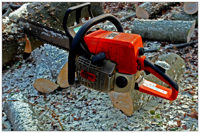
Composition:
The composition here is a bit static, but very colorful. I'm not exactly sure of how you accomplished it, but the saw indeed seems to be suspended, which I believe is an intentional effect. Doing this without "an adult", has left you with a perspective that only shows the saw, rather than "adulthood." I think the overall idea of the picture would have benefited from the saw being nearer to the bottom instead of off-centered toward the top.
Background:
The background appears very flat. I think this is a lighting and perspective issue, but it almost appears as flat as a sheet of paper.
I'm not certain of how you intended this to look, but that's the effect I get from the picture. It is also a rather "busy" background, with perhaps too many distracting elements.
Camera Work:
As I don't have information as to your camera settings, I can only guess, and I'm betting this was handheld with a fast shutter speed. The focus and sharpness is good, but a large aperture should have given better background blur with a 20D. A 1.8 or 2.0 would have been a good value to use, if you have a capable lens. The lighting appears natural.
Post-Processing:
I honestly don't detect a lot of post processing here, but you've definitely made the saw stand out. I think there's a little too much saturation, making the orange a bit unnatural.
My Opinion:
This is a neat idea, but somehow the shot feels uncomfortable. The colors are slightly distracting, and the background is busy and confusing. I think it would work better with less wood in the background. Overall, nice effort and a good idea.
I do see this as a great shot, and I hope my comments are constructive and informative. Thanks for entering!
If you've got any questions about this critique, please feel free to contact me via the PM system. |