| Author | Thread |
|
|
06/26/2002 12:26:00 PM |
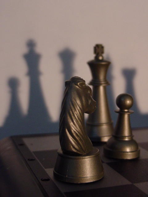
| i would have voted higher if the queen's shadow was darker than the rest of the peices, and was in better focus, as its the point of your shot according to the title. |
|
Comments Made During the Challenge  |
|
|
06/23/2002 10:11:00 PM |
| I think you would've been better off showing the sahdow of the rook as well. |
|
|
|
06/22/2002 11:47:00 AM |
| I like this one more and more. The chess pieces are nice, and I like the warm glow of light on them. I wish you'd got the king in focus, too, but I know the DOF is often limited when doing these kind of macro shots. Also like that the shadows are obviously not the same pieces and don't match up one by one. |
|
|
|
06/19/2002 03:36:00 PM |
| Nice shot! I wish the Knight was turne a little more to show its nice profile... good work! - jmsetzler |
|
|
|
06/19/2002 12:23:00 PM |
| Interesting idea (I'm a chess fan too). I wonder if you experimented with creating a harder shadow -- maybe closer to the chess board? How would this look if the shadows were darker and more menacing? |
|
|
|
06/19/2002 12:34:00 AM |
| Touch on the dark side, perhaps more contrast needed. Interesting though. |
|
|
|
06/18/2002 10:43:00 PM |
| Nice concept. Would have scored higher for me if there was a bit more color to compliment the bronze (tinted light or wall color maybe?)....or maybe as a black and white? Could also be more focus on the King. I wish we had re-do's so I could see this again after you re-worked it based on input. |
|
|
|
06/18/2002 07:59:00 PM |
| Nice lighting, very subtle. (Good title) Photo 10 Creativity 8 Shadows 9 total 9 |
|
|
|
06/18/2002 05:19:00 PM |
| It took me a moment to understand the significance of the title. NIcely done! |
|
|
|
06/18/2002 08:52:00 AM |
| Cleaver title, Focus seems a little soft. |
|
|
|
06/18/2002 12:12:00 AM |
| You are right, she is in the shadows, and so am I when it come to this picture |
|
|
|
06/17/2002 10:20:00 PM |
| Nice idea. Good use of light and shadows along with dramatic style chess pieces |
|
|
|
06/17/2002 09:21:00 PM |
| I like the angle of composition on this one. It is a nice setup that works well with the title. It might work better using a higher f-stop to keep things in focus. As it is, the viewer's attention is drawn to the knight in the foreground. Of course, that does lead next to the queen's shadow, so maybe not. |
|
|
|
06/17/2002 02:23:00 PM |
| Could have been a bit sharper in the foreground. Pallette is a little uninteresting. |
|
|
|
06/17/2002 02:17:00 PM |
| Makes you look twice - nice. |
|
|
|
06/17/2002 01:41:00 PM |
|
|
|
06/17/2002 01:45:00 AM |
| points since it was one of my original ideas ;-) |
|
|
|
06/17/2002 12:17:00 AM |
| I like the forboding shadows here. This image implies to me that there is inevitable doom coming to the dark side. I think, however, the angle of the Knight could be stronger...perhaps pointing more towards the right? |
|
Home -
Challenges -
Community -
League -
Photos -
Cameras -
Lenses -
Learn -
Prints! -
Help -
Terms of Use -
Privacy -
Top ^
DPChallenge, and website content and design, Copyright © 2001-2024 Challenging Technologies, LLC.
All digital photo copyrights belong to the photographers and may not be used without permission.
Current Server Time: 04/18/2024 11:17:30 PM EDT.