| Author | Thread |
|
|
10/19/2005 01:40:22 PM |
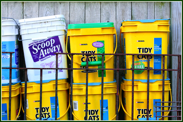
All I can figure is that your challenge average was getting uncomfortably high and you threw this one in there to drag it back to earth :o). But I think I would have titled it "Scoop Away" just to be contrary - heh heh.
Message edited by author 2005-10-19 13:56:11. |
|
 Photographer found comment helpful. Photographer found comment helpful. |
|
|
10/12/2005 12:51:01 AM |
| Hey Bear, I don't think you got permission to sneak into my garage to take this photo... tsk tsk tsk, shame on you! :-) Funny Stuff! |
|
| Photographer found comment helpful. |
|
|
10/12/2005 12:25:19 AM |
| They make excellent storage containers...... I keep a couple for bird seed. Excellent submission.... fyi 7 |
|
| Photographer found comment helpful. |
Comments Made During the Challenge  |
|
|
10/09/2005 04:28:29 AM |
| Even if you had gotten the colors right (and i am still trying to figure out which of the colors you think are the complements that meet the challenge), the white Scoop Away pail ruins the picture for me, unless the challenge had been something like "odd man out" but even then, I would have just chosen to let the pail with the green lid instead of the blue serve that purpose. |
|
| Photographer found comment helpful. |
|
|
10/08/2005 10:40:18 PM |
| Blue and yellow re not complimentar colors. |
|
| Photographer found comment helpful. |
|
|
10/08/2005 11:33:28 AM |
Complementary colours are pairs of colours that contrast strongly when compared to each other. The complementary colours I see in your image are
blue/yellow.
The challenge called for "two complementary colors to compose your photograph" but your photo shows more than two colours, violet, green, as well as neutrals black, white and greys... and that dilutes the visual effect of a single colour against its opposite (complementary) colour.
I think your photo would have been stronger if you had grouped the yellow containers with the blue labels and cropped tightly around them. The resulting photo would have been a very interesting geometric composition.
|
|
| Photographer found comment helpful. |
|
|
10/07/2005 05:13:55 PM |
| That must one hell-of-a big cat. |
|
| Photographer found comment helpful. |
|
|
10/07/2005 11:53:41 AM |
red/green
blue/orange
purple/yellow |
|
| Photographer found comment helpful. |
|
|
10/05/2005 11:59:01 AM |
| I guess the purple and yellow are complimentary, but I had to look too hard to find it. I do not find the subject interesting. |
|
| Photographer found comment helpful. |
Home -
Challenges -
Community -
League -
Photos -
Cameras -
Lenses -
Learn -
Prints! -
Help -
Terms of Use -
Privacy -
Top ^
DPChallenge, and website content and design, Copyright © 2001-2024 Challenging Technologies, LLC.
All digital photo copyrights belong to the photographers and may not be used without permission.
Current Server Time: 04/23/2024 06:30:30 PM EDT.