| Author | Thread |
Comments Made During the Challenge  |
|
|
08/02/2005 11:27:52 PM |
|
 Photographer found comment helpful. Photographer found comment helpful. |
|
|
08/02/2005 09:55:47 PM |
|
| Photographer found comment helpful. |
|
|
08/01/2005 10:57:35 PM |
|
| Photographer found comment helpful. |
|
|
07/29/2005 07:08:53 PM |
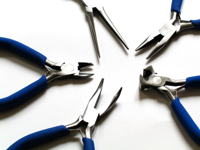
| 8 - Met the Challenge. I like this composition and the use of the three simple colors. Criticism; In my opinion, those said three colors are having trouble with each other. The blue being so bold and dark, has forced the 'steel' to become washed out (though this may be your intent). Also the white base exasperates that. Just seems it is hard to find a 'balance' and 'blend' of the three colors. Aside from that, for me, this would be a better photograph if either the needle nosed pliers had their handle grip in the frame, or perhaps if three were uniform with them, ie no handle grip showing. It is simple and pleasing to the eye but my eye picks out that 'imperfection' to the symmetry. On the symmetry note, I like the 'right alignment'. For me, either really go all out on the 'washed outness' or give some sharpness to the 'heads/cutters/noses/pliers' and show the 'metal'. |
|
| Photographer found comment helpful. |
|
|
07/29/2005 01:06:53 PM |
| go needle nose~! nice picture~! |
|
| Photographer found comment helpful. |
|
|
07/28/2005 07:56:49 PM |
| O very nice very nice. Setup? Foam whiteboard? |
|
| Photographer found comment helpful. |
|
|
07/28/2005 07:35:27 PM |
| I think a darker background might have helped keep the highlights from blending in as much. |
|
| Photographer found comment helpful. |
|
|
07/28/2005 10:42:46 AM |
| A clever star shaped composition. I like the colours but the image seems a tad overexposed. -8 |
|
| Photographer found comment helpful. |
|
|
07/27/2005 06:22:46 PM |
| Nicely arranged and colours superb well done |
|
| Photographer found comment helpful. |
|
|
07/27/2005 08:34:51 AM |
| One of the better tool pics in this challenge. I like the colors, the metal and the positioning. |
|
| Photographer found comment helpful. |
|
|
07/27/2005 03:35:57 AM |
| Light seems a bit strong and direct in this one. Using diffused light would get rid of the harshness in highlights and shadows. |
|
| Photographer found comment helpful. |
|
|
07/27/2005 02:41:35 AM |
| Like the concept, like the layout, just think it's a tad over-exposed. |
|
| Photographer found comment helpful. |
|
|
07/27/2005 02:02:27 AM |
| very cool! but the middles of the pliars are blown out in a few. 8 |
|
| Photographer found comment helpful. |
Home -
Challenges -
Community -
League -
Photos -
Cameras -
Lenses -
Learn -
Prints! -
Help -
Terms of Use -
Privacy -
Top ^
DPChallenge, and website content and design, Copyright © 2001-2024 Challenging Technologies, LLC.
All digital photo copyrights belong to the photographers and may not be used without permission.
Current Server Time: 04/16/2024 05:10:40 PM EDT.