| Author | Thread |
|
|
07/06/2005 01:11:26 AM |
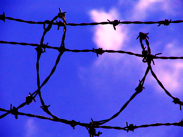
Originally posted by asij:
Good take on the challenge but the pink/purpel outlines on the clouds are bothering me a littel. |
I have a red-green form of color-blindness -- one of the most common manifestations is "not noticing" this type of thing.
As for lines leading and leading nowhere ... barbed wire commonly symbolizes confinement, wide-open skies (even if over-saturated) symbolize freedom, and these lines both lead you towards and bar you from that freedom. Maybe I should have added the reflective pause to the title, and called it
Lines Leading ... Nowhere |
|
Comments Made During the Challenge  |
|
|
07/03/2005 04:54:15 PM |
| a little too much saturation |
|
 Photographer found comment helpful. Photographer found comment helpful. |
|
|
07/03/2005 04:26:54 PM |
| I feel that in this photo, the lines ARE the subject, but I think that the idea is to use lines in a photo to direct attention to and enhance a subject that is a different part of the photo. My take, anyway. (4) |
|
| Photographer found comment helpful. |
|
|
07/03/2005 12:37:47 PM |
| Don't see the leading lines, but interesting shot. A bit overprocessed, and the color highlights on the wire don't work for me. |
|
| Photographer found comment helpful. |
|
|
07/02/2005 11:21:57 PM |
And lines leading no where fit in a leading lines challenge by...
TC |
|
| Photographer found comment helpful. |
|
|
07/02/2005 05:17:55 PM |
| Ouch...this image has been abused by some manic photoshopper ayh? Harsh color treatment completely ruins the image, and it also needs more creativity in my opinion, for example by way of shallow DOF and another angle |
|
| Photographer found comment helpful. |
|
|
07/02/2005 01:04:19 PM |
| I feel that the colour of the of the sky looks a little unnatural. Bold, simple lines in the barbed wire. |
|
| Photographer found comment helpful. |
|
|
07/01/2005 12:46:57 PM |
| Good take on the challenge but the pink/purpel outlines on the clouds are bothering me a littel. |
|
| Photographer found comment helpful. |
|
|
07/01/2005 02:42:41 AM |
| This doesn't do it for me...the lines don't lead and the background is oversaturated for my taste. |
|
| Photographer found comment helpful. |
|
|
07/01/2005 12:39:01 AM |
| i feel the colors are too saturated. |
|
| Photographer found comment helpful. |
|
|
06/30/2005 02:21:39 AM |
| The lines are nice but it appears over sharpened. |
|
| Photographer found comment helpful. |
|
|
06/30/2005 01:14:35 AM |
| Lines need to lead somewhere or you miss the spirit of the challenge. Just my opinion. |
|
| Photographer found comment helpful. |
|
|
06/29/2005 12:07:38 PM |
| i'd like to see the sky even more out of focus. well done with the composition. 7 |
|
| Photographer found comment helpful. |
|
|
06/28/2005 06:23:33 PM |
Leading lines or curves generally have two purposes. One is to lead the viewer into the scene. The other is to lead you toward the main subject. It is most effective if they come in from the lower left because that is the natural direction humans visually scan a picture from so are easiest to pick up.
The barbed wire appears to be the main subject itself and does not lead the viewer to any one place in the frame. |
|
| Photographer found comment helpful. |
|
|
06/28/2005 01:23:03 AM |
| colors are too vivid - they look fake - and the pic is a bit pixilated, too... if you don't have neatimage think about getting it (there is a free version) |
|
| Photographer found comment helpful. |
|
|
06/27/2005 10:58:51 PM |
We all know that this is a "Leading Lines" challeng. By just saying "Nowhere" gives a differant perspective, and makes the picture that much more stronger.
nice comp, nice dof, nice lines, blacks good, whites need work, lighing sillouette nice, nice idea, overall good. |
|
| Photographer found comment helpful. |
|
|
06/27/2005 03:22:52 PM |
| Too overprocessed (too much saturation) for my liking. |
|
| Photographer found comment helpful. |
|
|
06/27/2005 10:35:29 AM |
| i like how the cursive live moves the eye through the pic. seems a bit over saturated. the spirder web? is a bit distracting. wish there was something to counterbalance the brightness of the main cloud |
|
| Photographer found comment helpful. |
|
|
06/27/2005 12:47:19 AM |
| Don't care for the grainy harsh edges on the wires. Definately a distraction |
|
| Photographer found comment helpful. |
Home -
Challenges -
Community -
League -
Photos -
Cameras -
Lenses -
Learn -
Prints! -
Help -
Terms of Use -
Privacy -
Top ^
DPChallenge, and website content and design, Copyright © 2001-2024 Challenging Technologies, LLC.
All digital photo copyrights belong to the photographers and may not be used without permission.
Current Server Time: 04/23/2024 09:57:13 AM EDT.