| Author | Thread |
Comments Made During the Challenge  |
|
|
05/06/2003 05:33:11 PM |
|
|
|
05/06/2003 10:04:47 AM |
|
|
|
05/05/2003 12:10:11 PM |
| I would not have spaced the middle text out differently than the rest. Otherwise I really like it 8 |
|
 Photographer found comment helpful. Photographer found comment helpful. |
|
|
05/04/2003 09:57:11 PM |
| Would like to see a brighter background color, but the design is excellent. |
|
| Photographer found comment helpful. |
|
|
05/01/2003 06:03:56 PM |
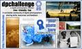
| I really like this design except for the font in "this is the digital..." The design is nice, I like the use of the ribbon graphic and the url is nice and clear. |
|
| Photographer found comment helpful. |
|
|
05/01/2003 01:18:05 PM |
| Very nice. I pick you to win. Your sticker is very clean and perfectly balanced. Good luck! |
|
| Photographer found comment helpful. |
|
|
05/01/2003 11:56:48 AM |
A great design layout. I think for me the let-down is the text - "This is the digital photography contest for you" - not catchy and too long - could lose the "This is" for starters.
I think, changing that for a different strapline would make this a stronger contender.
7, Kavey |
|
| Photographer found comment helpful. |
|
|
05/01/2003 11:19:01 AM |
| Letters too closely spaced. Too simple. |
|
| Photographer found comment helpful. |
|
|
05/01/2003 09:46:12 AM |
beautiful design, simple, clean and
striking colors ! |
|
| Photographer found comment helpful. |
Home -
Challenges -
Community -
League -
Photos -
Cameras -
Lenses -
Learn -
Prints! -
Help -
Terms of Use -
Privacy -
Top ^
DPChallenge, and website content and design, Copyright © 2001-2024 Challenging Technologies, LLC.
All digital photo copyrights belong to the photographers and may not be used without permission.
Current Server Time: 04/24/2024 09:04:00 PM EDT.