| Author | Thread |
|
|
05/05/2005 01:20:26 AM |
Wonderful image... Very creative... I't really has an ad feel to it... Very apelative.
Simple but effective... Great shot you got here... like all the photos on your portfolio... You are very creative keep it up... i am enjoying seeing your work. |
|
 Photographer found comment helpful. Photographer found comment helpful. |
|
|
05/02/2005 08:30:21 PM |
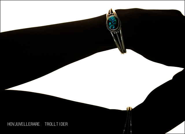
| Hey Eva, I gave this an 8. It was definitely one of my favorites from the challenge. I like your treatment of the type, too, and good typography was rare in this challenge. (I like GulimChe as well--its unevenness is really appealing.) I actually don't see the texture of the stocking at all. I guess my monitor is darker than yours. But that does answer the question of how you got the great silhouette-like effect, which I thought was amazing. Very well done. |
|
| Photographer found comment helpful. |
|
|
05/02/2005 07:20:52 PM |
| This so reminds of the debeers comercials way back in the day. I like how it looks though. I wouldnt have thought a stocking. I was first thinking your used a light box on the bottom and shot it from the top giving a natural silouette. Well done nice shot. |
|
| Photographer found comment helpful. |
|
|
05/02/2005 06:19:59 PM |
Thanks guys :)
I really appreciate it
lol @ Arnit.. Thank you so much :"> |
|
|
|
05/02/2005 04:24:42 PM |
classy photo - well taken.
|
|
| Photographer found comment helpful. |
|
|
05/02/2005 10:44:56 AM |
|
| Photographer found comment helpful. |
|
|
05/02/2005 10:15:08 AM |
| You've been robbed big time! I would have placed you number one in this challenge. |
|
| Photographer found comment helpful. |
|
|
05/02/2005 04:16:11 AM |
| Ya did good. Love the effect. |
|
| Photographer found comment helpful. |
Comments Made During the Challenge  |
|
|
05/01/2005 09:51:20 PM |
Perhaps one of the more unique shots in this challenge.
The high-contrast Black & White works well in an advertisement composition, though the lower bracelet is a bit lost. Effective text/font used. (6) |
|
| Photographer found comment helpful. |
|
|
05/01/2005 08:55:20 PM |
| Hard to see the jewelery on the bottom. Otherwise I like it. |
|
| Photographer found comment helpful. |
|
|
05/01/2005 07:53:16 PM |
| Great ad style. Bumping up. |
|
| Photographer found comment helpful. |
|
|
05/01/2005 02:47:31 PM |
| it's a little difficult to make out the detail in the jewelry (might need a bit more light and a tighter crop) but I like the silhouette concept. |
|
| Photographer found comment helpful. |
|
|
05/01/2005 11:40:58 AM |
| I like the idea, however the bracelet is a little too dark. |
|
| Photographer found comment helpful. |
|
|
05/01/2005 10:18:32 AM |
| Great idea. Top 3 without a doubt. The lighting is just perfect. Good luck. |
|
| Photographer found comment helpful. |
|
|
04/30/2005 11:48:53 PM |
| Cool idea. I like the way this is presented, unfortunatly, the bottom part is cut and is bugging me quite a bit. Also the text suffered from compression as its uneven. Nice little frame too. 7 |
|
| Photographer found comment helpful. |
|
|
04/30/2005 05:12:48 PM |
| The strknessx of this image caught my attention soI think that you have achieved well as an advert 9 |
|
| Photographer found comment helpful. |
|
|
04/30/2005 11:49:58 AM |
| excellent concept. this would work well for a jewelry line vs. an individual piece |
|
| Photographer found comment helpful. |
|
|
04/30/2005 12:13:17 AM |
| I really like what you have going on here. The only thing that bugs me is the bottom arm. Nice and clean shot. Good luck. 8 |
|
| Photographer found comment helpful. |
|
|
04/29/2005 08:58:52 AM |
| I really like this composition and conept. Was there a way to brighten the bracelet any more within the rules? |
|
| Photographer found comment helpful. |
|
|
04/29/2005 07:55:17 AM |
| Very nice. Very nice indeed. Love the shadowy effect. the saturation on the stone is good too.. 10 |
|
| Photographer found comment helpful. |
|
|
04/28/2005 04:14:15 PM |
| great idea, but i think the jewellery needs to pop a little more. |
|
| Photographer found comment helpful. |
|
|
04/28/2005 12:19:27 PM |
| Great concept. The words mean nothing to me, though, and the lower bracelet is too indistinct. 6 |
|
| Photographer found comment helpful. |
|
|
04/27/2005 06:37:47 PM |
|
| Photographer found comment helpful. |
|
|
04/27/2005 01:07:32 PM |
| the white triangle in the lower right takes away from the image imo... Plus im not too sure what im looking at, i see the upper form as a arm but have no clue what the lower form is, especially with the triangle in the lower right. I think also rotating the image 90 clockwise would have been a better orientation. |
|
| Photographer found comment helpful. |
|
|
04/27/2005 12:45:20 PM |
| Super well done. Great effect. |
|
| Photographer found comment helpful. |
|
|
04/27/2005 11:45:05 AM |
| I like the way you've lit this. Very creative use of lighting. The text in the bottom left could be cleaner. Overall, nice job. Good luck. |
|
| Photographer found comment helpful. |
|
|
04/26/2005 10:17:30 PM |
this is now my favourite one of the challenge.
i heart you. |
|
| Photographer found comment helpful. |
|
|
04/26/2005 01:58:27 PM |
| Interesting contrast between the black arms and the white background. |
|
| Photographer found comment helpful. |
|
|
04/26/2005 01:40:52 PM |
| I really like the high contrast BW, kind of like iPod ads |
|
| Photographer found comment helpful. |
|
|
04/26/2005 12:57:59 PM |
|
| Photographer found comment helpful. |
|
|
04/26/2005 12:22:59 AM |
| Wonderful idea with a good technique. It looks so good I'm almost hesitant to mention there could have been a wee bit more light on the stone itself. Something about the composition doesn't attract me. I will look back after the challenge to see if the model is wearing dark hose. If so, it was a brilliant idea. I'm going to have to remember this. |
|
| Photographer found comment helpful. |
|
|
04/25/2005 11:31:05 PM |
| One of the best compositions in the contest, but the jewelery doesn't catch my eye quickly enough. Maybe more contrast or exposure?I'd recommend a Different font too. (Thicker.) |
|
| Photographer found comment helpful. |
|
|
04/25/2005 07:05:01 PM |
| I like this idea a lot..the top bracelet is lovely with the silhouette, but the bottom one just seems to disappear..is it a reflection? I'm not certain if it's the same or another bracelet on two hands...maybe i'm just confused tonight. |
|
| Photographer found comment helpful. |
|
|
04/25/2005 06:27:13 PM |
| Unique and very artistic shot. I like what you done here. |
|
| Photographer found comment helpful. |
|
|
04/25/2005 05:40:32 PM |
| Interesting idea. Nice use of silhouette and mirror effect. I find the composition to be a bit odd and the jewel uninspiring. Font is annoying to me, sorry. Good job overall. Good luck! |
|
| Photographer found comment helpful. |
|
|
04/25/2005 05:34:53 PM |
|
| Photographer found comment helpful. |
|
|
04/25/2005 04:00:09 PM |
| quite nice == you pulled off this technique well. one of my ribbon picks == bol |
|
| Photographer found comment helpful. |
|
|
04/25/2005 03:11:07 PM |
| Is that a "wet suit"? Great one. |
|
| Photographer found comment helpful. |
|
|
04/25/2005 01:29:43 PM |
| i would have liked to see a little more color on the braclet to enhance it a bit, but overall a nice image. |
|
| Photographer found comment helpful. |
|
|
04/25/2005 11:16:45 AM |
| very nice concept. Love the silhouette. I gave it and 8. |
|
| Photographer found comment helpful. |
|
|
04/25/2005 09:50:26 AM |
| Nice photo, the bracelet could have been a little brighter |
|
| Photographer found comment helpful. |
|
|
04/25/2005 01:55:34 AM |
| crop is distracting and font seems choppy? |
|
| Photographer found comment helpful. |
|
|
04/25/2005 01:03:39 AM |
| would look great in a magazine. |
|
| Photographer found comment helpful. |
Home -
Challenges -
Community -
League -
Photos -
Cameras -
Lenses -
Learn -
Prints! -
Help -
Terms of Use -
Privacy -
Top ^
DPChallenge, and website content and design, Copyright © 2001-2024 Challenging Technologies, LLC.
All digital photo copyrights belong to the photographers and may not be used without permission.
Current Server Time: 04/19/2024 11:05:57 PM EDT.