| Author | Thread |
|
|
04/20/2005 07:48:08 AM |
| I really thought this should have rated higher in spite of the lightness. If you ever rework the image, I would love to see the results. This is one of the better composed images in the challenge. |
|
Comments Made During the Challenge  |
|
|
04/19/2005 12:54:57 PM |
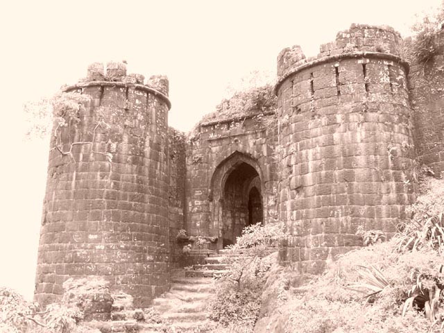
| A bit overexposed. I would like to be able to see a defined edge of where the building meets the sky. Very cool building though. |
|
 Photographer found comment helpful. Photographer found comment helpful. |
|
|
04/18/2005 12:28:54 PM |
| Nice subject but over exposed |
|
|
|
04/18/2005 10:24:26 AM |
| too bright. whites good, blacks barely there. nice comp. |
|
| Photographer found comment helpful. |
|
|
04/18/2005 09:24:58 AM |
| I'd have scored this even higher if the picture had had more bite. It's just a bit washed out for my liking even though I imagine that this was done to give the image an aged, 'times past' look. |
|
|
|
04/16/2005 09:28:16 PM |
| A great subject, but seems a little overblown. |
|
|
|
04/16/2005 04:56:05 PM |
| This photo had the greatest of potential, but from my perspective was ruined due to post processing. The magnificence of this structure alone should have put you in good stead with the voters of DPC, but what character the building may have possessed has been eradicated by whatever techniques you used to arrive at this end. It is sad... but as it stands I can only vote this a generous 5. |
|
| Photographer found comment helpful. |
|
|
04/15/2005 09:37:19 PM |
|
|
|
04/15/2005 05:28:46 PM |
I know it is just a matter of taste, but I just don't much like the processing here.
Good choice of subject and I like how you have framed it. |
|
| Photographer found comment helpful. |
|
|
04/15/2005 05:11:45 AM |
| sorry but i donot like this filter that you are using. And your sky is burnd out. I think it would be much better if you would have it in b&w. |
|
| Photographer found comment helpful. |
|
|
04/14/2005 09:39:11 PM |
| nice! Good composition, good tone |
|
| Photographer found comment helpful. |
|
|
04/14/2005 07:59:07 PM |
|
| Photographer found comment helpful. |
|
|
04/14/2005 04:15:39 PM |
| Seems a bit over exposed... |
|
|
|
04/14/2005 03:14:51 PM |
| the brightness hurts my eyes too much to focus clearly on the building. |
|
|
|
04/14/2005 12:48:04 PM |
| This would have been a teriffic photo if not so washed out. Good eye, good angle. |
|
| Photographer found comment helpful. |
|
|
04/14/2005 10:47:29 AM |
| nice building but i dont really like the color |
|
|
|
04/14/2005 01:51:27 AM |
| it's too bright for me. sorry. |
|
|
|
04/13/2005 08:44:28 PM |
| looks overexposed in the top left. Distracted my attention immediatly. Would have loved to see this in color. 5 |
|
|
|
04/13/2005 08:32:19 PM |
| what a great site. I think you could have upped the contrast a bit, or gone for pure B&W, and it would have been very dramatic. As it is, the sky is very washed out, and that distracts from the rest of the image. |
|
| Photographer found comment helpful. |
|
|
04/13/2005 06:36:35 PM |
|
|
|
04/13/2005 05:05:50 PM |
|
|
|
04/13/2005 04:28:39 PM |
| I like the building a lot but the sky looks like it is really blown out. |
|
|
|
04/13/2005 03:55:25 PM |
| A beuatiful subject, looks like a little blown out in the background. Needs a little more contrast with shadows. |
|
|
|
04/13/2005 02:28:57 PM |
| Was the over exposure intended or accidental? |
|
| Photographer found comment helpful. |
|
|
04/13/2005 02:22:05 PM |
| i like the washed out look, but sometimes people don't realize it's intentional, good luck! |
|
| Photographer found comment helpful. |
|
|
04/13/2005 02:09:47 PM |
| I think you located this shot perfectly. The viewer is 'led up the stairs into the door. I really like the image but wish it was either a little darker or in black and white instead of sepia. Sky looks a little blown out. 7 |
|
| Photographer found comment helpful. |
|
|
04/13/2005 12:56:09 PM |
| the overexposed sky distracts from a nice photo |
|
|
|
04/13/2005 12:52:55 PM |
| Like the angle, but the sky is a little overpowering. |
|
|
|
04/13/2005 12:12:30 PM |
| Nice castle, but the photo seems a bit washed out to me (not sure if this was done on purpose). The top left side takes away from the rest of the picture. |
|
|
|
04/13/2005 09:35:45 AM |
| Cool building, but I think B&W would have done better, or even color. The sky is too blown out. |
|
|
|
04/13/2005 04:49:45 AM |
| great shot but the large amount of over exposed sky doesnt help would have rated higher if ND or Grey grad used |
|
| Photographer found comment helpful. |
|
|
04/13/2005 01:25:46 AM |
| very pretty, but overexposed. |
|
|
|
04/13/2005 12:51:04 AM |
| sky a little too blown out here otherwise could be excellent |
|
Home -
Challenges -
Community -
League -
Photos -
Cameras -
Lenses -
Learn -
Prints! -
Help -
Terms of Use -
Privacy -
Top ^
DPChallenge, and website content and design, Copyright © 2001-2024 Challenging Technologies, LLC.
All digital photo copyrights belong to the photographers and may not be used without permission.
Current Server Time: 04/19/2024 10:11:26 AM EDT.