*Critique Club*
You didn't really get a lot of comments, so I'm glad this one came up for me on the Critique Club list.
There are quiet a few things that I see that I believe could use improvement.
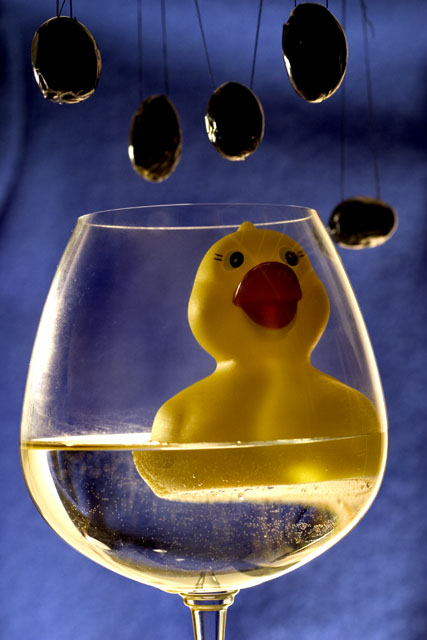
The very first thing that I notice is the darkness. With 3 lightsources, surely areas of this photo could have been brighter. The grapes for example are quite dark and actually hard to recognize as grapes. Definately can't tell if they are green grapes.
I see the strings holding up the grapes and can't figure out the purpose of that. I mean, I realize that you wanted the grapes obviously above the duck, but the strings to me are a distraction. One thing you could try, would be to stick toothpicks into the background (of course you would have to find a background that you could do that with) and then stick the grapes on the ends of the toothpicks. This would give the grapes the look of being suspended in mid air, without the strings to distract from other elements of the shot.
Next, I see that the glass is tilted to the left. It is not only leaning to the left, but it is also closer to the left of the photo as well. I think that straightening that up would add to the shot, and we could then focus on other elements of the shot, rather than the crooked (dirty) glass.
Next, there is a strange reflection right in front of the duckies face. This makes me look at the reflection trying to figure out what it is, rather than looking through the glass at the duck. Another distraction.
He seems like a really tiny duck to fit in a glass like that. I like the idea, and the setup is nice. The shot looks quick. Looks like you didn't spend a lot of time on it. It could be greatly improved by cleaning the glass, straightening the glass and making the lighting more uniform throughout the shot.
Hope this helps. ~Heather~ |