| Author | Thread |
|
|
05/13/2002 07:08:00 PM |
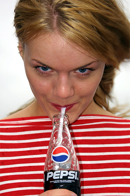
| 10th place? This was one of the best shots of the week in my opinion. I gave it a 10, and though sure it would place? If this shot is not a winner, then I'm not sure what the viewers are looking for? As an ad it is inviting, lively, entertaining, has a pretty girl, the product looks to be enjoyed, etc, etc. As a photo from a technical standpoint I think you did an excellent job. From a technical standpoint it is very difficult when shooting a portrait to get the subject to cooperate, and even more difficult to have them follow directions and look natural. You hit the mark here. I totally disagree with many of the comments below that criticize the model and her dress. My guess is that it can be difficult from a time and budgetary standpoint for most of the posters here to line up Cindy Crawford for a dpChallenge shoot. I think you were lucky to find such a pretty model as an ameature photographer (assumed). She is one of the prettiest girls I have seen photographed so far and I think her colorful blouse adds to the inviting look of the ad. Keep up the excellent work. |
|
|
|
05/13/2002 04:49:00 PM |
| Those girls from Iceland sure are pretty... but this made me want to go buy a pepsi! Nice job! |
|
|
|
05/13/2002 01:18:00 PM |
| Thanks for all the good comments. The spots on her shirt is rain. I took the picture outside and the weather was realy bad. Windy and raining :) |
|
Comments Made During the Challenge  |
|
|
05/12/2002 10:06:00 PM |
| Cute, albeit unoriginal. Well done |
|
|
|
05/12/2002 02:14:00 PM |
| Amazing colors. Bright. Beautiful. There is something about her eyes and smile that is infectious. Stunning. I can't help but smile... and want a Pepsi. |
|
|
|
05/10/2002 06:06:00 PM |
| I think a fuller bottle would have had a greater effect. |
|
|
|
05/10/2002 08:31:00 AM |
| It's not a wild and noisy as their real as campaign -- but Ilike this oe better. |
|
|
|
05/09/2002 09:50:00 PM |
| She has her head is bent down to far. I feel like there is more of her and not enough of the Pepsi product. |
|
|
|
05/09/2002 03:37:00 PM |
| isn't brittany in a commercial similar to this? |
|
|
|
05/09/2002 02:10:00 PM |
|
|
|
05/09/2002 01:58:00 PM |
| The horizontal stripes on her shirt give the shot some nice color |
|
|
|
05/09/2002 11:57:00 AM |
| you are not brittney, you look more like a she-devil spice girl |
|
|
|
05/09/2002 10:48:00 AM |
| The stripes are distracting, but overall good picture. |
|
|
|
05/09/2002 04:43:00 AM |
| The angle of her face gives her an impish, anime look that works really well. Full of promise... There's a term for the whites of the eyes being visible below the irises, but I can't remember what it is. It's deadly, though. Her shirt makes a great background for the bottle, as well. On the downside, the spots on the shirt detract, and the undiffused flash is very harsh and played hob with her skin tones and the bottle reflections. The washed out sky is a bit of a bummer (remember to order a nice blue one in advance next time). It would be nice to have more Pepsi in the bottle, and I'm not wild about the way she's smooshing the straw. Okay... and lose that finger. All the negatives aside, a very, very good bit of work. |
|
|
|
05/08/2002 11:08:00 PM |
| I like the clean background and the red and white stripes that are similar to part of the Pepsi logo. |
|
|
|
05/08/2002 10:49:00 PM |
| This could be straight out of a '50's magazine! Sharp, vidid colors makes it an eyecatcher. Simple elegance. |
|
|
|
05/08/2002 09:48:00 PM |
|
|
|
05/08/2002 02:19:00 PM |
| Good pose, well lit subject. Though the lighting is a bit strong, creating a shadow on her shirt. Also, and these are merely very minor details, but her shirt seems to have some spots on it, and her forhead is a bit sweaty. But these very minor distractions aside, this is a nice photo. Good work! |
|
|
|
05/08/2002 08:06:00 AM |
| mmhmm. makes me wanna drink it up. good use of red stripes to add visual interest and complement the pepsi colors. a cute blonde always helps, too : ) |
|
|
|
05/07/2002 11:51:00 PM |
|
|
|
05/07/2002 11:14:00 PM |
| I love this picture. This just screams vintage pepsi ad, revisited. The striped shirt was a must. Nicely done! |
|
|
|
05/07/2002 07:36:00 PM |
| nice composition, and certainly attractive girl, though she would have been more attractive with softer lighting. i really appreciate that you have the product being consumed with a look of contentment, good job! |
|
|
|
05/07/2002 04:49:00 PM |
| good picture, great eyes! The half full bottle is good. Did you experiment with the background color? I wonder if another color would be better--but maybe not. Just curious. |
|
|
|
05/07/2002 04:31:00 PM |
| Great shot. Lighting seems a bit harsh. Perhaps if her hair was back in a ponytail that would have been less distracting. |
|
|
|
05/07/2002 11:05:00 AM |
|
|
|
05/07/2002 08:26:00 AM |
| shirt, the look, the real bottle...very well done for the challenge. |
|
|
|
05/07/2002 08:19:00 AM |
| Very effective shot. The use of a model works well here. She looks like she is enjoying the product. Exposure is great. Only a few blown highlights on the bottle. Looks like a winner to me. I gave it a 10. |
|
|
|
05/07/2002 08:00:00 AM |
This is a great photo. I am assuming that the red stripes in ths shirt, the incredible blue eyes on the model and the simple white background were all used to accentuate the pepsi logo.
One criticism. I hate saying this becasue the model is very attractive. Great skin, great facial features and her eyes are exceptional.
But...her lips are a major distraction. I know..I know. Jerk, numbnuts, etc, etc but I was trying to place my finger on why I was holding back on giving this photo extremely high marks.
It had all the elements. But her lips need to be absolutely perfect in color and shape because, well...you know darn well why ;-)
The lip color is more raspberry than cherry/stop sign red and her lip shape is just not appealing enough to stand out on its own. They need to be fuller and stand out more. Seeing as how she is sucking on a straw (very sexy) this leads you right up to her lips and when you do that you need perfection there or it throws your concentration off.
This is the major danger of using humans that are not professional models. They not only bring their beauty to an ad..they become the ad and very few humans are good enough for that. Thats why the super models get the big bucks. I know..your budget didn't allow for Elle this time around but I am just trying to say how powerful the human image is, even in a DP Challenge contest. I did not even use my wifes image, as pretty as she is, in my little ad because I knew exactly what I needed (in eye color/shape/drama/size, etc).
Don't mean to go on and on and bore you but I see this as one of the photos that is one of the better ones and has the potential to be the best one.
BTW, if that is your sister/neighbor/friend/wife you can still tell her she is still fine enough to stop traffic and I might buy a Pepsi or three :-) |
|
|
|
05/07/2002 07:32:00 AM |
| Wow, this one looked great as a thumbnail, a bit retro... but from seeing the full image this kind of shot really needs a professional makeup artist :). Her eyes are very fetching, drawing you down her nose to the bottle, and the horizontal stripes of her top are very effective, but it's the kind of shot that needs a lot of planning and work because little flaws stand out a lot. |
|
|
|
05/07/2002 06:47:00 AM |
| I'm a coke drinker myself but this REALLY makes me want to drink pepsi |
|
|
|
05/07/2002 04:56:00 AM |
| This is great. You know exactly what product you are advertising, and your eye is captured firstly by the girl's face and grin, and then drawn to the bottle by her shirt. If anything, I would have gotten rid of her finger |
|
|
|
05/06/2002 11:30:00 PM |
| Gave this one good marks -- wondering if it would be better to crop out the hand totally or show more of it. The half finger thing is kinda weird. Like the angle of, and look on her face. What's up with the red/white thing? Shirt? Blanket? See a lot of spots on it.. Something weird going on with the lipstick too? |
|
|
|
05/06/2002 10:52:00 PM |
| beautiful photo. this was well-shot. |
|
|
|
05/06/2002 07:33:00 PM |
| Cute. Look out Britney, there's a new kid in town! |
|
|
|
05/06/2002 03:02:00 PM |
| Good shot, in real life photoshop would be used to touch up a few things but still a good shot. |
|
|
|
05/06/2002 02:12:00 PM |
| very pepsi like, great job |
|
|
|
05/06/2002 01:42:00 PM |
umm.. what am I supposed to vote on here?? :) I'm jealous of the straw. Ok.. pretty face.. the use of striped shirt is actually great.. that Pepsi bottle cannot be missed.. and what's also great about that pretty face is that it's tilted down in a way that makes my eyes move to the bottle. good move.
Coming back a day later, the only clean up to do is less shine on the face |
|
|
|
05/06/2002 01:14:00 PM |
|
|
|
05/06/2002 11:45:00 AM |
| I'll have some of that!!! ;) She has that look in her eye like she wants to share :) nice shot!!! |
|
|
|
05/06/2002 10:41:00 AM |
| Pretty girl, good ploy! No real critique to offer. Photo 10 Advert 10 (I don't know why, but I just can't give it a 10 overall) total 9 |
|
|
|
05/06/2002 10:28:00 AM |
Cute girl and cute idea here.
Her shirt looks stained, wet? Her forehead is sweating or wet and the glare is distracting. As is the finger at the bottom.
I don't mean that this is a bad photo because it's not. |
|
|
|
05/06/2002 08:39:00 AM |
| Very straight forward advertisement. Nce use of color and good composition. |
|
|
|
05/06/2002 07:51:00 AM |
| well, her shirt kind of reminds me of the "coke" colors. |
|
|
|
05/06/2002 06:47:00 AM |
| Nicely framed, and nice DOF. The shirt works well to contrast the wavy pepsi symbol, but at the same time blend with the red. |
|
|
|
05/06/2002 06:31:00 AM |
| I love the choice of shirt. Lighting might be a little too hard. Too much glow on the model's face. |
|
|
|
05/06/2002 05:50:00 AM |
| Now this sells ! Perfect shirt..natural look...and a straw even !!!! That flirty look adds so much to this ! Great light and focus. This is good. |
|
|
|
05/06/2002 12:58:00 AM |
|
|
|
05/06/2002 12:41:00 AM |
|
|
|
05/06/2002 04:04:00 PM |
| I like this. The colors and stripes on the shirt draw the eye directly to the bottle. |
|
|
|
05/06/2002 04:04:00 PM |
| pretty girl, sex, that is the america way |
|
|
|
05/06/2002 03:50:00 PM |
| superb colours, clarity and subject! |
|
|
|
05/06/2002 03:33:00 PM |
| I can't really pinpoint what it is - but this picture is brilliant. Sell it to Pepsi! |
|
Home -
Challenges -
Community -
League -
Photos -
Cameras -
Lenses -
Learn -
Prints! -
Help -
Terms of Use -
Privacy -
Top ^
DPChallenge, and website content and design, Copyright © 2001-2024 Challenging Technologies, LLC.
All digital photo copyrights belong to the photographers and may not be used without permission.
Current Server Time: 04/25/2024 11:45:54 AM EDT.