| Author | Thread |
Comments Made During the Challenge  |
|
|
05/05/2002 10:11:00 PM |
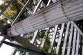
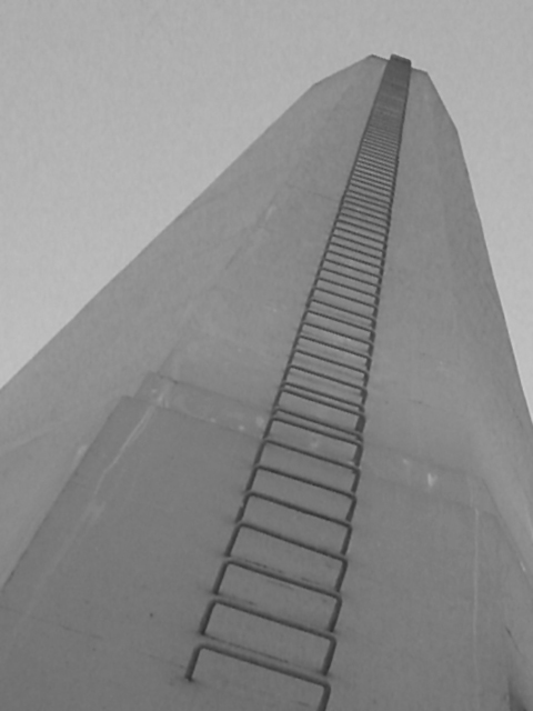
| The shot is cool, but it just seems so grainy and bland. I think the b/w is unnecessary. |
|
|
|
05/05/2002 12:11:00 PM |
| The picture seems really blotchy, and though I'm not sure what would cause that, it distracts me from the simplicity of the photograph. I really love the subject, though. If you cut just a little closer at the bottom, it would seem like the steps just went on forever. |
|
|
|
05/05/2002 11:05:00 AM |
| Sorry too cliché and dull !!! |
|
|
|
05/05/2002 09:01:00 AM |
| I persnally wouldn't have chosen B&W for this shot, as there is very little texture to either the sky or the tower/chimney. However, the overall bleak, industrial gloominess of the piece makes it work. |
|
|
|
05/04/2002 09:44:00 PM |
| the leaning tower of blah... |
|
|
|
05/03/2002 06:36:00 PM |
| Very up, but not terribly pleasing aesthetically... |
|
|
|
05/03/2002 02:10:00 PM |
| The composition is rather nice, but sort of unexciting |
|
|
|
05/03/2002 09:56:00 AM |
|
|
|
05/03/2002 12:26:00 AM |
| Good capture of height.Blurry & too plain--not interesting enough |
|
|
|
05/02/2002 07:46:00 PM |
| I dont know if you were intentionally going for that diffused color look, but it really detracts from an otherwise nicely composed photo. |
|
|
|
05/01/2002 08:08:00 PM |
| Why did you choose B&W? Nice shot. |
|
|
|
05/01/2002 04:28:00 PM |
| This picture meets the challenge, it is fromt the ground up. That being said the whole picture is out of focus, and there is no contrast everything is almost the same shade of grey. |
|
|
|
05/01/2002 02:24:00 PM |
| Good perspective, but short on detail. |
|
|
|
05/01/2002 12:54:00 PM |
|
|
|
05/01/2002 10:12:00 AM |
| Nice and simple, but too flat tonally, unsharp and noisy. |
|
|
|
05/01/2002 08:48:00 AM |
| is this the stairway to heaven :) |
|
|
|
04/30/2002 03:40:00 PM |
| Looks rather bleak. Is this the look you were going for? Nice perspective. |
|
|
|
04/30/2002 03:35:00 PM |
| nice angle and height but it just seems the tower is a bit dull |
|
|
|
04/30/2002 12:13:00 PM |
| Unfortunately, photo looks a little grainy. Also, while the ladder leads the viewer through the whole photo, which is nice, there's nothing else to hold the attention. |
|
|
|
04/30/2002 11:19:00 AM |
| Composed nicely, but the contrast is flat. I also find myself wishing for one additional visual element -- since I'm not sure what this is, I don't know what element I'd suggest -- just something to contrast all the perspective lines |
|
|
|
04/30/2002 01:57:00 AM |
| I would like to have seen a bit more contrast in this shot. |
|
|
|
04/30/2002 01:12:00 AM |
| Very interesting composition... somehow it reminds me of 1920s socialist propaganda, although I'm not sure why :). The ladder creates a sense of purpose, the converging lines and geometric shapes are interesting and somehow the lack of contrast works. I just think it's a bit dull though. |
|
|
|
04/29/2002 08:23:00 PM |
| Definately looking up! The contrast is a bit dull though. |
|
|
|
04/29/2002 03:35:00 PM |
| Overexpose & Out-Of-Focus (OOF).......... |
|
|
|
04/29/2002 03:32:00 PM |
| I dont think there is enough contrast to do this with black&white ... |
|
|
|
04/29/2002 12:46:00 PM |
| Good choice of using black and white, but I would have increased the contrast in post production. Nice angle |
|
|
|
04/29/2002 11:40:00 AM |
| very gray. lots of artifacts in the "sky". repetition of the ladder rungs is cool. other than that not great to look at. |
|
|
|
04/29/2002 10:53:00 AM |
| lacks good contrast in colors. |
|
|
|
04/29/2002 08:23:00 AM |
| grey, grey and more grey. Interesting study in monochrome, if that was what you were after. I'd personally like more light, maybe a rising/ setting sun casting strong shadows on the rungs ? If the sky's always that colour maybe you don't see the sun much... |
|
|
|
04/29/2002 07:28:00 AM |
| This is a good concept and I particularly like the tilt in this shot. I'm sure you will receive some comments the other way on that though... I think this shot woud be more impressive with some higher amount of contrast. In my opinion, there isn't enough contrast between this tower and the background. it would be really neat if someone was climbing the ladder. You probably ran into the same problem I had trying to get a similar shot. I bet this tower was fenced in and locked up! Good job... |
|
|
|
04/29/2002 07:27:00 AM |
| I would have added a little contrast I think. |
|
|
|
04/29/2002 01:56:00 AM |
| I like how the rungs cut throught he shot. Nice angle. |
|
Home -
Challenges -
Community -
League -
Photos -
Cameras -
Lenses -
Learn -
Prints! -
Help -
Terms of Use -
Privacy -
Top ^
DPChallenge, and website content and design, Copyright © 2001-2024 Challenging Technologies, LLC.
All digital photo copyrights belong to the photographers and may not be used without permission.
Current Server Time: 04/23/2024 02:24:03 PM EDT.