| Author | Thread |
|
|
04/30/2009 09:50:42 PM |
|
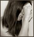
Comments Made During the Challenge  |
|
|
03/02/2003 10:18:47 PM |
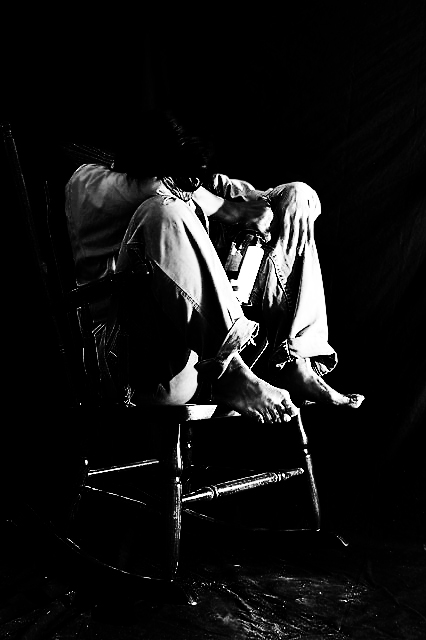
| Excelent! I as this was loading, I said "I hope he's not wearing any shoes. Then boom! No shoes. Great job. Very nice dramatic lighting and the angle and framing/cropping is excelent. Great despair shot. I would not change a thing. Simply beautiful. Good luck in the challenge. 10. |
|
|
|
03/02/2003 03:41:59 PM |
| nice subject but kind of hard to see... granulated, a little too dark. otherwise, an interesting photo. |
|
|
|
03/02/2003 02:23:15 PM |
|
|
|
02/27/2003 08:54:48 PM |
| this is a very strong photo.... good work.... |
|
|
|
02/27/2003 02:39:07 PM |
| nice photo, i really like the idea |
|
|
|
02/27/2003 02:17:32 PM |
| This is a very powerful image. The black and white colors make the subject seem very isolated and alone. I also like how the subject is barefoot, because it really helps the image stand out to be a moving one. |
|
|
|
02/27/2003 11:59:06 AM |
| excellent shot.. I love the contrast in this image.. great work :) - setzler |
|
|
|
02/27/2003 11:42:14 AM |
| Nice one. In a way it reminds me of one of those old James Dean photos. You did it well. I am not sure that it being too dark is a negative point actually. I like it that way. |
|
|
|
02/27/2003 10:13:19 AM |
| very nice iamge you did a good job, i like it...9 |
|
|
|
02/25/2003 01:58:15 AM |
| Seems too dark to me, I can hardly see the bottle at all. |
|
|
|
02/24/2003 07:21:07 PM |
| Too dark, and I understand that you intended this to communicate the theme, but your subject looks decapitated, and that's a different theme altogether. |
|
|
|
02/24/2003 10:51:53 AM |
| Contrast is a bit too strong. I can't make out the head (well, barely). The concept is great! |
|
|
|
02/24/2003 10:36:46 AM |
| A little too dark for my taste. It has meaning when associated with the word "despair" . Thanks for sharing it. |
|
|
|
02/24/2003 01:09:46 AM |
| The levels look a little funny... |
|
|
|
02/24/2003 12:38:43 AM |
| I like the shot and the contrast, but could be a bit dimmer.. the birght part is just a little too bright |
|
Home -
Challenges -
Community -
League -
Photos -
Cameras -
Lenses -
Learn -
Prints! -
Help -
Terms of Use -
Privacy -
Top ^
DPChallenge, and website content and design, Copyright © 2001-2024 Challenging Technologies, LLC.
All digital photo copyrights belong to the photographers and may not be used without permission.
Current Server Time: 04/25/2024 07:47:21 AM EDT.