| Author | Thread |
|
|
12/13/2004 12:12:37 AM |
| Ouch! Not a ribbon, but should have placed higher IMO. I gave it an 8. |
|
 Photographer found comment helpful. Photographer found comment helpful. |
Comments Made During the Challenge  |
|
|
12/12/2004 10:09:37 PM |
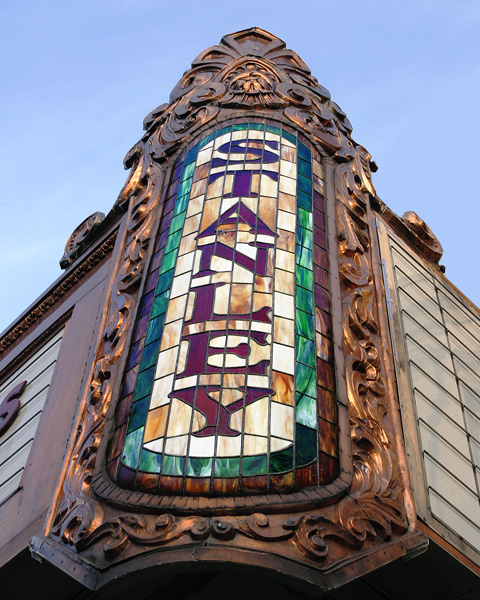
| Lucky it's not a 98-plex by now ... cool sign! |
|
| Photographer found comment helpful. |
|
|
12/12/2004 03:09:53 AM |
| detail colour and focus all great |
|
| Photographer found comment helpful. |
|
|
12/10/2004 07:43:48 PM |
| Your photograph seems to be slightly off center [bottom more to the left than the top]. I know we all talk about thirds but in this picture if feel as if 'STANLEY' would of been vertically in the middle given the picture an even flow outward would of been more apealing to the eye [imo]. However with that said I think you did a good job. I like the lighting, colors, shadows. As is [7] |
|
| Photographer found comment helpful. |
|
|
12/09/2004 02:19:44 PM |
| Woncerful subject, well exposed. Don't know if it is possible, but I think improvement would result from a more vertical (less leaning) composition. |
|
| Photographer found comment helpful. |
|
|
12/09/2004 11:40:59 AM |
| I guess that depends exactly how far east you're prepared to go, really. I can see the appeal of this light and tonality, which is well captured. I don't get the use of the odd angle, which seems neither a deliberate tilt nor an advantage. I like that you've tried a detail shot, rather than a dull full-on shot of as much of the building as you could get in ... but this seems oddly isolated. I think it's a composition thing: might you still have held the sign as your primary subject, but used the lines of the rest of the frontage, or rather 'some more' of the frontage, to bring the eye more strongly to that subject? |
|
| Photographer found comment helpful. |
|
|
12/09/2004 01:14:09 AM |
| The angle is a bit harsh because of the text you have to read. It's a little crooked too. |
|
| Photographer found comment helpful. |
|
|
12/07/2004 10:57:58 AM |
| Great photo! I've actually seen this on a tour I took. Beautiful inside too. |
|
| Photographer found comment helpful. |
|
|
12/06/2004 10:41:26 PM |
| I wish the "Stanley" was more verticle. Otherwise, I think it's a cool subject choice and like it alot. |
|
| Photographer found comment helpful. |
|
|
12/06/2004 09:24:14 PM |
| the off centerness of this is distracting for me, perhaps sliding a bit further over and making it align vertically would work better. |
|
| Photographer found comment helpful. |
|
|
12/06/2004 06:16:59 PM |
| A slight rotation is in order. Nice colors. |
|
| Photographer found comment helpful. |
Home -
Challenges -
Community -
League -
Photos -
Cameras -
Lenses -
Learn -
Prints! -
Help -
Terms of Use -
Privacy -
Top ^
DPChallenge, and website content and design, Copyright © 2001-2024 Challenging Technologies, LLC.
All digital photo copyrights belong to the photographers and may not be used without permission.
Current Server Time: 04/24/2024 03:00:04 AM EDT.