| Author | Thread |
Comments Made During the Challenge  |
|
|
02/02/2003 08:16:10 AM |
| Very interesting B&W. I really like the various angles in this shot. very effective. Good job. Jacko. |
|
|
|
02/01/2003 03:20:59 AM |
| Awesome shot. I would like to know how you got it to look like a pen and ink drawing. That solid black on the left is the only thing that bothers me. A great photo. Makes me think of superman. |
|
|
|
01/30/2003 02:41:40 PM |
| I really like ho you set up the blocks in this picture. I think that having the picture black and white helps create more intrest in the picture. I think this by also shooting on an angle helps create intrest. Good Work |
|
|
|
01/30/2003 02:23:19 PM |
| I like how there are a lot of different shapes involoved but the squares are still the main focus. |
|
|
|
01/30/2003 02:22:13 PM |
| I like how the lines in this photo make your eye travel through the photo. The contrast of black and white is very good. The way that the photo was taken gives the photo a since of depth. |
|
|
|
01/29/2003 02:12:26 PM |
| The pattern repetition is good. The concept is good. The fact that you can't see the end of the pile leads the observer to think the pile goes on forever. Good job on composition. Good contrast as well. Overall a good shot. |
|
|
|
01/28/2003 07:36:01 PM |
| It looks like someone drew it. I like the use of black and white. |
|
|
|
01/28/2003 06:48:01 PM |
| Wonderful shot. I like the sligthly chaotic order of the stones a lot. |
|
|
|
01/28/2003 05:20:54 PM |
|
|
|
01/28/2003 01:43:05 PM |
| Also a great texture shot. Good tones. |
|
|
|
01/27/2003 10:51:34 PM |
|
|
|
01/27/2003 09:01:25 PM |
| Interesting. I like the post processing. |
|
|
|
01/27/2003 07:38:43 PM |
| Good foucs, composition, and clarity.. Cub |
|
|
|
01/27/2003 04:50:05 PM |
| The "grainy" effect adds to the atmosphere of this photo. Almost looks like graphic art! |
|
|
|
01/27/2003 12:47:32 PM |
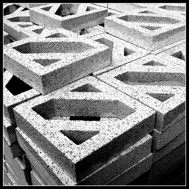
This is one of my favorite pictures for this week’s challenge. I like the use of contrast, line and texture in this picture. The composition is pleasing with the placement of the top blocks being offset the way they are. There are strong lines in the photograph that lead my eyes into the picture and keep them there. I particularly like the way you placed the block at the top of the frame perpendicular to the rest of the blocks. The texture of the concrete is really brought out by your choice of black and white. I can almost feel it. This photo almost looks like a charcoal drawing to me. I think it was well executed and the only suggestion I would make for improvement would be to eliminate the border. It is just my opinion, but I generally find them to be cheesy.
I hope you find this useful,
Greg
|
|
 Photographer found comment helpful. Photographer found comment helpful. |
|
|
01/27/2003 09:45:59 AM |
| Great detail and texture. Nice shot. |
|
Home -
Challenges -
Community -
League -
Photos -
Cameras -
Lenses -
Learn -
Prints! -
Help -
Terms of Use -
Privacy -
Top ^
DPChallenge, and website content and design, Copyright © 2001-2024 Challenging Technologies, LLC.
All digital photo copyrights belong to the photographers and may not be used without permission.
Current Server Time: 04/19/2024 10:20:29 PM EDT.