| Author | Thread |
|
|
01/31/2003 09:56:03 AM |
|
 Photographer found comment helpful. Photographer found comment helpful. |
|
|
01/30/2003 02:38:54 AM |
| You are so talented Khaled. You sure deserve more than that. I am proud to be your cousin. Randa |
|
| Photographer found comment helpful. |
|
|
01/29/2003 09:14:54 AM |
Since some asked about my toning, here it is, my trade secrets ;)...
In Photoshop:
1) Do a black and white conversion to taste using the Channel Mixer .. This can help you bring out elements that you want more contrast in your picture.
2) Open Hue/Saturation. CHeck the box which says 'Colorize'. This adds a tint to the black and white. Adjust the hue and the saturation of that to taste. i find backing off the saturation is a good idea, it makes the tint more subtle.
That's all there is to it! |
|
|
|
01/28/2003 01:50:30 PM |
~~~~Critique Club Comment~~~~
Congratulations Kollin! Your best score ever you said in the chat, frustratingly enough with a point and shoot and no preparation at all. Turns out it is a winner. :)
You have a very good eye. ;)
Would be cool to critique it and guess what happened when I hit the button....... But what to say about it? It looks almost perfect, I had to think about it for 36 hours to figure out what to say about it. And I still don't know, those portraits of yours were easier (and confirm the good eye). :)
Composition (content)
Good combination of subjects, they seem to strengthen each other. You have a corner sign and the corner of a building. Curves, circles and steps in/on both. The hoods on the lights could correspond with the pillars of the building.
The sign/lamppost is stylish and creates a timeless picture, like no time has passed since it was put there for all I know a century ago. The strenght of the building is that it doesn't break that spell. And it is further enhanced by your choice of toning, that reminds of old photo's and movies. Therefore it is very pleasing to look at.
The composition is very nice, because you show the cornersign, while the building creates the corner. The angle at which you shot both is great (also in combination with them entering the frame in the lower corners), it makes the angle of the lamppost meet the angle of the building somewhere, without looking distorted. The first thing you read is "New York" and then it leads you up up and away, hey I want to see more! :)
The building is nice too look at, in comparisson to other buildings, because it has a round corner. But the real strength of the round corner is the opposite shadows above every window, that is a very cool touch. Without that it would be a lot duller and perhaps even boring.
Background
I like it that the exposure of this hasn't blown out the sky completely. There is still a hint of clouds and tonal differences that are not created by filling in a blow out by using a blueish toning.
Camera Work (Technical)
Good job.
Digital Processing (technical)
Very cool toning, could you tell me what you did with it?
Good sharpness. Nice subtle frame.
Altough I can't see jpeg artifacts or quality degradation, there is still room for saving it at a higher quality.
My opinion
Favourite. :)
Message edited by author 2003-01-28 13:51:16. |
|
| Photographer found comment helpful. |
|
|
01/27/2003 06:29:02 PM |
Excellent in every way! Congratulations Kollin.
Now you've figured out how to do it, ... I could use a pointer or two.
|
|
|
|
01/27/2003 12:00:18 PM |
Great work Mag! I really like it! Something about your choice of colors really sells it. And the clarity is dead on. This is the type of photo you would see in my office... and I don't say that very often.
Congrats! |
|
|
|
01/27/2003 10:07:53 AM |
It's about time! Congratulations on a great photo, it was one of my favorites this week.
Dick |
|
|
|
01/27/2003 07:49:12 AM |
| Holy frick ! How did this happen??? There were many truly incredible shots in this challenge. I'm stunned, and I'll try not to let this happen again. LOL. |
|
|
|
01/27/2003 06:23:34 AM |
| Congrats man, great shot! |
|
|
|
01/27/2003 04:20:37 AM |
| mag---absolutely the best pic of the bunch--i am so proud of you! the tones, the composition, the framing, the angle--it couldnt be better--rock on! :) |
|
|
|
01/27/2003 02:35:19 AM |
| Congratulations on 1st Place! |
|
|
|
01/27/2003 02:09:34 AM |
| Excellent photo Kollin! Congrats!! |
|
|
|
01/27/2003 01:15:18 AM |
| Well done I am very glad this photo won |
|
|
|
01/27/2003 01:09:21 AM |
| Wooohooooo!!! 1st Place! Love the shot. I am sorry I didn't vote on this one. Didn't have time. I would have voted it a 10. I am going to go look at the ribbon on your profile page. hehe |
|
|
|
01/27/2003 12:51:05 AM |
|
|
|
01/27/2003 12:47:41 AM |
| Kollin!!! My My My!! Congrats! and double Congrats!!! Well deserved!!! Good for you my friend!!! :) |
|
|
|
01/27/2003 12:46:11 AM |
| I'm still liking it more the more I look at it! Congrats on 1st!!! |
|
|
|
01/27/2003 12:37:53 AM |
| congrats. i'm from dc but live in nyc now (obviously, just check out my photos). i know this street well. your photo is so simple but effective - which is always what the best photos turn out to be. i can't tell you that i thought at you would win, but actually i'm so happy that you did win because i think photos like this sometimes get passed up in the voting versus flashier/try-too-hard efforts. cheers, tomzinho |
|
|
|
01/27/2003 12:34:34 AM |
| Congratulations on 1st. Terrific photo! |
|
|
|
01/27/2003 12:29:00 AM |
| YES!!!!! Way to go Mag... so perfect, The contrast and focus is just perfect,.. Is about damn time!!! |
|
|
|
01/27/2003 12:23:22 AM |
| Congrats, a well-deserved win. One of my fav's this week! |
|
|
|
01/27/2003 12:19:02 AM |
| Yes!! Finally! My number one vote won first place! Way to go. It's a great photo!! Cub |
|
|
|
01/27/2003 12:17:21 AM |
| Congrates. Excellent shot well deserved. |
|
|
|
01/27/2003 12:11:44 AM |
| WTG Mag!! Wonderful shot. Impact and pefect focus. |
|
|
|
01/27/2003 12:11:18 AM |
|
|
|
01/27/2003 12:08:54 AM |
| Congrats on 1st place! Absolutely deserved! |
|
|
|
01/27/2003 12:07:59 AM |
| woohooo! Well deserved, congrats! |
|
|
|
01/27/2003 12:07:30 AM |
| Way to go Kollin. This is a great shot and a 10 any way you look at it! Its about damn time. Yep I grinning! |
|
|
|
01/27/2003 12:05:27 AM |
| Congrats Mag!!! This is some great work! |
|
|
|
01/27/2003 12:02:43 AM |
Great job Kollin!!! Congrats on a fantastic pic ...
Bob
|
|
|
|
01/27/2003 12:01:59 AM |
woooo hoooo congrats on a deserved win !!!! I'll be looking for my print in the mail ! hahaha
Really a great photo ! You nailed it perfectly ! |
|
Comments Made During the Challenge  |
|
|
01/26/2003 11:13:56 PM |
| great photo. I like the angle and I like the choice on black and white |
|
| Photographer found comment helpful. |
|
|
01/26/2003 09:16:09 PM |
| This is not exactly a black and white, more like light grey and dark grey, but I really like it. With the angle you shot the "road sign" I believe it speaks volumnes about New York: tall buildings and street light. All the techs are right in my opinion. This is a very well done composition with really good execution. Worhy of a 9. |
|
| Photographer found comment helpful. |
|
|
01/26/2003 08:45:05 PM |
| Great angle. I think that your border distracts a bit from the scene. jgillard7 |
|
| Photographer found comment helpful. |
|
|
01/26/2003 02:23:38 PM |
| strong composition with line. good cropping and contrast in value |
|
| Photographer found comment helpful. |
|
|
01/26/2003 04:31:53 AM |
| There's a nice tone to this shot and I like the viewpoint you chose, looking upward. The composition is excellent and you've made good use of the space available in the frame. |
|
| Photographer found comment helpful. |
|
|
01/26/2003 02:07:30 AM |
| Very nice! I love the angle and your choice of sign. The duotones works great here. Focus and exposure look dead on. Well done! |
|
| Photographer found comment helpful. |
|
|
01/25/2003 01:14:31 PM |
| Very nice composition. B&W works well here. Good use of border. The more I have looked at this, the more I like it. May be a bit too much contrast though as the details of the lamp post get a bit lost in the darkness. A very nice entry - good job! 8 md |
|
| Photographer found comment helpful. |
|
|
01/25/2003 11:46:35 AM |
| Very nice perspective. Clear and sharp throughout the DOF. |
|
| Photographer found comment helpful. |
|
|
01/25/2003 11:42:15 AM |
| My VERY favourite this week. The composition is just perfect. So is the clarity. B&w and the border is SO good too. Overall one of the best in months. Good luck! |
|
| Photographer found comment helpful. |
|
|
01/25/2003 10:14:51 AM |
| Great job! Crsply focused, nicely composed. |
|
| Photographer found comment helpful. |
|
|
01/24/2003 07:53:46 PM |
|
| Photographer found comment helpful. |
|
|
01/24/2003 05:01:05 PM |
| I simply love this shot. The black and white gives it an elegant look, and I love how the stop light and building draw the eyes up into the frame. |
|
| Photographer found comment helpful. |
|
|
01/24/2003 01:51:40 PM |
| I like the blue toning on this. Good angle too, with interesting elements in all areas of the photo. I gave this an 8, but am now boosting it to a 9! |
|
| Photographer found comment helpful. |
|
|
01/23/2003 07:21:04 PM |
Ooh, nice job! Cool! I want to know how you did this. . .
the blue/black pole is great, the white/black sign is great, and the building is great and then everything against that sky is marvelous! ! ! |
|
| Photographer found comment helpful. |
|
|
01/23/2003 05:46:23 PM |
| Great perspective shot..well composed and very sharp. |
|
| Photographer found comment helpful. |
|
|
01/23/2003 05:25:14 PM |
| I love the crisp metallic look of this image. Hard steel urbania mood. The dramatic edges among shadows and highlights are very appealing. The cloudless sky really adds to the starkness. The viewpoint is well chosen and adds to the towering looming metropolitan aura. Personally I would like a touch of space between the sign and tower. Otherwise this image has an awe inspiring modern age impact. Hope you receive many more positive remarks. Good work |
|
| Photographer found comment helpful. |
|
|
01/23/2003 03:48:12 PM |
| One. A big fat 1. You know why. Meanie. |
|
|
|
01/23/2003 10:57:42 AM |
| Excellent Work Here! Composition & color works great together. |
|
| Photographer found comment helpful. |
|
|
01/22/2003 09:31:38 PM |
| Really sharp focus. I like the angle. Nice picture. |
|
| Photographer found comment helpful. |
|
|
01/22/2003 07:12:54 PM |
|
| Photographer found comment helpful. |
|
|
01/22/2003 05:06:17 PM |
| Wow - such a vivid image. Black and white is a must for this image. The subtle grey line in the border is great and I love the contrast in this photo. The only thing I would have tried differently would be to move the sign slightly so that it didn't overlap the building - although it's hard for me to image what that would look like - perhaps it would destroy the towering effect. |
|
| Photographer found comment helpful. |
|
|
01/22/2003 11:45:28 AM |
| I love the strong composition on this photo... This is on my favorites list for this week.. The great composition and extreme depth of field, along with an excellent toning job make this an extremely strong shot... great work :) = 10 - setzler |
|
| Photographer found comment helpful. |
|
|
01/21/2003 10:44:25 PM |
| Great angle of photo shot, great contrast and composition and clarity. 9 |
|
| Photographer found comment helpful. |
|
|
01/21/2003 05:04:33 AM |
| Beautiful! Wonderful composition, nice angles. I love it. 10 from me. |
|
| Photographer found comment helpful. |
|
|
01/20/2003 11:33:07 PM |
great lines, good toning, a 'stand out' image and arresting
|
|
| Photographer found comment helpful. |
|
|
01/20/2003 10:54:56 PM |
| I realy like this photo. I think it's a great example of how less is more. It's simple, clean and gets it's point accross. I hope it does well. Good Luck. |
|
| Photographer found comment helpful. |
|
|
01/20/2003 10:34:57 PM |
| Nice use of B&W with the modern and antique looks combined. |
|
| Photographer found comment helpful. |
|
|
01/20/2003 07:25:34 PM |
| Really like your shot......good rich tones, color..focus. |
|
| Photographer found comment helpful. |
|
|
01/20/2003 04:29:20 PM |
| I have know advice for you. This is a great picture!!!! I LIke It |
|
| Photographer found comment helpful. |
|
|
01/20/2003 03:54:50 PM |
| I love the use of Black & White! |
|
| Photographer found comment helpful. |
|
|
01/20/2003 03:11:49 PM |
| This is a very cool perspective. I am tending to like the shots where the sign is the main subject, but here all the scenery really adds to make the effect. I love the upward angle, flow towards the top of the photo following the lines int he lamp post and the curve of the building. I really can't find much wrong with this shot, there is a shadow on the left side of the building, but hat isn't distracting at all. Mabey the street sign could be up just a tad, it is very low, but I would be afraid it would ruin the perspective. Great Job.9. |
|
| Photographer found comment helpful. |
|
|
01/20/2003 02:54:00 PM |
| Great job with the tint -- a very nicely done, sharp shot! |
|
| Photographer found comment helpful. |
|
|
01/20/2003 01:57:24 PM |
| This is photo i love, B+W works so well great focus and crop ---10 |
|
| Photographer found comment helpful. |
|
|
01/20/2003 12:20:13 PM |
| Yes, I could definitely hang this in my hallway. Very sharp. 10. Good luck. |
|
| Photographer found comment helpful. |
|
|
01/20/2003 11:49:27 AM |
| Great sharpness! This looks great in black and white! |
|
| Photographer found comment helpful. |
|
|
01/20/2003 10:21:23 AM |
| Great angle - nice B&W - love the photo!! |
|
| Photographer found comment helpful. |
|
|
01/20/2003 10:14:33 AM |
| Sharp stuff, and great tones. Love the composition! Not the real thing, though. ;-P That you? |
|
| Photographer found comment helpful. |
|
|
01/20/2003 02:55:14 AM |
| Beautiful shot!! Geez, I can surrender already!!! :-( You've got 10 from me!! cub |
|
| Photographer found comment helpful. |
|
|
01/20/2003 01:42:21 AM |
| One of my faves... nice use of duotone, excellent composition, and good sharpness and detail. 10 |
|
| Photographer found comment helpful. |
|
|
01/20/2003 01:20:36 AM |
| Lovely tonal qualities and composition. Feels like a piece of fine art. |
|
| Photographer found comment helpful. |
|
|
01/20/2003 12:53:58 AM |
| absolutely perfect--will comment more later! |
|
| Photographer found comment helpful. |
|
|
01/20/2003 12:33:00 AM |
| This is the most superb photo I've seen in a long time ! It's so very well done. It looks like something out of a major magazine. PERFECT 10 ! Good luck to you ! |
|
| Photographer found comment helpful. |


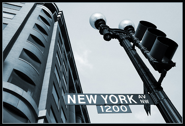
 Start Spreadin' the News