| Author | Thread |
|
|
04/09/2013 12:53:17 AM |
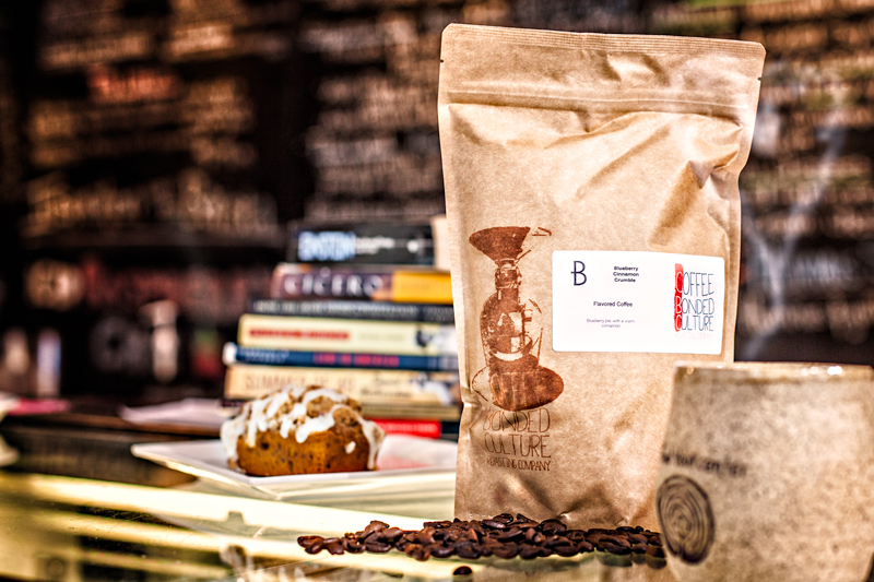
Too many distracting elements. You need to simplify a LOT or spread the attention. You have us looking at the beans but many other things are suitably sharp to look at.
I'm not saying this is particularly good, but I'd link some of the elements of espresso and coffee into the bag, which on its own isn't that interesting. Something like this- 
ETA: Also, you should ALWAYS make their company name very prominent. It's very subdued here, so... why is that an advertisement for them? Think of it like that... this is adspace.
Message edited by author 2013-04-09 00:53:59. |
|
 Photographer found comment helpful. Photographer found comment helpful. |
|
|
04/08/2013 06:43:34 PM |
| I like the composition you used. I would suggest cropping out the bottom right corned a little bit more to elimanate the black spot and see it you can get a litte more detail on the white label. I like the dof you used for the shot. |
|
| Photographer found comment helpful. |
Home -
Challenges -
Community -
League -
Photos -
Cameras -
Lenses -
Learn -
Prints! -
Help -
Terms of Use -
Privacy -
Top ^
DPChallenge, and website content and design, Copyright © 2001-2024 Challenging Technologies, LLC.
All digital photo copyrights belong to the photographers and may not be used without permission.
Current Server Time: 04/25/2024 07:57:32 AM EDT.