| Author | Thread |
|
|
03/15/2013 06:23:18 AM |
critique club
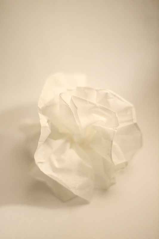
i don't like this image. the tungsten color cast isn't pleasing, the shadow on the right is attempting to capture my attention.
i admire the attempt at simplicity, it needs better lighting, too many competing elements take away from the what you are attempting to show based on your description.
|
|
 Photographer found comment helpful. Photographer found comment helpful. |
|
|
03/12/2013 01:39:08 AM |
|
| Photographer found comment helpful. |
Comments Made During the Challenge  |
|
|
03/10/2013 08:33:23 PM |
|
| Photographer found comment helpful. |
|
|
03/10/2013 05:46:23 PM |
| This looks yellow to me not white! I do like the simplicity of your photo. |
|
| Photographer found comment helpful. |
|
|
03/07/2013 01:06:12 PM |
| Try overexposing by one stop to get the background lighter |
|
| Photographer found comment helpful. |
|
|
03/06/2013 06:02:58 PM |
| Has a vintage feel to it! Wish the rose was formed a little better..since my initial impression was a crumpled piece of paper :) |
|
| Photographer found comment helpful. |
|
|
03/04/2013 09:58:55 PM |
| I suspect the brownish color will decrease the scores. I'll be interested in any description of how this was made. |
|
| Photographer found comment helpful. |
|
|
03/04/2013 03:07:05 PM |
| well. your white balance was seriously off, and the exposure isn't as good as could be hoped, along with the fact that your subject is brighter than the background. Sorry, I really feel bad giving you a 3, but this is just miles away from excellence. |
|
| Photographer found comment helpful. |
Home -
Challenges -
Community -
League -
Photos -
Cameras -
Lenses -
Learn -
Prints! -
Help -
Terms of Use -
Privacy -
Top ^
DPChallenge, and website content and design, Copyright © 2001-2024 Challenging Technologies, LLC.
All digital photo copyrights belong to the photographers and may not be used without permission.
Current Server Time: 04/17/2024 07:17:55 PM EDT.