| Author | Thread |
|
|
05/06/2010 06:57:10 PM · #1 |
Hey all
I am using PS CS2 and up until recently, my in-camera settings were sRGB. Then I switched them over to Adobe RGB.
After all if I am working with an Adobe product, why not keep things consistent and keep everything Adobe RGB?
However I now have to deal with the embedded colour profile. Options are to use the embedded profile, or discard the embedded profile or the option I have been using, telling it to convert the document's colours to the working space.
So first of all, should I be using sRGB or Adobe? And if I should be using Adobe RGB, where in PS CS2 do I find the magic thingy that changes the default so I don't have to do it manually every time I upload a pic to PS?
Any help greatly appreciated. |
|
|
|
05/06/2010 07:23:49 PM · #2 |
I believe the setting for that is under edit>color settings... there is something that lets you choose anyway.
I also have everything set to Adobe RGB instead of sRGB in my camera as well as PP tools... web uses sRGB I think. But I to am interested in which to use and why?
Message edited by author 2010-05-06 19:25:55. |
|
|
|
05/06/2010 08:25:05 PM · #3 |
| The bottom line is, if you don't understand color management, and it is a *very* complicated subject, you are *far* better off keeping everything in sRGB. You will have far fewer problems. Adobe RGB is a somewhat larger color space, but your monitor cannot display it all anyhow. |
|
|
|
05/06/2010 08:29:41 PM · #4 |
Your camera should be set to sRGB if you shoot jpeg.
eta
Here's a good article about colour space.
Message edited by author 2010-05-07 09:13:31. |
|
|
|
05/06/2010 08:53:53 PM · #5 |
So, here is a very short, basic, description of color space.
To describe color, you need some type of mathematical model Computers "see" color not based on how we perceive it, but how it fits into the model.
sRGB and AdobeRGB are similar, but are represented differently in the model.
AdobeRGB has more "colors" in it, meaning it is closer to what we see in nature, but not exact. sRGB is smaller, yet, still comprises most of the colors we see in nature.
The monitor you are reading this on is capable of displaying certain colors, essentially those in the sRGB colorspace. This is because of the limitations to electronically reproduce color.
So, a photo you have taken which consists of colors from nature, must be displayed within a smaller space, or the colorspaces of sRGB, AdobeRGB, etc.
When your computer and monitor display a particular color from nature and translates that to the light you see, if the translation is not within the colorspace, then it will find the nearest color to it and display that instead.
Since AdobeRGB is wider than sRGB, and your monitor (web) only shows sRGB, then the color representation in AdobeRGB is not what you would expect to see. Note: Newer LCD models claim they can view a wider range of colors than older ones.
So, always shoot, or convert to sRGB before uploading to the web.
So, why does AdobeRGB and others exist? The simple answer is to allow you to edit those colors for other output applications such as print, which can display a wider gamut. Also, working in the AdobeRGB or wider spaces allows you to avoid color clipping.
What is color clipping? Color clipping occurs when the computer can't display the color due to a smaller color space, so it picks the nearest color. If you shoot in RAW mode, you have the widest options available to you. Sometimes, extreme color ranges, reds, oranges, yellows become clipped and get washed out. If you work from RAW in a wide space, you'll actually be able to manually move the colors into the smaller region in a way that renders the image properly, instead of letting the computer do it.
For example, in this image:

The oranges were pushed quite far out of the sRGB colorspace. Because I was entering it into a challenge, and not printing, I needed to convert it properly. So, I worked in ProPhotoRGB (even wider than AdobeRGB) in order to render the colors, tones, contrast, the way I liked it. Then, I converted to sRGB for display here.
To give you an idea, consider this plot:
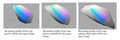
It compares what my monitor will see (and thus what I will see) to the three difference colorspaces I have mentioned.
sRGB (smallest) < AdobeRGB < ProPhotoRGB (widest)
My monitor matches sRGB the best. If I rendered a photo in AdobeRGB or ProPhotoRGB, those colors outside of the gray area would not look proper.
So, in summary:
1) Always use sRGB for web
2) Always use sRGB for most photo printing applications, unless told not to
3) Use AdobeRGB, or wider, to work with wide gamut images to manually convert to sRGB
Although this is long, it is only the basis for the science of color replication. |
|
|
|
05/06/2010 09:35:23 PM · #6 |
Wow,  PGerst, thanks for the detailed explanation! You even answered any further questions in advance. Thank you! PGerst, thanks for the detailed explanation! You even answered any further questions in advance. Thank you!
Susan |
|
|
|
05/06/2010 10:44:57 PM · #7 |
| Any time. Feel free to PM me if you'd like more info. |
|
|
|
05/06/2010 10:48:41 PM · #8 |
So if I shoot in raw and almost never print I should definitely have my PP software profile set to sRGB and it doesn't matter what my camera is set to?
Thanks for the great explanation BTW! |
|
|
|
05/06/2010 10:58:38 PM · #9 |
Originally posted by tehben:
So if I shoot in raw and almost never print I should definitely have my PP software profile set to sRGB and it doesn't matter what my camera is set to? |
Pretty much so. There may be an argument to be made for using a larger color space on images that are really pushing the limits, and then converting for web viewing, but it's complicated and the gains may be illusory.
R.
|
|
|
|
05/06/2010 11:23:11 PM · #10 |
No problem.
If you are shooting RAW, then the color space shouldn't matter as you will pick this on the fly.
The problem occurs when you pick a color space and are shooting JPG. You are relying on the camera processor to map everything appropriately.
I recently added "I will always shoot RAW" to my front page, as my reminder to turn the camera to RAW. I had forgotten recently when I was taking photos of my daughter's ballet class. Photos are fine, but the color correction is a little harder. Plus, I lost a few spots to highlights that I normally would have been able to recover.
Originally posted by tehben:
So if I shoot in raw and almost never print I should definitely have my PP software profile set to sRGB and it doesn't matter what my camera is set to?
Thanks for the great explanation BTW! |
|
|
|
|
05/07/2010 07:00:07 AM · #11 |
As I understand it, "print" (CMYK?) is a smaller color space than sRGB.
Originally posted by PGerst:
...to allow you to edit those colors for other output applications such as print, which can display a wider gamut. |
Message edited by author 2010-05-07 07:02:48. |
|
|
|
05/07/2010 07:23:51 AM · #12 |
Yes.
Originally posted by Olyuzi:
As I understand it, "print" (CMYK?) is a smaller color space than sRGB.
|
|
|
|
|
05/07/2010 07:47:23 AM · #13 |
So then why use a wider gamut color space than sRGB if print won't be able to accommodate the larger selection of colors?
Originally posted by PGerst:
Yes.
Originally posted by Olyuzi:
As I understand it, "print" (CMYK?) is a smaller color space than sRGB.
|
|
|
|
|
|
05/07/2010 08:43:23 AM · #14 |
Because electronic displays and printed material are completely different. You'll still have a wider range on screen than you will on print. This gets into a completely different topic in regards to soft proofing for print.
Originally posted by Olyuzi:
So then why use a wider gamut color space than sRGB if print won't be able to accommodate the larger selection of colors?
|
|
|
|
|
05/07/2010 04:30:53 PM · #15 |
I would VERY much like to thank  snaffles for this post, and to pgerst for the insight. I had NO idea the differences between the spaces, and if it had not been for this post, I certainly wouldn't have checked my computers or my PS settings.... snaffles for this post, and to pgerst for the insight. I had NO idea the differences between the spaces, and if it had not been for this post, I certainly wouldn't have checked my computers or my PS settings....
Long and short of it....
I have a 13" Macbook and a 27" iMac that I regularly go between using CS5. So, my MB was set to Adobe RGB and the CS5 on there was set to render images for a person who is red/green colour blind. (Face in hands) Don't ask me how this happened.....
My brand new iMac (about 3 days old now) was set to ProPhoto and CS5 on there was set to Adobe RGB.
SO......I want to send out a sincere apology to anyone that received a comment from me stating that their colours looked "off"! LOL
Now, I have everything set (and screens calibrated) to sRGB and what a difference!!!!
If it hadn't been for this post, I would most certainly still be as lost!
Thanks again |
|
|
|
05/07/2010 06:05:50 PM · #16 |
| Everyone's writing double-spaced today I think. :) |
|
|
|
05/07/2010 06:10:32 PM · #17 |
*scuffing at ground* Aww goshdurnit, no need to thank me...thank Ryan, Magnumphotography, he's the one who's always bugging me to read the manual and learn all the submenus an' stuff! :-)
ETA: glockguy, you can go change your comment now...no, that uhmmm err animal is NOT purple! lol!
Message edited by author 2010-05-07 18:13:21. |
|
|
|
05/07/2010 06:41:46 PM · #18 |
| Ok, let me ask the silly question. I get the idea of the different color spaces. That seem pretty fundamental. However, if the display is not capable of rendering the wider color spaces, how can one edit the image and deal with the wider ranges of colors? In other words, how do you deal with what you can not see? |
|
|
|
05/07/2010 07:00:46 PM · #19 |
My take on the situ is how the monitor renders colours that are not part of the native colour space.
It seems that changes things immensely.
|
|
|
|
05/07/2010 07:33:15 PM · #20 |
Its not a silly question. Look at it this way. Lets say you bought 2 monitors, one very cheap, with very small contrast range and one real good one with a very wide contrast range.
The wide one will show the very small differences in shades better than the cheap one. Yet, if you were to work on the image on the cheap monitor, you'd be able to compensate to a point.
Same difference with the color spaces. Though, if you are using a wide color space, you won't get an "out of gamut" error. You may not be able to accurately perceive the color, but you know it is there.
Also consider that there are far many more colors and tones than our eye can see. Colors in the IR or UV range for example. Technically speaking, these colors could be rendered, mapped, and printed. Whether or not we can see them is another story.
In fact, color is perceptual in most cases anyway. How someone who is color blind sees things is different than a non color blind person.
Its pretty much all the same. You can get technical in many ways, but it comes down to these simple comparisons at the end.
Anything more than that is beyond my experience and comfort level to talk about, since I do absolutely no printing outside of sRGB color space.
Originally posted by ambaker:
Ok, let me ask the silly question. I get the idea of the different color spaces. That seem pretty fundamental. However, if the display is not capable of rendering the wider color spaces, how can one edit the image and deal with the wider ranges of colors? In other words, how do you deal with what you can not see? |
|
|
|
|
05/07/2010 08:08:16 PM · #21 |
Originally posted by ambaker:
Ok, let me ask the silly question. I get the idea of the different color spaces. That seem pretty fundamental. However, if the display is not capable of rendering the wider color spaces, how can one edit the image and deal with the wider ranges of colors? In other words, how do you deal with what you can not see? |
One of the keys is to learn to use Photoshop's Info window (a.k.a "online densitomiter"). Position the cursor over various colors and see what numbers come up ... I have the most experience preparing photos for print reproduction, so I set the Info options to display the Grayscale and CMYK ink densities. This instantly lets me know if the color under the cursor can be accurately reproduced in print (i.e. is in or "out of gamut" as previously mentioned).
When I started using Photoshop there were no "calibrated" monitors (or digital cameras), and we were taught to "never trust what you see on the monitor" but to only go by what "the numbers" in the Info window said would be the final output.
I've especially had to rely on this method since I'm one of the 10% or so of males with some form of color-blindness (a form of "red-green" defect in my case). (see this recent thread for more discusstion of this issue.)
At least in prepping photos for the Internet, or inkjets or true photo printers, you don't need to deal with "dot gain" or the color shifts caused by the physical spread of the ink on paper in the offset printing process. The photo as displayed on the monitor would usually need to look kind of flat and washed-out in order to print properly. :-(
FWIW I've only ever had cameras which shoot JPEG or TIFF (I've never gotten the hack which let's my Canon shoot RAW to work), so I've always been working in the sRGB color space, and never use printer profiles, and most of the time my output (mostly from Noritsu printers on Fuji paper) looks like what I expect. |
|
Home -
Challenges -
Community -
League -
Photos -
Cameras -
Lenses -
Learn -
Prints! -
Help -
Terms of Use -
Privacy -
Top ^
DPChallenge, and website content and design, Copyright © 2001-2024 Challenging Technologies, LLC.
All digital photo copyrights belong to the photographers and may not be used without permission.
Current Server Time: 04/19/2024 08:12:29 PM EDT.


