| Author | Thread |
|
|
10/24/2012 09:10:48 AM · #1 |

My entry in Princess Bride Quotes received:
1's - 7
2's - 7
3's - 8
There were 3 comments, 2 positive, and 1 I didn't understand (BTW - what does:
]
\
mean?)
Anyhow, I'm trying to figure out why so many folks (22 or over 17%) felt this shot was 3 or lower. Input! I need input! (Johnny 5 - Short Circuit)
|
|
|
|
10/24/2012 09:26:55 AM · #2 |
| I didn't get round to viewing or voting on the challenge so didn't give you a score myself but i'd imagine for a lot of people the image is not photographic in nature enough. It may be a photograph but it is more graphic design/illustration in nature. |
|
|
|
10/24/2012 09:34:58 AM · #3 |
Originally posted by rooum:
I didn't get round to viewing or voting on the challenge so didn't give you a score myself but i'd imagine for a lot of people the image is not photographic in nature enough. It may be a photograph but it is more graphic design/illustration in nature. |
This is what I saw in it as well. |
|
|
|
10/24/2012 09:39:56 AM · #4 |
+1
Originally posted by giantmike:
Originally posted by rooum:
I didn't get round to viewing or voting on the challenge so didn't give you a score myself but i'd imagine for a lot of people the image is not photographic in nature enough. It may be a photograph but it is more graphic design/illustration in nature. |
and +1
This is what I saw in it as well. |
|
|
|
|
10/24/2012 10:34:23 AM · #5 |
| i enjoyed the concept, but simply having someone's hand holding this, and cutting out the superfluous white paper around the "parchment" would have boosted this from "picture of a print out" to "holding the to do list in the movie" and really increased the score. |
|
|
|
10/24/2012 10:46:16 AM · #6 |
| I like the concept, but what you have just isn't much of a photograph |
|
|
|
10/24/2012 11:07:55 AM · #7 |
I was one of your 2s.
It is not really photographic in any way,and is of zero interest.
I think I was very generous now you mention it. |
|
|
|
10/24/2012 11:09:24 AM · #8 |
I actually gave you an 8 for that mate. The reason being that I really enjoyed the relevance of the quote and you linked it in. It may have been a simple idea... but it appealed to me on first glance, and then again on second review after an hour or so. Whenever that happens... I know I like the photo!
That being said, I do agree with the other posters that it's less photography, more graphic design. |
|
|
|
10/24/2012 11:19:23 AM · #9 |
| The fact you can see it's a printout on plain paper detracts from the effect. It'd had been better to cut around the 'parchment' to give it jagged edges, and then crinkle it up and have someone hold it for the shot. |
|
|
|
10/24/2012 11:25:00 AM · #10 |
I gave it a 7 for relevance mostly. Otherwise, it just seemed like a picture of artwork. I agree with others -- even having a hand holding it, or a knife stuck through it attaching it to a table, or something other than just a piece of paper would have made a huge difference in the score.
|
|
|
|
10/24/2012 11:54:43 AM · #11 |
| Didn't get to this one for some reason, but first I just want to say I appreciate your out of the box thinking, and that I can tell some thought went into this. A set up shot, regardless of how simple it is, takes time and planning. So the pluses on this is that the lighting is even, the artifact itself is creative and well made, and perfectly relevant to the challenge. Also, a good choice of title as it adds to the humor. The down side are what others have mentioned. In and of itself it is not interesting enough without some form of human touch. |
|
|
|
10/24/2012 04:56:01 PM · #12 |
I feel kind-of stupid, now that you-all point out the obvious. But, it wasn't obvious to me. Guess that what happens when you have a left-brained geek trying to do right-brained creativity. Loses a bit of something in the translation.
Anywho, thanks to you all. The one thing I (sort-of) appreciate about dpc - the others won't let you get away with anything...
|
|
|
|
10/24/2012 06:44:34 PM · #13 |
| I didn't vote in this challenge. I like the light and the way the paper looks. But isn't it just a quote from The Princess Bride? To me it was like taking a picture of a quote, for the challenge that asked for interpretation of a quote. That's just my thoughts though. |
|
|
|
10/24/2012 07:54:32 PM · #14 |
Originally posted by dtremain:
I feel kind-of stupid, now that you-all point out the obvious. But, it wasn't obvious to me. Guess that what happens when you have a left-brained geek trying to do right-brained creativity. Loses a bit of something in the translation.
Anywho, thanks to you all. The one thing I (sort-of) appreciate about dpc - the others won't let you get away with anything... |
No, don't feel stupid at all. I really can see where you are coming from. Forget about the left brain/right brain stuff. That's nonsense. Like i said, i didn't vote on your entry because i didn't vote on the challenge but that's not to say i didn't like it. I like the textures in your image and i do like the idea of graphic design. I'm reminded of the stuff i used to do at university in the late 90's. I used to love getting various textures and combining them with text. Sometimes i'd use song lyrics or make up my own, and just scan in loads of materials or photos or whatever. Take photos of walls, or metal or tree bark, scan in ripped up bits of wallpaper or found bits of rubbish in the street. I'd scan it in and add the text, which was another whole level of fun and creativity.
So, what i'm saying is. Don't throw that idea away. Its a good idea if you enjoyed doing it. I certainly did and i'm sure i will do again. |
|
|
|
10/24/2012 10:24:22 PM · #15 |
I was one of your higher scores and I also left a comment.
I guess different photos touch different people in different ways.
When I saw your shot I felt it was an image in my head that I didn't know I had.
Sounds crazy but thats how I felt and I liked it.
I still like it and if we voted again I would vote it high again. |
|
|
|
10/24/2012 11:16:37 PM · #16 |
| I can see what others are saying. I gave it a 6 because I thought it fit the challenge and it was clear you thought about it. :-) and I just liked it. I can see others points of view too though. That's the thing about the votes and scores here. You have to take them with a grain of salt... :-) mostly helpful but in the end just people's own opinions and thoughts. |
|
|
|
10/25/2012 12:37:52 AM · #17 |
| Looking back, you photographed a quote. Way too literal for DPC! ;) |
|
|
|
10/25/2012 03:26:46 AM · #18 |
| Had it been pinned to an old oak table with a dagger and a candlestick a roaring harth in the back ground an Irish wolfhound lay on the straw floor you might have had a chance as it was you could have submitted it without even using your camera. Not good on a photo site. |
|
|
|
10/25/2012 07:54:35 AM · #19 |
Originally posted by Giles_uk:
Had it been pinned to an old oak table with a dagger ... |
I agree an element of dynamism would have helped ... I've used a similar idea for some earlier challenges ... 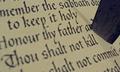 
|
|
Home -
Challenges -
Community -
League -
Photos -
Cameras -
Lenses -
Learn -
Prints! -
Help -
Terms of Use -
Privacy -
Top ^
DPChallenge, and website content and design, Copyright © 2001-2024 Challenging Technologies, LLC.
All digital photo copyrights belong to the photographers and may not be used without permission.
Current Server Time: 04/19/2024 12:44:39 PM EDT.


