| Author | Thread |
|
|
08/22/2012 02:04:43 PM · #1 |
By posting this I hope I don't get the label of being a sore loser. I must first say that I am ecstatic at my new personal best score, below, but I was totally convinced it was a ribbon contender after seeing it at 7.2 @ 20 votes in. I guess I had my hopes set way too high.
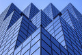
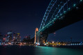
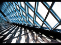
Mine (#12):

Getting down to specifics, I find my image to be very similar to (and if I may be so bold as to say more dramatic than) the #5 image:
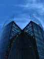
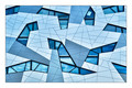
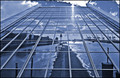
#5:
So I'd like any honest feedback here. What did the #5 image have that mine lacked? Was my image just too simplistic? Did it need more 'interest'?
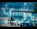
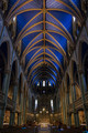
For that matter... this image fits into this discussion too at #15:
#15:

To be honest, I would expect either #15 or mine to be higher placed than #5.
Would love to hear people's thoughts, as all three images were very similar. What set #5 apart?
Message edited by author 2012-08-22 14:05:10. |
|
|
|
08/22/2012 02:11:47 PM · #2 |
| I'm not in the least surprised at the placements, except to the extent that I'd have expected Penny's image to finish ahead of yours; yours is the most simplistic of the three in terms of form, and requires less engagement from the viewer. Complexity is good in this sort of shot. Warping of masses, not so good. The 5th-place shot has a purity to it that's very appealing to me, and apparently to others. |
|
|
|
08/22/2012 02:18:34 PM · #3 |
I don't think the DPC voters like that much flare/glare, even with the nice double-ray effect on the windows. In any event, it still finished way ahead of mine, at 53rd ...
 |
|
|
|
08/22/2012 02:23:42 PM · #4 |
Originally posted by JamesDowning:
Would love to hear people's thoughts, as all three images were very similar. What set #5 apart? |
- perfect symmetry
- the blues got a little darker on the right facing panels as the building got taller
- the blues got a little lighter on the left facing panels from right to left.
- many facets and angles creating lots to look at
Yours was simply a building with clouds in the sky. That's my take on it.
edit - I should add I voted them all pretty average for the reason Minso brought up, kind of boring.
Message edited by author 2012-08-22 14:36:05. |
|
|
|
08/22/2012 02:32:45 PM · #5 |
They are all pretty boring to me. Just shots of buildings and the sky. None were scored low since they were technically good shots but out of the 3 I liked Penny's best just for the lines and flow. The others seemed like shots I had seen many times.
Interestingly enough I had my scores backwards to the placement lol. Penny's and yours both scored higher from me then the 5th place shot. It's not bad but it's not really different. Perhaps this is why I rarely score highly. |
|
|
|
08/22/2012 02:46:09 PM · #6 |
| i do not care for the 5th place one at all, and probably would have given it a 5 during voting. yours is much better; very dynamic, great tones, lighting, and composition. i would have given it a 7 or an 8. |
|
|
|
08/22/2012 02:54:36 PM · #7 |
This is cool! I'm flattered to see some discussion on my photo, positive or negative.
 JamesDowning, like I commented in voting, I personally really liked your photo. It had great drama, and great 'thirds' composition. When I was shooting mine, I knew the symmetry would be appealing, but I really wish I had more dramatic lighting. I even wanted to go back and reshoot with a different sky/sun position, but couldn't find the time. Although, as it stood, I still liked the patterns of the dark and light blues with opposing symmetry. JamesDowning, like I commented in voting, I personally really liked your photo. It had great drama, and great 'thirds' composition. When I was shooting mine, I knew the symmetry would be appealing, but I really wish I had more dramatic lighting. I even wanted to go back and reshoot with a different sky/sun position, but couldn't find the time. Although, as it stood, I still liked the patterns of the dark and light blues with opposing symmetry.
I suppose I owe the extra 0.3 points to the architect for giving me some additional angles to work with.
Thanks for the kind votes everyone.
|
|
|
|
08/22/2012 03:08:18 PM · #8 |
James, I gave a 7 to both yours and the #15 image. The 5th place HM only pulled a 6 from me. I happen to like strong perspectives, so I think that was the reason they appealed to me more.
|
|
|
|
08/22/2012 03:14:42 PM · #9 |
of the 3 you posted, yours is by far the best image
but that's just my opinion, and obviously the voters don't agree with us :) |
|
|
|
08/22/2012 03:17:04 PM · #10 |
Originally posted by EntertainMe:
This is cool! I'm flattered to see some discussion on my photo, positive or negative.
JamesDowning, like I commented in voting, I personally really liked your photo. It had great drama, and great 'thirds' composition. When I was shooting mine, I knew the symmetry would be appealing, but I really wish I had more dramatic lighting. I even wanted to go back and reshoot with a different sky/sun position, but couldn't find the time. Although, as it stood, I still liked the patterns of the dark and light blues with opposing symmetry.
I suppose I owe the extra 0.3 points to the architect for giving me some additional angles to work with.
Thanks for the kind votes everyone. |
I enjoyed yours Peter, but I think the flat lighting, plain sky, and the fact that the 'steps' didn't perfectly align threw me, personally. If you had taken like two steps back and aligned the architecture in the vertical plane better, I think I could have agreed with the placement.
Again, not trying to be a sore loser, I just like open and honest discussion. |
|
|
|
08/22/2012 03:20:45 PM · #11 |
Originally posted by Venser:
Originally posted by JamesDowning:
Would love to hear people's thoughts, as all three images were very similar. What set #5 apart? |
- perfect symmetry |
Would symmetry make mine any better? I wasn't convinced, as that was my first approach to my building, but it seemed too blah (probably a big difference between the two buildings, considering mine was just a glass cube). But I intentionally tried to align the left diagonal of my building with the top right and bottom left corners. So there was a "method" to the orientation. |
|
|
|
08/22/2012 03:22:35 PM · #12 |
| I liked your lack of symmetry, I think that made it at least a bit more interesting personally. |
|
|
|
08/22/2012 03:24:48 PM · #13 |
Originally posted by JamesDowning:
Would symmetry make mine any better? I wasn't convinced, as that was my first approach to my building, but it seemed too blah (probably a big difference between the two buildings, considering mine was just a glass cube). But I intentionally tried to align the left diagonal of my building with the top right and bottom left corners. So there was a "method" to the orientation. |
To be frank, I don't know. I scored all three just above my average. It's one of those things I would have to see because I don't look at the picture in solidarity, but as one entry in a collection.
For reference, here were my top two.
  |
|
|
|
08/22/2012 03:40:55 PM · #14 |
|
|
|
08/22/2012 04:42:14 PM · #15 |
Originally posted by Venser:
Originally posted by JamesDowning:
Would symmetry make mine any better? I wasn't convinced, as that was my first approach to my building, but it seemed too blah (probably a big difference between the two buildings, considering mine was just a glass cube). But I intentionally tried to align the left diagonal of my building with the top right and bottom left corners. So there was a "method" to the orientation. |
To be frank, I don't know. I scored all three just above my average. It's one of those things I would have to see because I don't look at the picture in solidarity, but as one entry in a collection.
For reference, here were my top two.
|
Those were my two favorites as well. |
|
|
|
08/22/2012 07:28:23 PM · #16 |

My two highest scores (both 8s).. I posted the Frank Gehry building because it's blue and I was pretty sure DPC would score it okay. Don't get me wrong, I like my entry (and I love Frank Gehry), and it worked for me even though the sky (light) wasn't ideal due to rain ... but I would have been more proud of the score had it been for something more than just somebody else's building. |
|
|
|
08/22/2012 07:43:48 PM · #17 |
Upon reflection (no pun intended) - I thought this image was a top three for sure
//www.dpchallenge.com/image.php?IMAGE_ID=1029147
Curiously, the commenters generally scored the challenge images 1.5 to 2 points higher than the participants in the challenge. I don't think I've ever noticed that before.
Anyway, I thought the overall imagery was terrific and was very impressed with almost everybody - well, there were one or two exceptions which kind of baffled me but then I'm easily confused. |
|
|
|
08/22/2012 09:53:10 PM · #18 |
I voted these as a 6... 7... and 6.
The middle one, to me, was more dramatic and "in your face".
6 is my starting vote.
On yours, in particular, it seems that the blue architecture was not the subject, as much as the bursts overwhelmed it. I think that's because of the darkness of the building in the foreground. If that part had been brighter... I think it would have scored more highly.
Message edited by author 2012-08-22 21:55:11. |
|
|
|
08/22/2012 10:07:00 PM · #19 |
| When you reference the 'bursts', are you talking about the halo effect from the haze, or what appears to be "star bursts" coming from the halo on the building? If you were referencing the starbursts, do you realize that the bursts are actually an affect of the alignment of window vertices and not a standard diffraction type starburst? That's actually something I didn't realize until I was editing the shot. |
|
|
|
08/22/2012 10:17:36 PM · #20 |
I'm saying that the eye is always drawn to the lightest part of an image. So that, coupled with the even darker foreground at the base of the building (which is where the lines lead), makes the eye jump back up to the light spots, making it about the light spots and not about the building.
And the building, in this challenge, was what it was supposed to be about.
I've fallen prey to this same "error" many times. Good image. Wrong challenge.
If it were an Effects challenge, it might have scored more highly.
|
|
|
|
08/22/2012 10:23:42 PM · #21 |
| Good points! Some basic photographic knowledge there that is easily forgotten. Maybe I should have inverted the colors! Hmm. |
|
|
|
08/22/2012 10:44:54 PM · #22 |
Remember, though, I'm only one of your 129 voters. :D
It's just what I saw and think. |
|
|
|
08/22/2012 11:34:53 PM · #23 |
James,
The first time round on viewing the photos in the challenge I stopped at yours and thought "WOW" but I often do that, and I tend to vote the 2nd time around, and I see a totally new picture come to mind. The photo's that wowed me the first time around, don't seem to as much the 2nd time, so I vote according to what it looks like the 2nd time around.
I didn't get that "WOW" moment the 2nd time around, and couldn't work out why I didn't like it anymore, I guess it just came across a little boring, just another tall building surrounded by clouds, and it was the clouds I enjoyed seeing more than the building, but b/c the challenge was about the architecture I was basing my score on that.
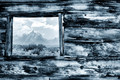
I also tend to find pic's of buildings a bit boring unless they are artisically done, hence this is why my fave photo was this one . I also liked Tiny's shot  but think it could of been improved maybe by cropping it tight, looking front on and capturing say two windows, the building had character, and that's what I look for in architecture, the more character the more it interests me! but think it could of been improved maybe by cropping it tight, looking front on and capturing say two windows, the building had character, and that's what I look for in architecture, the more character the more it interests me!
Message edited by author 2012-08-22 23:36:45. |
|
|
|
08/23/2012 12:04:56 AM · #24 |
I appreciate the input guys. Trying to digest it all.
And to be clear, the blue wall and stairway was my personal top pick too. |
|
|
|
08/23/2012 02:43:16 AM · #25 |
HERE WERE MY TOP EIGHT RE THE  SHERPET JEWEL AWARDS SHERPET JEWEL AWARDS
IN NO PARTICULAR ORDER... FROM SHEZ
 - Rhapsody in Blue by JustFred - - Rhapsody in Blue by JustFred - 
 - Fibonacci's Stairwell by giantmike - - Fibonacci's Stairwell by giantmike -
 - Blue Arches by - Blue Arches by  missxmisery - missxmisery -
- Complete the Square by  EntertainMe - EntertainMe -
 - Connections by MichaelC - - Connections by MichaelC -
 - Grid Iron by roba - - Grid Iron by roba -
 - Cunningham Cabin -- circa 1885 by vawendy - - Cunningham Cabin -- circa 1885 by vawendy -
 - The boat shed by Neat - - The boat shed by Neat -
I AM SO MOVED FOR ALL THE EIGHT ENTRIES FOR THIS CHALLENGE AND FEEL THEY ALL DESERVE IT AS THEY ALL TOUCHED MY HEART A LOT...
|
|
Home -
Challenges -
Community -
League -
Photos -
Cameras -
Lenses -
Learn -
Prints! -
Help -
Terms of Use -
Privacy -
Top ^
DPChallenge, and website content and design, Copyright © 2001-2024 Challenging Technologies, LLC.
All digital photo copyrights belong to the photographers and may not be used without permission.
Current Server Time: 04/23/2024 09:47:48 PM EDT.


 - Connections by
  - Grid Iron by
  - Cunningham Cabin -- circa 1885 by
  - The boat shed by