| Author | Thread |
|
|
12/30/2011 04:59:41 AM · #1 |
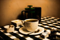
got 6 nice comments and really thankful for them, but i'd like some negative ones please.
maybe the 1x1 why did you hate it so?
2 x3's or 9x4's might like to say why it didnt do it for them, i thought it would around about here and i liked it, just like some negative feedback please
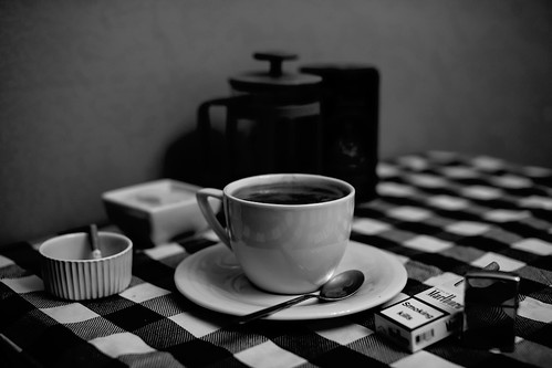
b/w alternative here
IMG_2329 by gilesbert, on Flickr |
|
|
|
12/30/2011 05:11:06 AM · #2 |
I gave it a 5. Whilst a nice enough shot i felt it was just too much of a cliche to hold much interest for me. I prefer your black and white conversion slightly though- the sepia was a bit overpowering.
|
|
|
|
12/30/2011 05:26:23 AM · #3 |
see its hard to tell which way to do it, i took it as things that go well together from the description
Description
Like a hammer and nails, the world is full of things that just seem to be a "couple" and go well together. Creatively compose and then photograph two things that "go together".
so i picked a few classic combinations and this was the one i had in my head, the other two ideas i had but didnt have time to shoot were "man and woman" black and white over head shot of couple spooning in bed white sheets etc
or rum and coke, icy dewy coke filled glass with dof enabling rum and coke bottles to be out of focus but still distinct, id drank all the run though doh!
i guessed its hard to not be trite or cliched when looking for classic combimations, i was the only one to do this in this challenge and i didnt see one in the few id looked through on the previous challenge.
on the others you can see the caffeterie and the jar of harrods coffee maybe i should have left more detail in? |
|
|
|
12/30/2011 05:44:15 AM · #4 |
Yes, i can see your point there and i do think your photo fits the challenge perfectly so no problems with that. Everyone has their own voting criteria of course and i tend to be one of those voters for whom challenge relevence is less important. 5 gets there with that. 6+ are for those images that trancend the challenge topic or technical issues andnmove into photographs i engage with on a different level. Also, bear in mind that i don't think much of the challenge topic anyway.
Message edited by author 2011-12-30 05:45:31. |
|
|
|
12/30/2011 06:38:26 AM · #5 |
I didn't vote on the challenge but the main thing that strikes me is that coffee and cigarettes only really go together for people who smoke, for anyone who doesn't it's probably DNMC.. It is a nice image though and I quite like the sepia too ;)
|
|
|
|
12/30/2011 07:45:10 AM · #6 |
I voted this a five. My main 2 gripes:
* To me, it's too crowded with objects. Interestingly, the B&W version doesn't seem to show that problem.
* Not in a million years would I have thought of these two things going together. |
|
|
|
12/30/2011 08:07:09 AM · #7 |
would you not think coffee and cigarettes?
im not a smoker but i know these two go together and as i say in description mood came from the same titled film, this is a european breakfast hehe and from teh vast majority of films ive seen an american tradition as well hehe
i thought some of the others were weird choices teh cancer and petrochemical industry one to name a few hehe.
it was a toss up between the two but preferred the warmer tone to highlight the warmth of the coffee
i wanted steam from teh coffee and smoke from the cigarette, but my heating had come on before i got home so house was warm. lots of room for improvement :) |
|
|
|
12/30/2011 08:14:52 AM · #8 |
| Coffee & Cigarettes definitely go together. Jim Jarmusch even made an entire film around the pairing. Shot in grainy black and white i might add. |
|
|
|
12/30/2011 08:25:11 AM · #9 |
| The concept has potential, but the composition is awkward. The layout doesn't present as though I've walked in on someones coffee and smoke, left handed cup with the ashtray on the same side, everything in a line at the front, big empty space behind. So, it's missing the human participation aspect. |
|
|
|
12/30/2011 08:53:14 AM · #10 |
Even if you don't smoke or drink coffee they still can go together for the fact that both of them contain an addictive substance. Caffeine and Nicotine.
I don't smoke either but I know many people who do both.
Honestly I gave it a 7 and I scored lower for those who picked the equivalent of "Peanut butter and jelly", where it was evident no imagination went into it. And before anyone rants about how we should score soley on photography, look at those who scored low on this shot because they couldn't correlate the "togetherness" of the two...
Message edited by author 2011-12-30 09:36:56. |
|
|
|
12/30/2011 09:25:50 AM · #11 |
| I gave it a seven as well, I particularly liked the reflection on the cup- that was technically really well done. The general feel of the grayscale and high contrast yellowed shot are equally nice; perhaps a more simple composition, the dark coffee pot in the back is ok, but perhaps there is too much clutter. Overall a pretty nice feel to the shot. |
|
|
|
12/30/2011 11:05:02 AM · #12 |
Didn't vote, but here is my two cents, FWIW. First, I most definitely prefer the B&W over the faux-sepia, but that might change if you followed the advice from another commenter and desaturated the image before adding the sepia. The touch of green is very off-putting in the sepia version.
I agree with other commenters that the image is generally too cluttered, but I think a lot of that could be cured by simply moving the press pot into the upper-right of the frame. (Maybe also ditch one or both of the two items on the lower-left. Especially with the pattern of the tablecloth, the image is just too heavily weighted to the lower-left of the image and with everything so closely clustered together it is hard to isolate any of the individual elements. The eye gets lost and ends up slipping off the frame to the left.
Good idea, but needs to be cleaned up in execution.
Cheers. |
|
|
|
12/30/2011 11:27:28 AM · #13 |
| I looked thru the challenge but didn't get motivated to vote. I like it that you are asking for critical comments, I often want to do that but lack the courage. "D So, here are mine. I think you should re-shoot it some morning from real life when you look at these same objects & suddenly the light, the arrangement, & the mood all seem to have a unique togetherness that speaks to you. What I find lacking in this is emotional truth, a criticism I have of almost every shot in that challenge. Your objects look lined up for their photoshoot much the same way people are grouped up for a snapshot portrait. Technically, object-arranging is an art in itself, not only to take advantage of the light & DOF & reflections, but to take advantage of their differing attractions to one another. Just for one example, I can't tell if the person having this European Breakfast is right-handed or left, & I want to know something about the person who's not in this day-in-the-life shot. Then in the sepia version, the DOF & contrast created glowing blobs of light on the tablecloth that pull focus from the subjects. My preference is for the BW version because for me the sepia has too much gold in it. For the the combination of coffee/cigarettes is more natural than some of the combinations I saw in that challenge. Keep on clickin'! |
|
|
|
12/30/2011 12:41:25 PM · #14 |
| The two main issues for me are composition and light, both of which have been pointed out several times on this thread. The lighting is too even and too murky for me, and the objects are just clumped in the center. There's no room to savor each piece, nor do they express any relationship to each other, much less of the person about to enjoy them. |
|
|
|
12/30/2011 12:47:20 PM · #15 |
| I voted the image a 7, but agree that the placement of objects seemed crowded. I'm thinking shooting from a higher angle could have helped, or maybe a more neutral tablecloth (I think I mentioned this in my comment). Some fill light to remove the "close shadows" and directional light to produce more interesting shapes could also have helped. |
|
Home -
Challenges -
Community -
League -
Photos -
Cameras -
Lenses -
Learn -
Prints! -
Help -
Terms of Use -
Privacy -
Top ^
DPChallenge, and website content and design, Copyright © 2001-2024 Challenging Technologies, LLC.
All digital photo copyrights belong to the photographers and may not be used without permission.
Current Server Time: 04/18/2024 04:28:22 AM EDT.


