| Author | Thread |
|
|
06/08/2010 07:45:16 AM · #1 |
Achieved my lowest percentage score in the recent FS with this shot.
I now realise that the fire was a fairly emotional event for me as well as the local residents and I probably see more in the pic than others.
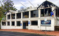
I seemed to fail in conveying the impact and wonder what I could have done to improve the shot and rate better in the challenge.
Failing any suggestions is it really just a dud shot???
Message edited by author 2010-06-08 07:59:47. |
|
|
|
06/08/2010 08:10:26 AM · #2 |
| You have created a very good documentary shot of the after effects of the fire. There's nothing really technically wrong with the photo. I would suggest doing a little more study of the subject. Try diferent points of view to see what appears more exciting. You got a good angle as shot. It is not straight on which adds some interest, but it looks like you were standing holding the camera at eye level which is a pretty standard and rather boring POV. Also, it is a rather static image. There is nothing that suggest movement, no real leading lines to the subject, like I said pretty much a standard documentary shot. |
|
|
|
06/08/2010 08:19:45 AM · #3 |
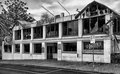
I was one of your sixes, as I thought it told an interesting story. I do wonder if a different perspective could have helped, maybe without getting the road in it, or a tighter crop to see more of the damage (and less of the in-tact area). Also, this type of shot seems to call for B&W, to bring out the details of the broken glass and soot stained areas.
Message edited by author 2010-06-08 08:20:34. |
|
|
|
06/08/2010 08:22:27 AM · #4 |
To be brutally honest it is just a snap shot not a photograph. Sure in 10-40 years time people interested in the local history they will love the shot.
At a first glance it looks like you were walking by and just too a shot at first angle you saw it from. The street sign is a distraction as is the chromatic aberration in the pine tree on the left. The building looks just like any other you might walk by so it in the frame by its self is not very interesting.
There is not too much to work with here so I would take a walk about the place try different angles and heights then either wait for some good light or work on the smaller details. By this I mean things like the VB sign, the pub sign, broken glass, the out door ash trays or the security camera.
Another idea would be to get the owner down there (or some one that worked there) and take a portrait shot with the building in the back ground for some emotional impact.
Some times mono works better with the reportage shots. Also something to keep in mind is that just about every one that sees this shot has never heard of the Isle of weight so like you said we don't have the emotional ties.
Just did a quick web search on Photojournalism tips and came across this which might be useful in the future.
I would not worry to much about this one shot as some of your other work is great.
Message edited by author 2010-06-08 08:24:48. |
|
|
|
06/08/2010 08:28:29 AM · #5 |
If you would have stood at more of an angle to the front of the building cropping (in camera) out the left side up to the Isle sign and including more of the fire damage on the right side, would have added more impact. Oblique angles add interest and impact. (after posting I see some others beat me to it.)
Message edited by author 2010-06-08 09:40:47. |
|
|
|
06/08/2010 08:37:19 AM · #6 |
I would of shot later in the day, and certainly have opted for B&W.
Having the owner of the building in the foreground, on his knees, looking at a slightly singed framed B&W picture of his dad who built the hotel with his bear hands, crying - whilst holding his head up to the heavens and asking
"WHY GOD??? WHY?????"
would of got a 6 from me then. |
|
|
|
06/08/2010 08:56:48 AM · #7 |
Originally posted by Simms:
Having the owner of the building in the foreground, on his knees, looking at a slightly singed framed B&W picture of his dad who built the hotel with his bear hands, crying - whilst holding his head up to the heavens and asking
"WHY GOD??? WHY?????"
would of got a 6 from me then. |
Brutal, man, brutal. |
|
|
|
06/08/2010 09:00:28 AM · #8 |
| I agree with the others, it was a fairly plain snapshot, though a good one. It got a 5 from me. From the perspective and treatment, it just came across as "this is a burned building". The impact of what this place may have meant to people did not carry across to me. |
|
|
|
06/08/2010 10:27:56 AM · #9 |
| For me, there is no emotion here, simply documentation. Evening or early morning might have added some drama. |
|
|
|
06/08/2010 07:30:54 PM · #10 |
Entered
 Should have entered (doh!) Should have entered (doh!)
Just did a quick desaturate and a Topaz adjust.
I can see the difference most of you suggested and am kicking myself for not thinking of it before I entered.
Thanks for the eveyone's input. Hopefully I won't be making the same mistake again soon.
I forgot to mention the entire site had a 6 feet high barricade around it, due to an arson investigation, and I had to hold the camera up above it to get the shot. That made getting a better angle a little difficult.
Message edited by author 2010-06-08 19:36:19. |
|
|
|
06/08/2010 07:46:31 PM · #11 |
Originally posted by bcenu:
Entered
Should have entered (doh!)
Just did a quick desaturate and a Topaz adjust.
I can see the difference most of you suggested and am kicking myself for not thinking of it before I entered.
Thanks for the eveyone's input. Hopefully I won't be making the same mistake again soon.
I forgot to mention the entire site had a 6 feet high barricade around it, due to an arson investigation, and I had to hold the camera up above it to get the shot. That made getting a better angle a little difficult. |
much, much better in black and white. The color version really doesn't show the damage well. The black & white draws your eyes to the damage.
|
|
|
|
06/08/2010 09:42:29 PM · #12 |
Originally posted by bcenu:
I forgot to mention the entire site had a 6 feet high barricade around it, due to an arson investigation, and I had to hold the camera up above it to get the shot. That made getting a better angle a little difficult. |
Limitations like that are often the case. I've frequently not gotten the best shot due to something like that. Not like the knowledge changes anything.
Message edited by author 2010-06-08 21:42:43. |
|
Home -
Challenges -
Community -
League -
Photos -
Cameras -
Lenses -
Learn -
Prints! -
Help -
Terms of Use -
Privacy -
Top ^
DPChallenge, and website content and design, Copyright © 2001-2024 Challenging Technologies, LLC.
All digital photo copyrights belong to the photographers and may not be used without permission.
Current Server Time: 04/16/2024 12:41:17 PM EDT.


