| Author | Thread |
|
|
05/03/2010 11:11:51 AM · #26 |
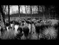
The 'border police' gave me a ticket on my B&W Landscape entry. They caught me doing an over the top black border in a 'lay it on lightly to allow the details to speak' zone.
They were right giving me the ticket - I needed one!
Here is my entry:
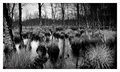
Here are a couple of other options that I didn't even consider until I got the first rightfully given comment....
Simple White:
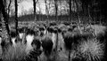
White Letterbox:

None:
Message edited by author 2010-05-03 11:25:46. |
|
|
|
05/03/2010 11:13:35 AM · #27 |
Originally posted by Bear_Music:
n/m |
I wish I'd seen what you wrote.
My opinion is that the irony of starting a thread about how 'vociferous' voting keeps a person from using other kinds of borders, and then proceeding to slag on one certain type of border (whether it's voted down or not) is quite delicious.
Mmm. Delicious irony.
|
|
|
|
05/03/2010 11:21:33 AM · #28 |
Originally posted by K10DGuy:
Originally posted by Bear_Music:
n/m |
I wish I'd seen what you wrote. |
It was an ill-advised joke about "stupid" & "pretentious", not directed at anyone in particular, which Penny saw and told me might easily be misunderstood in context, so I removed it. It was of no import whatsoever :-)
R. |
|
|
|
05/03/2010 11:22:41 AM · #29 |
Originally posted by Bear_Music:
Originally posted by K10DGuy:
Originally posted by Bear_Music:
n/m |
I wish I'd seen what you wrote. |
It was an ill-advised joke about "stupid" & "pretentious", not directed at anyone in particular, which Penny saw and told me might easily be misunderstood in context, so I removed it. It was of no import whatsoever :-)
R. |
Hehe. Aight.
|
|
|
|
05/03/2010 11:36:26 AM · #30 |
Originally posted by bassbone:
The 'border police' gave me a ticket on my B&W Landscape entry. They caught me doing an over the top black border in a 'lay it on lightly to allow the details to speak' zone.
They were right giving me the ticket - I needed one!
|
Somewhat, but they could have given you a warning instead. :-)
I like the letterbox on this versus how the image looks without a border at all, and the aspect ratio of the photo alone almost mandates a letterbox for presentation. The white is "ok", but I think the black would have worked better with just a one pixel medium to dark grey line between the photo and the letterbox border. |
|
|
|
05/03/2010 11:43:11 AM · #31 |
Originally posted by glad2badad:
Originally posted by bassbone:
The 'border police' gave me a ticket on my B&W Landscape entry. They caught me doing an over the top black border in a 'lay it on lightly to allow the details to speak' zone.
They were right giving me the ticket - I needed one!
|
Somewhat, but they could have given you a warning instead. :-)
I like the letterbox on this versus how the image looks without a border at all, and the aspect ratio of the photo alone almost mandates a letterbox for presentation. The white is "ok", but I think the black would have worked better with just a one pixel medium to dark grey line between the photo and the letterbox border. |
Have you ever considered working on the 'border patrol?' ;-)

That one pixel of grey seems to have really done the trick in my book...
|
|
|
|
05/03/2010 12:00:17 PM · #32 |
Originally posted by bassbone:
Originally posted by glad2badad:
Originally posted by bassbone:
The 'border police' gave me a ticket on my B&W Landscape entry. They caught me doing an over the top black border in a 'lay it on lightly to allow the details to speak' zone.
They were right giving me the ticket - I needed one!
|
Somewhat, but they could have given you a warning instead. :-)
I like the letterbox on this versus how the image looks without a border at all, and the aspect ratio of the photo alone almost mandates a letterbox for presentation. The white is "ok", but I think the black would have worked better with just a one pixel medium to dark grey line between the photo and the letterbox border. |
Have you ever considered working on the 'border patrol?' ;-)
That one pixel of grey seems to have really done the trick in my book... |
I'd also knock off 15-20 pixels on each border, slim it down just slightly.
|
|
|
|
05/03/2010 12:00:38 PM · #33 |
I disagree, I think the way you entered is best, it helps pop the detail and contrast that gets lost on the DPC gray background. But the one you just added with the gray pixel seperation, looks even better!
Originally posted by bassbone:
...They were right giving me the ticket - I needed one!... |
Message edited by author 2010-05-03 12:01:32. |
|
|
|
05/03/2010 12:03:23 PM · #34 |
Originally posted by K10DGuy:
I'd also knock off 15-20 pixels on each border, slim it down just slightly. |
I think you are right about knocking off a bit of black - but I posted this version to show how one pixel of grey on each side would make a world of difference. One of those things to remember for next time.... |
|
|
|
05/03/2010 12:10:25 PM · #35 |
Originally posted by bassbone:
Originally posted by K10DGuy:
I'd also knock off 15-20 pixels on each border, slim it down just slightly. |
I think you are right about knocking off a bit of black - but I posted this version to show how one pixel of grey on each side would make a world of difference. One of those things to remember for next time.... |
Yup.
As an aside, and not directed to you personally Bassbone:
Letterbox borders, like everything else in photography, have a place. Sometimes they work, sometimes they don't. Some people love them, others don't.
Same goes with 1 pixel uniform borders, borders with multiple frames, and fancy clip-art borders (which aren't allowed here, but you see them a lot elsewhere).
To each their own.
"border police" are no different than "waterdrop police", or "flower police" or "children police" or "stupid seascapes police" (oh wait, that might just be me ;D). Take it as you will, roll with the punches, whine in the score threads, go do a few comments of your own, and then leave everyone else the hell alone. lol.
If you think something is pretentious and stupid, that's far within your right. Lots of things I find pretentious and stupid. I just find it a little head-scratching to call something specific, pretentious and stupid, while at the same time trying to get people to stop being, well, pretentious and stupid.
|
|
|
|
05/03/2010 12:19:00 PM · #36 |
Originally posted by bassbone:
Have you ever considered working on the 'border patrol?' ;-)
That one pixel of grey seems to have really done the trick in my book... |
Hey, I'm glad that worked out! As for the 'border patrol' I'll have to pass...don't they wear funny uniforms? :-) |
|
|
|
05/03/2010 12:28:48 PM · #37 |
Originally posted by bassbone:
Originally posted by K10DGuy:
I'd also knock off 15-20 pixels on each border, slim it down just slightly. |
I think you are right about knocking off a bit of black - but I posted this version to show how one pixel of grey on each side would make a world of difference. One of those things to remember for next time.... |
It's exactly what I would have recommended; whenever I do letterbox, I include the inline and it makes a difference.
R. |
|
|
|
05/03/2010 12:37:30 PM · #38 |
Originally posted by Bear_Music:
Originally posted by bassbone:
Originally posted by K10DGuy:
I'd also knock off 15-20 pixels on each border, slim it down just slightly. |
I think you are right about knocking off a bit of black - but I posted this version to show how one pixel of grey on each side would make a world of difference. One of those things to remember for next time.... |
It's exactly what I would have recommended; whenever I do letterbox, I include the inline and it makes a difference.
R. |
The color of the inline can make a big difference also. For example, in this case a white inline would have stood out too much (white is frequently used, that's why I mention it). I've actually used a very dark grey that by itself you would think it's black, but put next to black it's just enough to create that separation. |
|
|
|
05/03/2010 12:40:32 PM · #39 |
I don't understand why there was a problem with this tasteful and understated border.
 |
|
|
|
05/03/2010 12:43:57 PM · #40 |
Originally posted by K10DGuy:
"border police" are no different than "waterdrop police", or "flower police" or "children police" or "stupid seascapes police" (oh wait, that might just be me ;D). |
I feel dissed, you left out "JPEG compression police".

|
|
|
|
05/03/2010 12:45:42 PM · #41 |
Originally posted by Yo_Spiff:
Originally posted by K10DGuy:
"border police" are no different than "waterdrop police", or "flower police" or "children police" or "stupid seascapes police" (oh wait, that might just be me ;D). |
I feel dissed, you left out "JPEG compression police".
|
hahaha. Sorry.
|
|
|
|
05/03/2010 01:31:37 PM · #42 |
Originally posted by glad2badad:
Yep - I'd call that moaning. :-) |
Call it whatever you want.....you've got your mind made up. It was an opinion and an observation. You want to take it as a slur, I can't stop you, but it doesn't matter one whit as long as I don't consider it part of the image. I vote based on meeting the challenge, and the image quality, and its abiklity to convey its message to me. Borders really don't affect that for me.
My whole premise was that there is a whole segment of the voters that go stone rabid over one type of border, yet don't seem to care about another.
That's it, that was my only point.....I was just wondering why.
|
|
|
|
05/09/2010 08:45:03 AM · #43 |
So, what about borders that are used as a special effect like the optical illusion created by this border...

Yes, shallow dof creates some 3d feel, but this shot uses a border selectively to trick the viewer into a perception that the subject is actually poking out of it. I'm not sure if it violates the letter of the current rules, but imho it violates the spirit of non-expert dpc rules and I don't think this sort of special effect should be allowed. (yes, I would have submitted it to be checked for a rules violation, but I have been too busy to be on dpc much lately & didn't see it until today)
If it does violate a rule, perhaps it's this one:
You may not...
"use ANY editing tool to move, remove or duplicate any element of your photograph that would change a typical viewer�s description of the photograph (aside from color or crop), even if the tool is otherwise legal, and regardless of whether you intended the change when the photograph was taken."
I am curious if this was challenged and if it is indeed legal to use borders in this way under advanced editing rules.
Message edited by author 2010-05-09 08:46:15. |
|
|
|
05/09/2010 11:19:11 AM · #44 |
Originally posted by JMart:
I am curious if this was challenged and if it is indeed legal to use borders in this way under advanced editing rules. |
There have been numerous examples of knocked out borders before this, so I assume it's been ruled legal. The technique is used fairly often with "inlines", borders that are set some distance in from the edge of the image.
R.
|
|
|
|
05/18/2010 12:48:05 PM · #45 |
nvm. I found the answer to my question.
Message edited by author 2010-05-18 13:29:11. |
|
|
|
05/18/2010 02:04:35 PM · #46 |
Here's a legal way of doing a frame behind the subject, even in basic editing :)
 |
|
Home -
Challenges -
Community -
League -
Photos -
Cameras -
Lenses -
Learn -
Prints! -
Help -
Terms of Use -
Privacy -
Top ^
DPChallenge, and website content and design, Copyright © 2001-2024 Challenging Technologies, LLC.
All digital photo copyrights belong to the photographers and may not be used without permission.
Current Server Time: 04/24/2024 06:36:44 PM EDT.


