| Author | Thread |
|
|
03/26/2008 01:38:20 PM · #1 |
It seems no matter what I do, I cannot place very well in the challenges. Her are some examples. Please, tell me what my shots are lacking.
Fences II: 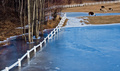
Place: 70 out of 248
Avg (all users): 5.6711
Avg (commenters): 7.5000
Avg (camera): 5.6486
Avg (no camera): 7.3333
Blurry Mess: 
Place: 147 out of 290
Avg (all users): 5.1282
Avg (commenters): 6.5000
Avg (camera): 5.1322
Avg (no camera): 5.0000
Peek-a-Boo: 
Place: 48 out of 130
Avg (all users): 5.6437
Avg (commenters): 5.8182
Avg (camera): 5.6416
Avg (no camera): 6.0000
Pet Portrait III: 
Place: 76 out of 258
Avg (all users): 5.9581
Avg (commenters): 6.8182
Avg (camera): 5.9673
Avg (no camera): 4.0000
I stopped entering for a bit once already thinking I needed to just quit trying. I don't enter as many challenges any more, just the ones that really interest me. I still am frustrated by it all. I don't get it. While I know my shots may not have been as good as the top finishers, I really felt they should have placed ahead of some others in the running. I'm not trying to be w hiner, just looking for some help here. |
|
|
|
03/26/2008 01:43:47 PM · #2 |
| I've been similarly frustrated by some images that I felt were better than the vote they got. I will be happy to have a closer look at yours this evening when I have some time to mull over them. |
|
|
|
03/26/2008 01:46:46 PM · #3 |
It happens man lol. I thought that my blurry mess

as well as a couple others were better than the second and third place finishes but I placed like 70th. It just happens. You have to stop worrying about your score and just enter for fun. Honestly most winners only score a 7.2 anyways. |
|
|
|
03/26/2008 01:49:50 PM · #4 |
I don't think individual photo critiques are going to help much. Every challenge is different. You've ribboned before and scored over a 7 a couple of times, so I'd say you're obviously capable of doing well here. I think perhaps it's time to start being more critical of your own work. If you see a small imperfection in your image - everyone is going to see it, too - do not submit it.
Study the winning images. Tack sharp images do well. Saturated colors do well here. Non-complicated images to do well here ... etc, etc.
Remember it's a game as not to drive yourself crazy ... but play hard. Put the time in, learn some new photoshop techniques, stuff like that.
Message edited by author 2008-03-26 13:50:07. |
|
|
|
03/26/2008 01:50:25 PM · #5 |
| Well, I asked to try and get some constructive help here - not to compare failures or be told not to worry about it. I do enter for the fun of it, but would have more fun if I didn't get rated so low all the time. Especially when I enter a shot I believe is going to do very well. |
|
|
|
03/26/2008 01:57:47 PM · #6 |
I'll take "Peek-a-pup" as an example. This is an opinion, based on criteria I've observed for winning shots, not necessarily what I personally think of your pictures.
The subject is probably the first thing that garnered the large number of mid-range votes of 5. Cute pet photos probably do best only in subject-related challenges, such as Pet Portrait. Consider that your other shot of the pup in Pet Portrait III had more sixes than fives, probably for this reason.
There's nothing particularly engaging about Peek-a-pup, even though the dog is very cute, and acting in a cute way. For example, nothing has separated this picture from the large number of pet snaps that exist on Flickr, DPC, or many other websites.
Focus on the little guy's nose is sharper than on his eyes. If his eyes were lit well, or had interesting catchlights making his eyes look very big, maybe the photo would connect with more people. As it is, his dark eyes are almost lost in his dark fur.
The similarity of colour between the "backdrop" and the floor create a very unidimensional quality to this photograph, making it somewhat bland.
Overall, the picture lacks sharpness. It's a little soft.
It might have been improved by the following:
Ensure the image is tack-sharp. Let's see the individual strands of fur, or some detail that engages the viewer. I love blur and soft focus as an intentional effect, but for this style of photo, I consider sharpness essential. Check  yanko's cat portraits for an example. yanko's cat portraits for an example.
There are basically two colours here: grey and purple. Mix it up in your backgrounds, floor, add a red ribbon to your pet, etc. Add something interesting to the frame.
The framing/cropping itself is not very interesting, and should engage the viewer. Had we seen more of his environment, perhaps with the dog more to right-of-frame, it might have been more of an interesting view.
|
|
|
|
03/26/2008 02:00:17 PM · #7 |
Okay so looked at your images and here are my thoughts.
FENCES II
A tighter crop would have helped it. The lama is just a distraction the fence and trees with the frozen surface are really cool like honestly I've never ever seen that in nature. The focus should have been just that area.
BLURRY MESS
Your blurry mess just didn't have any wow factor. Kind of like my personal fence II submission "cool but didn't hold my interest and stand out"
PEEKABOO
The dog is cute but hes too dark. the eyes are the window to a soul and you cant really make them out very well in that picture.
These are just some quick thoughts. Overall your shots are great but those are the things that I notice about those that probally limited your scores. |
|
|
|
03/26/2008 02:02:32 PM · #8 |
Originally posted by ShutterPug:
It seems no matter what I do, I cannot place very well in the challenges. Her are some examples. Please, tell me what my shots are lacking. |
Fences II:
Although a visually pleasing photo with nice colors, for the challenge the fence doesn't seem prominent enough as the subject. Perhaps a lower perspective to get the fence to appear larger - would lose some of the view appeal, but gain in subject to scene ratio.
Blurry Mess:
As far as being blurry, it fits the challenge. However, there is little to capture the attention. It is easily recognizable as feathers, doesn't hurt it really, but there is nothing particularly captivating with the image. A little flat.
Peek-a-Boo:
I didn't vote or view this particular challenge, so just based on this image, for the challenge it looks a bit too posed and really just like a cute portrait of a pet. if there was some sort of action associated with the pose it may have helped. As it looks, to me, it is very static so the element of 'peek-a-boo' is missing.
Pet Portrait III:
I see a few problems with this image. First, the subject appears soft. With just the dog it may be ok. But the wagon - steel and wheels, begs to be sharper. There are some distracting shadow lines and texture in the background and underneath the wagon which, again to me, makes it look sort of 'sloppily' processed (not that I can do better).
Message edited by author 2008-03-26 14:04:22. |
|
|
|
03/26/2008 02:12:11 PM · #9 |
I totally know what is meant by the images not being tack sharp. I have no idea why I can't get them to come out sharper. I have a decent camera and lenses, and use auto focus. On most the shots I also use a tripod. Yet I cannot seem to get really sharp images. It is driving me insane. The same problem occurs with all the lenses, so I am starting to wonder if the camera has an issue. Is there a way to test this without sending it in to Canon?
|
|
|
|
03/26/2008 02:16:22 PM · #10 |
Originally posted by ShutterPug:
I totally know what is meant by the images not being tack sharp. I have no idea why I can't get them to come out sharper. I have a decent camera and lenses, and use auto focus. On most the shots I also use a tripod. Yet I cannot seem to get really sharp images. It is driving me insane. The same problem occurs with all the lenses, so I am starting to wonder if the camera has an issue. Is there a way to test this without sending it in to Canon? |
There's going to be some softness in your photos before you process them. Taking them into Photoshop or your editing software and finalizing sharpness there is the way to go. |
|
|
|
03/26/2008 02:16:24 PM · #11 |
Originally posted by ShutterPug:
I totally know what is meant by the images not being tack sharp. I have no idea why I can't get them to come out sharper. I have a decent camera and lenses, and use auto focus. On most the shots I also use a tripod. Yet I cannot seem to get really sharp images. It is driving me insane. The same problem occurs with all the lenses, so I am starting to wonder if the camera has an issue. Is there a way to test this without sending it in to Canon? |
Are you doing a sharpening in PP as a final step after resizing? I have CS3 and use "Smart Sharpen", set at between 50 and 100, to really bang the philistine voters over the head with the fact that the damn shot is sharp, and they're just a philistine.
|
|
|
|
03/26/2008 02:17:02 PM · #12 |
Louis, by two seconds... :-P
|
|
|
|
03/26/2008 02:18:16 PM · #13 |
I will do my best to provide some insight. In regards to the comments below, my voting range is from 3 to 8.
I gave this image a 5. Great colors and good exposure. The reason I didn't give it a higher mark was because it is not clear what the focal point is. There are many objects which grab my attention: The blue ice, the fence, the trees, and the llamas. If you showed this photo to someone who didn't know it was entered into a fence challenge, would they know the fence was the important element? A good image, but I think it could benefit from a stronger composition.
This was a very difficult challenge in my opinion because you had to think outside the box. I gave this image a 5. In my opinion, it looked more "out of focus" and not "blurred". If you look at the images on the first two pages of this challenge, you will see that they are a lot blurrier and more abstract. I wouldn't lose much sleep over this challenge, as it was a bit of an experiment for everyone.
I also gave this image a 5. In hindsight, it might have gotten a 6. I can see by the votes that it scored half way in between. This is a very cute image. The composition is good. I like that you have left enough negative space around the dog. If the image was a little sharper, I would have easily given it a 6.
There is a similar image of a cat coming out of the drapery on the 4th page of this challenge that scored a little better than your image. In comparison, I think you will see that the cat is more in focus. I also think the composition of this photo is stronger because it follows the rule of thirds (the cats head is at the intersection point of where the lines would be if you divided the photograph into thirds both horizontally and vertically)
Last but not least. I did not vote for this challenge. I definitely think this is the strongest of the four images you have posted here. I would have given it either a 6 or 7 depending on how strong the other images in the challenge were. It is incredibly cute. Again, great exposure, and awesome color. You've left plenty of negative space. This is a strong photo in my opinion. Great work.
I hope this information is helpful. Feel free to send me a pm if you would like anything clarified. |
|
|
|
03/26/2008 02:19:20 PM · #14 |
|
|
|
03/26/2008 02:24:02 PM · #15 |
As an example of what you should do in PP, check these two photos of Alex, the first not sharpened yet, the second sharpened.
[thumb]662391[/thumb] [thumb]594203[/thumb] |
|
|
|
03/26/2008 02:30:11 PM · #16 |
I do use Photoshop CS3. I always make sure I sharpen them as I know shooting digital images are otherwise soft.
I usually use the Unsharp Mask. I really have not used the Smart Sharpen so much.
here is an example of an image I shot of Waldo. First is unedited - only resized for web. Second is unedited other than sharpening with Unsharp Mask. Third is using Smart Sharpen.
[thumb]662392[/thumb]
[thumb]662394[/thumb]
[thumb]662393[/thumb] |
|
|
|
03/26/2008 02:33:58 PM · #17 |
Hmmmm, #2 looks sharper than #3. Is your Smart Sharpen at 100? I usually use 100, radius=1, gaussian.
|
|
|
|
03/26/2008 02:34:10 PM · #18 |
Originally posted by ShutterPug:
I do use Photoshop CS3. I always make sure I sharpen them as I know shooting digital images are otherwise soft.
I usually use the Unsharp Mask. I really have not used the Smart Sharpen so much.
here is an example of an image I shot of Waldo. First is unedited - only resized for web. Second is unedited other than sharpening with Unsharp Mask. Third is using Smart Sharpen.
|
Your smart-sharpened one is the most pleasing to me. Also consider that you usually can't "set it and forget it" with filters as dependant on the photo's contents as sharpening is. You'll have to take hue, contrast, detail, etc. into account. Experiment with all controls and all tabs until the result is what you expect. |
|
|
|
03/26/2008 02:35:22 PM · #19 |
|
|
|
03/26/2008 02:36:17 PM · #20 |
Originally posted by Strikeslip:
Hmmmm, #2 looks sharper than #3. Is your Smart Sharpen at 100? I usually use 100, radius=1, gaussian. |
I set it at 100, but had it on motion blur, not gaussian. I'll have to play around with that tool some more. |
|
|
|
03/26/2008 02:36:20 PM · #21 |
I guess a question to Louis (or whoever) is... Is #1 a reasonable sharpness, as far as un-PP'd, unsharpened shots go?
|
|
|
|
03/26/2008 02:36:42 PM · #22 |
Originally posted by ShutterPug:
I do use Photoshop CS3. I always make sure I sharpen them as I know shooting digital images are otherwise soft.
I usually use the Unsharp Mask. I really have not used the Smart Sharpen so much.
here is an example of an image I shot of Waldo. First is unedited - only resized for web. Second is unedited other than sharpening with Unsharp Mask. Third is using Smart Sharpen.
[thumb]662392[/thumb]
[thumb]662394[/thumb]
[thumb]662393[/thumb] |
What lens did you use and what was the shutter speed and apature? This looks a bit like it has motion blur. |
|
|
|
03/26/2008 02:39:07 PM · #23 |
All too often people want to sharpen images to the point they are razor-sharp, which is technically great, but unpleasant to the eye, as we most often don't see it that way in real life. Sometimes keeping it softer is easier on the eyes and "looks" sharper, as it is is how we normally would see it. A great deal can be done for final image appearance simply by the resampling method during downsizing of the image, such as do the editing at full size, then crop/resize down half the size using Bicubic or Bicubic Smoother, then half again using Bicubic or Bicubic Smoother, then down to final dimensions for the web using Bicubic Sharper. It often snaps the image back to a decent, realistic sharpness without adding the ghastly halos. I rarely ever use any USM or similar when PP images from a good camera & lens. The what and how much will depend greatly on if it is from a 12Mp or 3MP camera - each has it's own recipe.
(1)Your mileage may vary (2)Void where prohibited (3)Caution - contents hot (4)Do not stick in your eye. |
|
|
|
03/26/2008 02:39:28 PM · #24 |
| Added a comment to your fences photo. |
|
|
|
03/26/2008 02:41:22 PM · #25 |
Originally posted by trevytrev:
What lens did you use and what was the shutter speed and apature? This looks a bit like it has motion blur. |
Canon 30D
Sigma 28-105mm f/2.8-4.0
ISO 400
Shutter Speed 1/640
Aperture f2.8
Tripod was used
I did not realize the shutter was still set at 2.8 when I shot the image. I guess had I paid more attention to that detail itself the image would have been much better, changing to f8.0 or close to it.
Message edited by author 2008-03-26 14:41:53. |
|
Home -
Challenges -
Community -
League -
Photos -
Cameras -
Lenses -
Learn -
Prints! -
Help -
Terms of Use -
Privacy -
Top ^
DPChallenge, and website content and design, Copyright © 2001-2024 Challenging Technologies, LLC.
All digital photo copyrights belong to the photographers and may not be used without permission.
Current Server Time: 04/18/2024 08:32:43 PM EDT.


