| Author | Thread |
|
|
12/08/2015 11:12:09 PM · #1 |
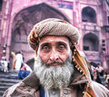
Is it the composition, processing, or the subject itself is uninteresting? Didn't fare well.
 |
|
|
|
12/08/2015 11:26:38 PM · #2 |
The crop's not helping you at all, too much distraction, even though you DO need context and the color palette is great, as Don said. Beyond that, the image is a little washed-out looking and it feels to me like the face needs to be popped out more. Here's a very quick take on it, a little Nik Viveza and some Color Efex Pro, plus of course the crop. This is just one direction it might go in, and it very well may not suit you, but...
 |
|
|
|
12/08/2015 11:35:12 PM · #3 |
| Agree with Robert in what he said, it lacked contrast to me, his edit is awesome BTW! |
|
|
|
12/08/2015 11:44:03 PM · #4 |
Originally posted by Bear_Music:
The crop's not helping you at all, too much distraction, even though you DO need context and the color palette is great, as Don said. Beyond that, the image is a little washed-out looking and it feels to me like the face needs to be popped out more. Here's a very quick take on it, a little Nik Viveza and some Color Efex Pro, plus of course the crop. This is just one direction it might go in, and it very well may not suit you, but...
 |
Great edit! Definitely makes it look a lot better.
And you're right. I wanted to give context of the mosque in the background. But I never felt there was too much distraction in the photo. And for some reason, I don't know why I didn't up the contrast. Your tighter crop helps the photo a lot.
Thanks. Will keep it in mind. |
|
|
|
12/09/2015 12:19:33 AM · #5 |
I agree with what Bear said. I think his edit could have pulled a 6+. I gave it a 6. Interesting face, but it didn't jump out and grab me as it is.
|
|
|
|
12/09/2015 01:37:09 AM · #6 |
I found a couple of things that could be improved.
The skewed background isn't helping, so a crop can help at least.
The coat doesn't match the rest of the photo. It is much too western looking. Again, cropping here can help.
The colours are little washed out.
I think Bear's photo is an improvement, but a little too much contrast for my taste. This is my quick attempt using a preset (Detail ) in Topaz Adjust and some cropping. I think it helps with some of the skewed background and the coat, as well as adding a little pop to the face. The background could use a little denoise to smooth it out now, but I don't have time for that.
 |
|
|
|
12/09/2015 05:12:47 AM · #7 |
| 2 extra points on bear's edit. |
|
|
|
12/09/2015 06:03:31 AM · #8 |
Originally posted by romil:
... And you're right. I wanted to give context of the mosque in the background. But I never felt there was too much distraction in the photo ... |
I gave you a 5. I think there's too much distraction in the background. First the blown-out parts on the top, my eyes really wants to focus on that part instead of the man's face. And another thing I found distracting was the horizon. Looking to the building and the stairs behind the man, the image is tilted quite a bit. I know the guy itself seems vertical OK, but together it doesn't feel right.
Message edited by author 2015-12-09 06:03:57. |
|
|
|
12/09/2015 08:07:55 AM · #9 |
| I like Bear's crop and your original edit. As others have stated the top section distracts. |
|
|
|
12/09/2015 08:21:17 AM · #10 |
Originally posted by GeorgesBogaert:
2 extra points on bear's edit. |
+1 |
|
|
|
12/09/2015 09:02:09 AM · #11 |
A great subject......fantastic face.
Another possibility....

|
|
|
|
12/09/2015 09:32:46 AM · #12 |
Originally posted by FromDaRock:
I found a couple of things that could be improved.
The skewed background isn't helping, so a crop can help at least.
The coat doesn't match the rest of the photo. It is much too western looking. Again, cropping here can help.
The colours are little washed out.
I think Bear's photo is an improvement, but a little too much contrast for my taste. This is my quick attempt using a preset (Detail ) in Topaz Adjust and some cropping. I think it helps with some of the skewed background and the coat, as well as adding a little pop to the face. The background could use a little denoise to smooth it out now, but I don't have time for that.
 |
Thanks for the completely different perspective :) Although I do think that removing the coat would have taken a lot away from the main subject. I guess the background was really a distraction for everyone. |
|
|
|
12/09/2015 09:35:14 AM · #13 |
Originally posted by Kroburg:
Originally posted by romil:
... And you're right. I wanted to give context of the mosque in the background. But I never felt there was too much distraction in the photo ... |
I gave you a 5. I think there's too much distraction in the background. First the blown-out parts on the top, my eyes really wants to focus on that part instead of the man's face. And another thing I found distracting was the horizon. Looking to the building and the stairs behind the man, the image is tilted quite a bit. I know the guy itself seems vertical OK, but together it doesn't feel right. |
Yup. What I gather from the feedback here is that
1) The tilted background is distracting
2) The contrast looks pretty light for the subject to pop out. If you see I already mentioned that in my caption when I submitted the photo. Dang! Just couldn't get it right!
Thanks for the critique!
|
|
|
|
12/09/2015 09:35:59 AM · #14 |
Originally posted by NikonJeb:
A great subject......fantastic face.
Another possibility....
 |
Great edit, Jeb! A little too much vignette? |
|
|
|
12/09/2015 06:52:04 PM · #15 |
Originally posted by NikonJeb:
A great subject......fantastic face.
Another possibility....
 |
Originally posted by romil:
Great edit, Jeb! A little too much vignette? |
Sure, if you think it is, it is.
I was trying to bring down the background, (The tilt REALLY messed with me.) and I like his face so much I wanted to make sure that is the only place for the viewer to land.
I was also trying to take down the hot spots on either side & the forehead. For whatever reason, when I brought the vignette in some from the outside, that helped.
|
|
|
|
12/09/2015 07:12:53 PM · #16 |
Originally posted by romil:
Originally posted by NikonJeb:
A great subject......fantastic face.
Another possibility....
 |
Great edit, Jeb! A little too much vignette? |
Yes, just a touch too much vignette and sharpening but a beautiful processing. Prefer this much to Robert's, with all due respect |
|
|
|
12/09/2015 08:24:28 PM · #17 |
I am never good at processing especially somebody else's work, but I was intrigued by the original that I quite liked without making any comment though (it was 6 from me because I felt that the image was "unfinished" somehow).
Since I make a comment about other people's experiment with this, here is my take - very quick and a bit negligent, but the idea is there I hope
- this one is closer in tonality of the original - I modified mostly the background that took too much of my attention

And there are also experiments when everything else fails!

|
|
|
|
12/09/2015 09:14:08 PM · #18 |
After seeing all these edits, I thought let me also give it a try :)
Here is my version, I have kept both original and modified next to each other so that you can see how it looks.

Just in case if you want to know how I did, I created lightroom preset of this entire setup. Download from here. I hope this helps :)
Message edited by author 2015-12-09 21:19:08. |
|
Home -
Challenges -
Community -
League -
Photos -
Cameras -
Lenses -
Learn -
Prints! -
Help -
Terms of Use -
Privacy -
Top ^
DPChallenge, and website content and design, Copyright © 2001-2024 Challenging Technologies, LLC.
All digital photo copyrights belong to the photographers and may not be used without permission.
Current Server Time: 04/19/2024 08:01:26 PM EDT.

