| Author | Thread |
|
|
03/01/2012 11:05:56 AM · #1 |
So I have decided to take the advice of some fellow DPCer's here, and put my picture up for review.
Comment if you wish.
All of the following forms are acceptable:
a) Constructive Criticism
b) Individual preference
c) What YOU would have done differently
d) Nice comments
e) Mean comments
f) Insulting comments
g) Offensive comments
h) Inspiring comments
i) and anything else not mentioned above.
Ok... let the commenting/critiquing/whatever you want to call it, begin (Oh, and thanks in advance for your input!):
|
|
|
|
03/01/2012 11:13:56 AM · #2 |
|
|
|
03/01/2012 11:18:43 AM · #3 |
I applaud you! Asking for critiques is brave!
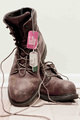
1. The background. Typically I like darker backgrounds (personal preference), however this shot works ok with a white background. I would just try to use a seamless white paper. The line is a bit distracting.
2. The crop. a little too tight for my taste. Tight crops work well on portraits, but for boots I'd like to see a bit more depth or environment.
3. Positioning. Not sure the benefit of the boot being on the other one. Takes away from the character of both boots. They each have character and a story to tell. The tags speak for themselves. The laces are fine, they can help create leading lines if properly placed.
4. Contrast. I might use a little more levels and curves to create some added contrast.
My $.02
Jeff |
|
|
|
03/01/2012 11:19:13 AM · #4 |
Originally posted by giantmike:
Left you a comment :) |
Thank you. This is the type of things that open my eyes to a different POV.
I, personally, liked the bleached out look, simply because it forced the viewer to focus on the boots. The tags were a little "dull" in my opinion, so I increased the color saturation of the reds and greens in the photo. Perhaps that was a little much. But working on the laptop, vs. my new iMac may make a difference (as I can already see the difference in screens).
And thank you... it's something I can take into consideration in future challenges. :)
|
|
|
|
03/01/2012 11:22:30 AM · #5 |
Originally posted by sempermarine:
I applaud you! Asking for critiques is brave!
1. The background. Typically I like darker backgrounds (personal preference), however this shot works ok with a white background. I would just try to use a seamless white paper. The line is a bit distracting.
2. The crop. a little too tight for my taste. Tight crops work well on portraits, but for boots I'd like to see a bit more depth or environment.
3. Positioning. Not sure the benefit of the boot being on the other one. Takes away from the character of both boots. They each have character and a story to tell. The tags speak for themselves. The laces are fine, they can help create leading lines if properly placed.
4. Contrast. I might use a little more levels and curves to create some added contrast.
My $.02
Jeff |
I personally think all critiques are good. Even if it's insulting, there could be SOME truth underlying in the statements.
Thank you for your input. As it helps me to envision my photo differently. I wasn't' sure about the crop... but I didn't want ANY other distractions in the photograph, I wanted to viewer to see the boots, and the boots only.
The baseboard in the background does somewhat throw it off, as I noticed that AFTER the voting begun... but hey, live and learn.
And I don't usually use "levels and curves", as it's something I am currently experimenting with. So that is dually noted.
Thank you! :)
|
|
|
|
03/01/2012 11:35:07 AM · #6 |
Added mine to the photo itself.
CS |
|
|
|
03/01/2012 12:56:42 PM · #7 |
This was a good thread. You got some good comments. I think when you do shots that invoke "military" emotions they have to be perceived to be genuine, authentic and fully detailed.
I don't question the genuine emotion you have, but perhaps it doesn't shine through enough on this shot.
Good news is you have Mike, and Jeff who both do fantastic military shots, leaving you good advice, my advice is to look at their portfolios. and Toddhead as well. |
|
|
|
03/01/2012 12:58:44 PM · #8 |
Originally posted by dyridings:
So I have decided to take the advice of some fellow DPCer's here, and put my picture up for review. |
Just a note to remind folks that this type of thread should go in the Individual Photograph Discussion section of the forums -- I've moved it for you.
Message edited by author 2012-03-01 12:59:03. |
|
|
|
03/01/2012 01:27:06 PM · #9 |
Originally posted by blindjustice:
This was a good thread. You got some good comments. I think when you do shots that invoke "military" emotions they have to be perceived to be genuine, authentic and fully detailed.
I don't question the genuine emotion you have, but perhaps it doesn't shine through enough on this shot.
Good news is you have Mike, and Jeff who both do fantastic military shots, leaving you good advice, my advice is to look at their portfolios. and Toddhead as well. |
I agree that it didn't shine through as much as I would have liked. This was a tribute to my husband and everything he has done. I appreciate him more than anything in this world and more than anyone ever could. Too bad the message didn't convey the genuine passion and emotion I would have like it to have.
Thanks for your response.
@General: Thank you. Dually noted for future reference! :)
ETA: I had already favorited them as photographers. They were among the first. :)
Message edited by author 2012-03-01 13:29:30.
|
|
|
|
03/01/2012 01:27:33 PM · #10 |
Originally posted by blindjustice:
This was a good thread. You got some good comments. I think when you do shots that invoke "military" emotions they have to be perceived to be genuine, authentic and fully detailed.
I don't question the genuine emotion you have, but perhaps it doesn't shine through enough on this shot.
Good news is you have Mike, and Jeff who both do fantastic military shots, leaving you good advice, my advice is to look at their portfolios. and Toddhead as well. |
+1 on  toddhead he does exceptional military style shots. He has been successful selling military stock. toddhead he does exceptional military style shots. He has been successful selling military stock. |
|
|
|
03/01/2012 01:30:59 PM · #11 |
Originally posted by sempermarine:
Originally posted by blindjustice:
This was a good thread. You got some good comments. I think when you do shots that invoke "military" emotions they have to be perceived to be genuine, authentic and fully detailed.
I don't question the genuine emotion you have, but perhaps it doesn't shine through enough on this shot.
Good news is you have Mike, and Jeff who both do fantastic military shots, leaving you good advice, my advice is to look at their portfolios. and Toddhead as well. |
+1 on toddhead he does exceptional military style shots. He has been successful selling military stock. |
Thanks... funny though, my highest score military shot is of my boy sempermarine
 |
|
|
|
03/01/2012 06:34:27 PM · #12 |
Looks like a good pic to me......
|
|
|
|
03/02/2012 08:08:36 PM · #13 |
I like the idea behind your image, and your title as well. For me the color is a little distracting as well as the baseboard molding. I personally...and it's just me would have gone with a more tinted monochrome shot and entitled it something like "Home At Last". That title makes the molding in the shot more acceptable per se because it conveys a soldier who finally got home, empty boots, dog tags put aside for the time being. It also leaves it open to the viewers imagination as to where that soldier is right now. My guess...in the other room with his wife or girlfriend etc. uhhh hummm...catching up on lost time. ;)
Here is my quick...very quick take on it. By darkening down some of the wall area I started to see some spackle or something on the wall. I didn't take the time to edit it, but you get the idea.
Dave

|
|
|
|
03/02/2012 08:11:34 PM · #14 |
I was thinking of going that way..
And the title was originally "home from the field". But I went another direction in the end. Thanks for your view and edit
|
|
|
|
03/07/2012 10:18:54 AM · #15 |
Since the Euphemism challenge is completed, I would like some critique on my entry (if anyone has any advise as to what could have been done differently). Open to suggestions, and learning more.

Thanks guys! :)
PS... I received some very nice comments on this during, and after the challenge, and it placed a little higher than my first challenge entry, so a new personal best! Awesomeness!
|
|
|
|
03/07/2012 10:35:19 AM · #16 |
Originally posted by dyridings:
Since the Euphemism challenge is completed, I would like some critique on my entry (if anyone has any advise as to what could have been done differently). Open to suggestions, and learning more.
Thanks guys! :)
PS... I received some very nice comments on this during, and after the challenge, and it placed a little higher than my first challenge entry, so a new personal best! Awesomeness! |
I liked your image a lot, and gave you a 7. However, I can quickly see what provided you with a number of lower votes: the sharpness. The focal point looks like it's a bit behind the main part of the scene. To me, this softness is a great contrast to the jagged shells. But many votes are going to vote down an image without the focal point on the subject. |
|
|
|
03/07/2012 10:37:14 AM · #17 |
Originally posted by giantmike:
I liked your image a lot, and gave you a 7. However, I can quickly see what provided you with a number of lower votes: the sharpness. The focal point looks like it's a bit behind the main part of the scene. To me, this softness is a great contrast to the jagged shells. But many votes are going to vote down an image without the focal point on the subject. |
Well, you saw what I was going for with the softness factor then. I did a few shots with the focal point a bit more in the foreground, but it looked strange (IMO), so I thought that it wouldn't work well with the euphemism.
Thanks for the comment, and the vote! :)
|
|
Home -
Challenges -
Community -
League -
Photos -
Cameras -
Lenses -
Learn -
Prints! -
Help -
Terms of Use -
Privacy -
Top ^
DPChallenge, and website content and design, Copyright © 2001-2024 Challenging Technologies, LLC.
All digital photo copyrights belong to the photographers and may not be used without permission.
Current Server Time: 04/18/2024 09:58:29 PM EDT.


