| Image |
Comment |
| 09/30/2006 11:13:27 AM |
Reflectionsby SiggavComment: An good attempt but it doesn't quite work for me. The refections just aren't adding enough interest to be the main focus of the composition. The reflections just look like glare to me. |
 Photographer found comment helpful. Photographer found comment helpful. |
| 09/30/2006 11:03:02 AM |
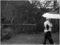
slow escapeby saintaugustComment: Nice. I kind of wish you didn't cut off their feet. I also wish the background was a bit more interesting in terms of architecture. |
| Photographer found comment helpful. |
| 09/30/2006 11:02:17 AM |
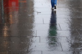
Sunny side downby jjbeguinComment: Very nice...I like the high contrast. The figures really stand out against the blown out puddle reflections. I like the generous vertical frame. This gives a definite sense of place and mood. I could wish for a bit more detail in the foreground shadow area, at least in the building but in order to keep the figures dark you would have to dodge/burn and that is advanced editing. So no real complaints from me. |
| Photographer found comment helpful. |
| 09/30/2006 10:55:08 AM |
Circularby Everyday ReneeComment: I looked through all the photos before voting and commenting. This was the first one like this that I saw. I believe there are about 4 very similar. However, this one grabbed me and it still seems like the one the works the best as a pleasing abstraction. Whether that was random fortune or very careful framing (or cropping) is your secret to keep, as far as I'm concerned.
The contrast could be upped a bit for some darker darks but I wouldn't want the lightest greys to go much lighter. |
| Photographer found comment helpful. |
| 09/30/2006 10:52:13 AM |
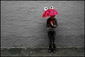
through these eyesby oneredstarComment: I like the composition and the simplicity of the red and grey color scheme. It is hard to tell if selective desaturation was done in post-processing or done through very careful selection of background and clothing. Either way, it works for me. Ordinarily, I hate selective desaturation, but because this doesn't have the look of that process, it's very successful. |
| Photographer found comment helpful. |
| 09/30/2006 10:48:54 AM |
Light for a Rainy Dayby mickisdaddyComment: A different take on the challenge. Its not quite grabbing me though. The focus is a bit soft on the right candle stick and the composition just isn't interesting enough to draw me in. |
| Photographer found comment helpful. |
| 09/30/2006 10:46:32 AM |
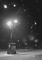
when getting dumped on is a good thingby deepfrog17Comment: There doesn't appear to be much to draw me into this photograph. The image quality is lacking---too much rain got on the lens, thus the all the white spots and smears. It's kind of messy looking without being particularly artistic. I feel like if there had been someone standing by the light or passing through, reacting to the rain I could forgive the poor image quality becuase I like the placement of the light in the composition. The light on it's own just isn't interesting enough. |
| Photographer found comment helpful. |
| 09/30/2006 10:42:19 AM |
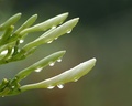
Rain dropsby avbComment: Nice simple background and good capture of the rain drops. It doesn't shout out to me though. I've seen this type of shot so many times on DPC. I understand the temptation---I've taken this type of shot too. It's a classic. But something has to be remarkable in terms of composition for me to want to linger. I think my problem with this shot is the monochromatic color scheme. Sometimes this works for me, usually when the color is fairly rich and saturated. In this case, it just seems bland. |
| Photographer found comment helpful. |
| 09/30/2006 10:37:48 AM |
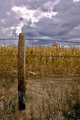
Rain Cometh...Hopefullyby dacrazyrnComment: Nice capture of the clouds and careful composition. It doesn't quite grab me though. Maybe in black and white and taken from a more dramatic point-of-view? If you had gotten low to the ground and shot up at the post it would have created a very different mood and a bit more interest for me. |
| Photographer found comment helpful. |
| 09/30/2006 10:35:20 AM |
Catching leaves floating down the Streetby mattforbesComment: Very nice. I like her outfit...simple, classic, evocative of childhood. I like the color contrast of the green boots with the dark ground and her violet dress. I'm wondering if this could have been warmed up a bit though. It appears very blue. Of course, that can help to create the mood but I feel like her skin tone could be warmed up a tad. Just a tad. This shows thoughtfulness in composition--very simple background, interesting placement of the child in a vertical frame. I kind of wish she were looking into the camera---her eyes are at perfect placement in the center of the upper third of the frame that it seems like when we look there we should meet her gaze. I would have likely given this a 9 or 10 if she were meeting the viewer's eye. |
| Photographer found comment helpful. |
Home -
Challenges -
Community -
League -
Photos -
Cameras -
Lenses -
Learn -
Prints! -
Help -
Terms of Use -
Privacy -
Top ^
DPChallenge, and website content and design, Copyright © 2001-2024 Challenging Technologies, LLC.
All digital photo copyrights belong to the photographers and may not be used without permission.
Current Server Time: 04/19/2024 02:04:56 PM EDT.