Pearby
persimonComment by LucidLotus: I like your ability to take common foods and make them look interesting. I looked at both the pear and the garlic shots and thought they were all very good. The pears are the most interesting to me and this one topped the list.
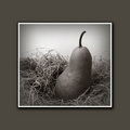
What caught my attention here is how you've brought the viewer in to the image and centered them on the pear with the darker shading around the outer edge of the photo. That addition makes my eyes skate over the edges and to the lighter areas and then to the pear itself.
I think the composition here is excellent. There is a nice duality between the straw which has a strong horizontal pull and the pear with its more vertical positioning. The contrast is furthered by the darkness of the pear and the light squiggles the straw brings to the image.
The focus looks great, it has enough sharpness to make the image look clean in that regard yet there is also a softness to it that allows the viewer to sort of float over the image and take each item in. There are no harsh lines and the shadows are there but have been gentled so they aren't dominating the shot.
I think the lighting here is great, whether it was so controlled from the outset or is the product of some great PS work and design, it has just the right amount of intensity and it highlights what needs to be highlighted and just brushes over the areas that aren't as important.
I think that light grey banding along the inside of the image really helps take it up a notch and feeds a certain mood. That was very well envisioned and exectuted in the post processing. Without it, the image would be entirely different and I don't think nearly as successful.
As much as I like the shot there is one area that I don't like at all and that's the border. I think the image is very strong and can easily carry the thin white border that's directly around it, but the thicker border just overwhelms the image to me. I do see that its color is a nice enhancement, it helps tie itself to the image, but I think that could be easily accomplished with something a bit more subdued in size. The image is of course automatically set off by the size of the border which is nice but even with those positives I just find the border to be unnecessarily large and thus a bit of a detriment. Not enough to ruin the image of course, but enough that as I sit and look at the picture my primary thought is "I wish the border wasn't there/so big".
Still, that's more of an aesthetical preference and I'm sure others don't mind it. I think overall this is a fantastic image and it really shows what a little creativity and forethought can do for a common item like a pear. I hope others find this as intriguing as I do and have bought a print. :)