|
|
| Image |
Comment |
| 01/05/2010 12:57:04 PM | "Oh, thanks! ... I LOVE cheese..." by LydiaComment: Funny how a dead, pesky, disease ridden rodent can stir up such an argument. Nothing surprises me here anymore, though. For the record, I am much worse than Lydia. I kill these little bastards every chance I get. Anyway, awesome shot there Lydia. Wonderfully creative and the story still has me chuckling. Congrats on the ribbon!! |  Photographer found comment helpful. Photographer found comment helpful. |
| 12/31/2009 05:15:37 PM | | | Photographer found comment helpful. |
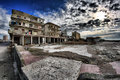
| 12/23/2009 10:59:30 PM | Luxuryby Rino63Comment: Hey there from the Critique Club
First of all, congrats on the new personal best. Very well done.
My thoughts on the image: This was one of my favorites during voting for this particular challenge. The wide angle, deep depth of field, and point of view are all spectacular. Your cloud cover and bright sunshine adds a wonderfully dramatic feel to the image as well.
My ideas for improvement: I may have adjusted the crop just a little tighter on the left hand side, but that would have been one of the only things I could even imaging changing.
Where I would have/did score this entry: I did vote on this challenge, and...no surprise now...I was one of the 12 voters that believed that nothing needed changing or adjusting with this particular capture. This is a beautiful capture and a well-deserved finish. Congrats.
Thank you for the opportunity to provide a critique on your entry,
Eric
| | Photographer found comment helpful. |
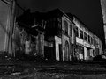
| 12/23/2009 10:26:52 PM | Eastern Blocby GeorgeComment: Hey there from the Critique Club
First of all, congrats on a new personal best, as well as a top 10 finish. Also, thanks for providing the detailed information on the shot. This helps a ton when trying to offer a meaningful critique.
My thoughts on the image: You lighting and tonal range here is fabulous. The range does a wonderful job gently leading my eye deeply into the entire frame. I also like the flow of the composition that you presented, but that could also be improved on a bit. There is a wonderful amount of detail in the image that kept me busy for awhile during voting. I especially like the evil face that my eye sees on the left hand third of the image relatively centered vertically. It also adds nicely to the mood of the image. The cold, dark, hopeless feeling that you were apparently after is well presented and wonderfully conveyed.
My ideas for improvement: Shift your point of view to the left a little. The protruding building on the right hand side of the image competes strongly for my eye's attention. There is plenty of interest throughout the frame to help overcome this, but the image would be even stronger with this portion excluded.
Where I would have/did score this entry: I did vote on this challenge, and I voted this one a 6. Overall, looking back through the images, I do believe that this one fell into place well with the voters. Nicely seen and very well presented.
Thank you for the opportunity to provide a critique on your entry,
Eric
| | Photographer found comment helpful. |
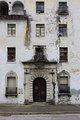
| 12/23/2009 12:51:05 AM | MENby picklenoseComment: Hey there from the Critique Club
My thoughts on the image: I tend to agree with most of your commenters here in that this is a fairly uninteresting composition. The centered yet awkwardly tilted building leaves me with an feeling that this was more of a snapshot that an intentionally composed image. I do find that the building appears to hold a great deal of interest, and I think the composition possibilities here are near limitless.
My ideas for improvement: Put more time into the initial composition of the capture. I am not sure if tighter or wider would be better with this one, but I'd like to see combinations of both. While I am no stickler for the 'rules' of photography, this particular structure presents with far to many possibilities to be closed in with a centered composition. I'd also like to see more contrast to the overall image. Perhaps shooting this one at a different time of day would have presented you with some great shadows and more highlights that the flatness that this particular lighting yielded.
Where I would have/did score this entry: I did vote in this challenge, and you pulled a 5 from me. I do think that it meets the challenge perfectly, but with some better execution and composition, this vote would surely have grown.
Thank you for the opportunity to provide a critique on your entry,
Eric
|
| 12/23/2009 12:36:39 AM | Crosswords On The University Wallby MArteSiComment: Hey there from the Critique Club
My thoughts on the image: This was one of my favorite voting challenges as of recent history here. I like the vast array of options and situations that the challenge lent itself to shooting. Here, you have a great start, but the image is lacking in my opinion. I think that's I'd like to see the crop a little wider, as my eye wants to think so much more exists to the decay portion of the image. Your lighting is a bit harsh, graduating from the dark, near-under exposed left hand side to the bright, near over exposed right hand side.
My ideas for improvement: Open the crop up and show me more decay. I do get the feeling of the withering structure, but I don't see enough destruction to make me really love this image.
Where I would have/did score this entry: I did vote in this challenge, and I was one of your 4s. This one could have easily grown in my mind with a different crop and composition.
Thank you for the opportunity to provide a critique on your entry,
Eric
| | Photographer found comment helpful. |
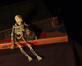
| 12/05/2009 01:11:18 PM | Evolution. Just a theory?by snafflesComment: Hey there from the Critique Club
My thoughts on the image: Nice combination of interesting elements that cover both sides of this 'argument' between science and religion. I like the left-to-right flow that you created with the books, but overall, the image is a bit to dark for my personal taste.
My ideas for improvement: I think that this one would have made a stronger entry with a little more exposure, as well as a black and white conversion. I'd also like to see the cloth underneath your subjects the same black color as your background.
Where I would have/did score this entry: I did not vote in this particular challenge, but I would tend to agree with the voters here. I would have most likely scored this one in the 5 range, perhaps 6 because I do like the subject matter. I think that a black and white conversion would have given this one a little more pop.
Thank you for the opportunity to provide a critique on your entry,
Eric
| | Photographer found comment helpful. |
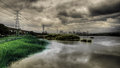
| 12/04/2009 06:44:49 AM | A Cloudy Day in Taipei Cityby DeenComment: Hey there from the Critique Club
My thoughts on the image: I absolutely love the drama you captured in the sky, as well as the balance created with the reflection in the water. While not a common presentation in landscape images, the power lines you included serve well as a line that leads me deep into the image. I agree with Jeff in that I like the left to right transition of color to monochrome. Additionally, I like the dichotomy you created with the nice green grass, a peaceful pond that is led into a busy city by a row of menacing power lines. This entry speaks a lot if one takes time to listen.
My ideas for improvement: I would have probably not have included the city in a landscape challenge, but that is strictly personal opinion. Had I voted, that may have prevented me from scoring this one well.
Where I would have/did score this entry: As I eluded to up above, I did not vote in this particular challenge. I am actually torn as to how I would have voted. If I were taking the time to study and comment on much of the challenge, this one would have pulled an 8 or 9 from me because of all it contains. Had I been storming through, handing out votes like many of us so often do, I would have most likely written it off as more of a cityscape and low balled it with a 4. Either way, I am glad I got the opportunity to critique the image and really have a chance to listen to all that is said within.
Thank you for the opportunity to provide a critique on your entry,
Eric
| | Photographer found comment helpful. |
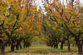
| 12/04/2009 06:36:01 AM | Autumnby Rino63Comment: Hey there from the Critique Club
My thoughts on the image: Great colors and an interesting array of textures. I like the point of view in that it provides terrific leading lines that serve well to draw me deep into the image. This does a great job pulling my eye to nearly every individual tree and leaf that I can see.
My ideas for improvement: I think pulling back on the crop would have yielded a nice improvement to the image. As it is, I do see the landscape. With more to look at, my eye would have also felt the landscape.
Where I would have/did score this entry: I did not vote on this particular challenge, but it would have most likely drawn a 5 from me. With a more open crop, I think the score would have most certainly grown.
Thank you for the opportunity to provide a critique on your entry,
Eric
| | Photographer found comment helpful. |
| 12/04/2009 06:31:58 AM | Red Barnby davidwComment: Hey there from the Critique Club
My thoughts on the image: Nice entry. The colors you captured here are an amazing strength of the image. You found a very nice balance of a rural landscape scattered with interesting area architecture. The sun and lying shadows are equally as intriguing to my wandering eye.
My ideas for improvement: I'd like to see a little more vibrance in the sky itself. There are nice pastels there, but a bit more contrast would have added a nice punch.
Where I would have/did score this entry: I did not vote in this particular challenge, but this one would have most likely pulled a 6 or 7 from me. In that fact, I do agree with the voters here. Nicely done!
Thank you for the opportunity to provide a critique on your entry,
Eric
| | Photographer found comment helpful. |
Home -
Challenges -
Community -
League -
Photos -
Cameras -
Lenses -
Learn -
Prints! -
Help -
Terms of Use -
Privacy -
Top ^
DPChallenge, and website content and design, Copyright © 2001-2024 Challenging Technologies, LLC.
All digital photo copyrights belong to the photographers and may not be used without permission.
Current Server Time: 04/16/2024 03:36:52 PM EDT.
|