|
|
| Image |
Comment |
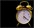
| 02/12/2009 12:54:29 PM | Armageddon... by LutchenkoComment: Use to be a member of the club, grew out of it in 2002.
Expect to re-up membership when I retire and am in a wheel chair with nothing better to do.
By the way, it says 4:21. |  Photographer found comment helpful. Photographer found comment helpful. |
| 01/07/2009 04:21:24 PM | | | Photographer found comment helpful. |
| 01/07/2009 04:20:24 PM | | | Photographer found comment helpful. |
| 01/07/2009 04:19:23 PM | Lucky Numberby tfarrell23Comment: Your whites are blowing out especially at the top left corner.
I like the image however. Watch those levels. | | Photographer found comment helpful. |
| 01/07/2009 04:17:26 PM | Great Smash !!by MiepComment: the horizon really needs to be level to make this work, especially in a sport image. | | Photographer found comment helpful. |
| 12/24/2008 10:01:04 AM | Got oneby gunsmith6Comment: This was a great idea.
there are a couple flaws in the imagery, including the flat, unattractive lighting which I am sure is from the store.You may of been able to go to the lighting section of Lowe's and played around with their displays to achieve something more interesting if this is the case.
And the blocking and cropping of the image could use work.
Good luck. | | Photographer found comment helpful. |
| 12/17/2008 09:37:30 AM | bortukan by shay455Comment: First of all...where is the bokeh?
Secondly...why are you trying to make me care for the back side of someones head? I can care less for the curly hair. Hair has no emotional impact, no matter how you try.
The crop is off as well.
The only good thing in this image is the dof, the rim light off the face which I would of wanted to see more for the emotional value, and the key light kicking off the shoulder.
Not going to do so well in this challenge, especially on this web site.
Good luck, happy holidays. | | Photographer found comment helpful. |
| 12/17/2008 09:17:56 AM | Before and aftermashedby snafflesComment: The blocking of the image is great.
but, imo only, the white balance does look off. The image itself gives a yellowish hue to it. White balance with the light you use, not before.
Another thing, this is from the industry I call a career, and really hate it when the writers, or SAG, or the teamsters threaten my job.
A rule of thumb, normally, not always, is that, the darker the bg, the more drama the lighting.
If you notice in food magazines, not all, but a lot, they use white table cloths. Your wooden table is ok to use, but it is also darker than a white table cloth. Hence forth, more dramatic lighting.
Think of it this way. If your table was black, and you use the lighting set up presently, your lighting would look way more flat than it is. If you used a white cloth, the natural ambiance, bouncing off the white cloth may of given more natural drama, depending on where you place the lights that is.
I don't know about a haze perse on your image, but, I personally think with a bit of tweaking, a few more shots doing different things, paying attention to the light and to details, this could of been a winner. | | Photographer found comment helpful. |
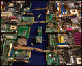
| 12/13/2008 04:33:16 PM | Circuit Cityby scarbrdComment: I scored high on this entry.
the only comment I have for you is this.
if this is a city scene, why is the lighting so flat.
i mean, you are making the sun look like it is directly above at 12 noon when you should of made the sun during sun rise or sun set.
but, if you did that, then you would have to add more detail and depth using lights to hilight the image even more. you know, like a bustling city, street lights, building lights, car lights, boat lights, blah, blah.
the lighting was too flat for me to give you more than a 7. | | Photographer found comment helpful. |
| 12/06/2008 09:34:51 AM | Cover Girlby JaimeVinasComment: Yeah, I can see this in an ad.
Nice job with this portrait.
Good luck. | | Photographer found comment helpful. |
Home -
Challenges -
Community -
League -
Photos -
Cameras -
Lenses -
Learn -
Prints! -
Help -
Terms of Use -
Privacy -
Top ^
DPChallenge, and website content and design, Copyright © 2001-2024 Challenging Technologies, LLC.
All digital photo copyrights belong to the photographers and may not be used without permission.
Current Server Time: 04/25/2024 06:25:27 AM EDT.
|