| Image |
Comment |
| 06/10/2010 10:34:03 AM |
|
 Photographer found comment helpful. Photographer found comment helpful. |
| 06/10/2010 10:33:21 AM |
|
| Photographer found comment helpful. |
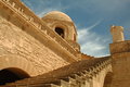
| 06/10/2010 10:31:00 AM |
Up to the Minaretby spanishbeachComment: I like this compposition but I wonder if yoou could give it a bit more punch in post processing? Try adding a new "channel mixer" layer, tick the "monochrome" box, move the sliders (try pushing the blues very dark) to get a different contrast - and then set the channel mixer layer to "luminance". You'll get a really punchy look that I think would really suit this image. |
| Photographer found comment helpful. |
| 06/10/2010 10:28:12 AM |
|
| Photographer found comment helpful. |
| 06/10/2010 10:27:51 AM |
|
| Photographer found comment helpful. |
| 06/10/2010 10:24:34 AM |
|
| Photographer found comment helpful. |
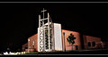
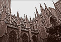
| 06/10/2010 10:24:05 AM |
Arkby jnenvirComment: I get no sense of "church" from this. |
| Photographer found comment helpful. |
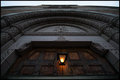
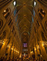
| 06/10/2010 10:21:30 AM |
Inside the Notre Dame of Parisby AllenPComment: Too yellow! Also too much local contrast makes this look over processed.
If you desaturated (especially the yellow channel) by 70-80% you'd have a much nicer image. |
| Photographer found comment helpful. |
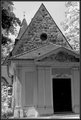
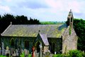
| 06/10/2010 10:19:45 AM |
WELSH CHAPELby sunraygpComment: Pretty subject but image blurry and has too much colour - I suggest that you look into some methods of sharpening your images when you resize for submission.
Also the image of the church is too tightly cropped and tilted. |
| Photographer found comment helpful. |
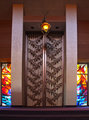
| 05/19/2010 07:46:53 AM |
Marac by TomCubisComment: I guess the question is whether or not the ribbon is worth the cracked lens?
Well done!
M |
| Photographer found comment helpful. |
Home -
Challenges -
Community -
League -
Photos -
Cameras -
Lenses -
Learn -
Prints! -
Help -
Terms of Use -
Privacy -
Top ^
DPChallenge, and website content and design, Copyright © 2001-2024 Challenging Technologies, LLC.
All digital photo copyrights belong to the photographers and may not be used without permission.
Current Server Time: 04/25/2024 03:46:14 PM EDT.