| Image |
Comment |
| 02/22/2006 12:29:28 AM |
Faith by mciComment: lucky number 44! thanks to everyone for the kind votes and comments. now i can retire! |
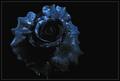
| 06/27/2003 09:37:58 AM |
Midnight Roseby mciComment: underrated is my middle name.
thanks to those who commented. all 3+2 of you. |
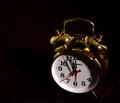
| 06/26/2003 10:58:44 PM |
Almost Midnightby ArtifactsComment: good focus and lighting. minor things that detract are the less-than-black background elements (brown fabric or something) below the clock and the minor dings and scrapes in the clock. these things add too many distracting elements and take away from the shapes and subtletes of the clock. 5. |
 Photographer found comment helpful. Photographer found comment helpful. |
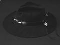
| 06/26/2003 10:57:23 PM |
Hatby hawkidaComment: a very dull image, both in tonal range/contrast and in subject. 4. |
| Photographer found comment helpful. |
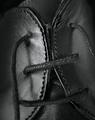
| 06/26/2003 10:56:43 PM |
UNLACEDby AnastasiaComment: this has some pretty interesting parts to it, but overall i think the subject is just a bit boring and the fact that it fills the frame doesn't really help it's case. it's kind of in-your-face. i like the depth of field and lighting, but i think it's just the subject/crop that detracts. 5. |
| Photographer found comment helpful. |
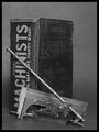
| 06/26/2003 10:55:32 PM |
Back In Timeby autoolComment: i think a detail of this tool without the book and with some more contrast and darker background would look a lot better. this seems a little cluttered, and also mostly filled with grays and not a lot of contrast.4. |
| Photographer found comment helpful. |
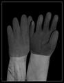
| 06/26/2003 10:54:39 PM |
Glovesby greenem2Comment: the subject here is pretty dull, as is the light and tonal range. 4. |
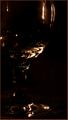
| 06/26/2003 10:54:12 PM |
Abstract Glassby CreativeFlyPhotoComment: this is a good attempt, and i thought of doing something like this myself. unfortunately, there are some flaws with this. i'm not sure if it's an illusion or not, but the crop makes it look a tad tilted to the right. also, the lighting seems pretty strange. maybe the focus is a bit soft, making the lighting look blurry. 5. |
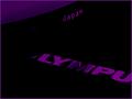
| 06/26/2003 10:52:33 PM |
Unilluminatedby justineComment: i'm not a fan of the crazy purple effect, and it looks like you've pumped the levels or contrast to make this more arty. overall, i think it's a mostly boring subject that you've tried, mostly unsuccessfully, to spruce up. 3. |
| 06/26/2003 10:48:35 PM |
Seeing visionsby mbardeenComment: this is a pretty cool effect, but something about the shot bothers me. maybe the fact that the main subject is so centered, or that it's tilted just a tad to the right. also, there is a small light-blemish in the lower left side that's kind of distracting. other than that, the lighting and focus and effects are very well done. 6. |
| Photographer found comment helpful. |
Home -
Challenges -
Community -
League -
Photos -
Cameras -
Lenses -
Learn -
Prints! -
Help -
Terms of Use -
Privacy -
Top ^
DPChallenge, and website content and design, Copyright © 2001-2024 Challenging Technologies, LLC.
All digital photo copyrights belong to the photographers and may not be used without permission.
Current Server Time: 04/24/2024 09:57:10 AM EDT.