| Image |
Comment |
| 01/03/2007 11:55:09 AM |
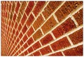
CONVERGENCEby ericwooComment: :::Critique Club Here:::
First Impression: Psychedelic effect makes me want to turn my head. Almost make me feel like I am in a trance. (10)
Technical: The composition is just excellent. I love the way the angles make this photograph work. One would'nt imagine taking a photograph of bricks could be nice to look at. You managed to make this work very well. I like the effect of being able to see the detail in the bricks. (10)
Appeal: When I first start looking at this photograph is overall very appealing but my attention starts to walk away from it. I am not sure why but I think it's maybe just too bland or too simple. (7)
Challenge: The overall photograph definitely meets the criteria of the challenge. There is a definite pattern that is visible within the photograph and this could be the bricks or the texture within the bricks. (10)
Title: The title within this photograph works very well since it is all molds and infinite sequence or series. (10)
Overall: Overall this is a wonderful photograph however difficult to get high scores due to the fact that it is very limited in its appeal. Technically speaking this photograph is very well shot, the angle that you are able to capture makes this work very well. Keep up the good work (What do they say "everyone is a critic") (9)
Hiral Patel |
 Photographer found comment helpful. Photographer found comment helpful. |
| 01/02/2007 10:14:26 AM |
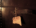
Torn Memoriesby HaneckComment: :::Critique Club Here:::
First Impression: Just couldnt figure our what it was at first. Slowly started making sense some kind of chest or travel bag. The wow factor was not there though. (4)
Technical: Composition is just too centered. I understand the section you were trying to show but I think a different angle could haver really changed that. Also would have eliminated the hotspot caused by the flash on the left side by the rivets. (4)
Appeal: Once again there was'nt the wow effect. Very difficult to add the wow the effect in a photograph like this but using maybe a different angle with a closer crop could have added a little more to the overall appeal by involving the texture of the chest, handle, and handle rivets. (4)
Challenge: Meets the challenge or brown since there are difinetly various shades of brown within the photograph. (10)
Title: The title helped understand what the photograph was conveying about the old chest (10)
Overall: (6) Some areas of improvement and thats what learning is all about. (What do they say "everyone is a critic")
Hiral Patel |
| Photographer found comment helpful. |
| 12/28/2006 07:17:39 PM |
My Worldby timfythetooComment: :::Critique Club Here:::
First Impression: How on earth did he do that. Glad you had an explanation. Just a great photograph.
Technical: 10 The exposure looks good and so does the whole composition though they say never to place its directly in the center in this case it works very well because of the "world" "round" feeling.
Appeal: 10 Very nice image to look at. Each section or building makes me want to go round in circles twisting my head like a dog.
Challenge: 7 This is the one area that though there is sky its hard to tell that its the sky and not just a blue background. This I would not say is the photographers fault too bad there it was'nt blue sky cloudy day. This would have really changed the outcome of this photograph.
Title: 10 The title really compliments the overal subject that being the roundness of the world.
Overall: 9 What do they say "everyone is a critic" Hope this helped.
Hiral Patel |
| Photographer found comment helpful. |
| 12/28/2006 01:42:14 PM |
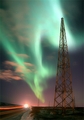
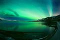
Northern Lightsby BogiComment: :::Critique Club Here:::
First Impression: Very nice lots to look at kept me interested.
Compostion: 8 well balanced only thing I did'nt like was the car lights.
Technical: 8 I would have post processed by cloning out the power lines and make those stars stand out just a little bit more.
Appeal: 10 Very nice image to look at.
Challenge: 10 I see the sky helping enhance the the overall subject being either the light tower or the Northern lights.
Title: 4 Really here you could have done something to give it more flavor just too bland with "Northern Lights" I think this is very important in photography.
Overall: 8 What do they say "everyone is a critic" Hope this helped.
Hiral Patel |
| Photographer found comment helpful. |
| 12/28/2006 01:20:18 PM |
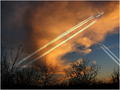
Menacingby GiorgioComment: ::: Greetings from Critique Club :::
I have had the privilege of writing a critique on your photograph.
First Impression - the most important one:
Wow that is freakin sweet...there are some areas that could have made this just super sweet.
Composition:
I like the overall composition with the diagonal lines and all. In my opinion I would have only used one plane. In your composition I follow the first planes lines and end up moving on the second plane I think this photographs well if you can stay on one subject area.
Subject:
The subject here being the plane in the sky is just is just a tad soft on the plane maybe some selective sharpening on just the plane region.
Technical (Colour, focus, and light):
I could however tell that this was done using the same plane. Maybe just using one plane going across and working more on the sky to enhance the planes appearance this could also be done in post processing. The exposure looks pretty good, worked well for you here.
To grow its vote?:
Very tough to increase voting scores but I would say just some post processing or just thinking how the voters think could make some good changes.
Summary:
Overall very nice. Good photograph to learn from.
Keep up the good work.
Hiral Patel |
| Photographer found comment helpful. |
| 12/28/2006 10:43:56 AM |
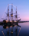
Friendship of Salemby baco99Comment: ::: Greetings from Critique Club :::
I have had the privilege of writing a critique on your photograph.
First Impression - the most important one:
Wow...I love it. Then it starts to set in the sky does help this photograph make it more appealing and comfortable to look at. I can see how the voters may overlook that area as the main focal point show the ship.
Composition:
Changing the crop of shooting from further or even using a wider angle could have changed the effect dramatically. With a wider angle you could have achieved the full refelection in the water of the ship and also added more gradient in throughout the photograph of the sky. Not sure but maybe even the sun setting.
Subject:
The subject here being the ship is just phenominal. I love the sharpness you have been able to capture.
Technical (Colour, focus, and light):
Focus is a dead on, color and exposure worked very well as both the ship and the gradient sky look very natural.
To grow its vote?:
Pay more attention to croping and shooting wider in a situation like this. I sometimes try and think of how the voters taking a quick glance at it may look at the photograph.
Summary:
Overall very nice to look at and maybe even re-shoot challenge someday.
Keep up the good work.
Hiral Patel |
| Photographer found comment helpful. |
| 12/28/2006 10:17:42 AM |
Heaven by Ragga2000Comment: Critique Club.
Composition - What can you really say about a photograph that is a ribbon winner obviously it has all the technical know how. The one major thing I can say about this photograph is I am not sure if it needs to be leveled as far as the horizon line. I did see your comment about the bent horizon line caused by the lens. I do however think keeping the bent equal on both sides would have appealed to me. Give me a break I dont know how to critique a ribbon winner.
Technical - You managed to capture what you saw and the colors and the landscape all look spot on. I can't image even trying to capture a good image is pitch darkness or what minimal light there may have been.
Post Processing - I cant image that with a landscape there is much in the need of post processing. Night time shots generally I've noticed need to have dodging done since alot of the highlights tend to show as yellow.
Overall - This is a wonderful photograph and congratulations on your Yellow Ribbon. Keep up the good work.
Hiral Patel |
| Photographer found comment helpful. |
| 12/26/2006 11:05:13 AM |
Windows to the Soulby jeroweComment: Compostion � I am just not comfortable with this composition. I am not sure if it�s the crop that throwing me off. I think maybe placing the whole head in the shot would have changed his look even if the head was on an angle.
Technical & Set-Up � From reading your comments the setup and lighting looks good and your methods of creating something different from the norm by creating a semi-wet look is excellent. This also shows in the comments from the other members and a lot of them liked the wet look. Looking at the rest of portfolio you have a good understanding of you camera and your technique is very sound.
Post Processing- Overall the processing has been done good as there is good clarity and your view of getting his eyes to attraction to the photograph is one spot. As soon as I looked at the photograph the first thing that drew me in was her eyes.
Opinion � This image fits and works very well for this challenge. You have just a beautiful lab and you have managed to capture that with excellent clarity. My biggest change in this photograph would have been the composition and this would have just been getting more of his head into the shot and not such a tight crop.
Hiral Patel
|
| Photographer found comment helpful. |
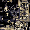
| 12/25/2006 07:13:31 PM |
Why The Long Face?by jimnessComment: Compostion - the composition in this photograph is just excellent and you really meet the requirement of the challenge. It is well balanced.
Technical & Set-Up � looking at this photograph. It looks as though this may be a candid shot. I am also assuming that the lighting was the natural light available in the store. I am however aren't sure why you may have converted to a black-and-white rather than leaving the original color image. In my opinion, I think you should've left the image in color. This would have given more of an appeal towards the right side of the image which has the jokes items at the same time, which links your title of the long face.
Post Processing - one of the hardest photographs to convert to black-and-white is an image that has a lot of noise by noise I mean, the amount of things that are occurring within the photograph. What I mean by this is the fact that there are a lot of things to look at in this photograph. I have also noticed that DPC tends to prefer images that are more crisp black-and-white.
My Bais � I would have tried a simple black and white and then burned areas away from the viewers focusing on the elements that would make this image stand out. This would be the guy with the long face and the gags or jokes portion. This would have made things direct towards what your focusing on. If you have any questions please feel free to email me.
Hiral Patel
|
| Photographer found comment helpful. |
| 06/27/2006 12:19:09 PM |
Sea Treasureby susanhComment: The overall texture and patterns are spot on. Very pleasing and creative. |
| Photographer found comment helpful. |
Home -
Challenges -
Community -
League -
Photos -
Cameras -
Lenses -
Learn -
Prints! -
Help -
Terms of Use -
Privacy -
Top ^
DPChallenge, and website content and design, Copyright © 2001-2024 Challenging Technologies, LLC.
All digital photo copyrights belong to the photographers and may not be used without permission.
Current Server Time: 04/19/2024 05:43:20 PM EDT.