| Image |
Comment |
| 12/02/2004 01:36:39 AM |
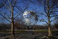
The Seven Continentsby TLL061Comment: If the globe was more prominent in this photo... the trees on the sides draw too much attention. |
 Photographer found comment helpful. Photographer found comment helpful. |
| 12/02/2004 01:09:20 AM |
|
| Photographer found comment helpful. |
| 12/02/2004 12:54:35 AM |
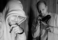
Uh, oh...Did I Leave the Oven On?by TranquilComment: Excellent photo! The only thing missing (imho) is that to better fit the challenge topic, photo needs to rely less on the title you give it. I had to read the title to understand what the humor is about. Some other pics did not need the reinforcement of the title, and only because of this I give it a 8. For some other topic, I would have went with 10. |
| Photographer found comment helpful. |
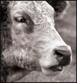
| 12/02/2004 12:42:41 AM |
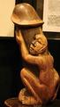
who's the bossby docpjvComment: I am not sure if this can pass, as you did not show enough of the background or otherwise placed the statue in the middle of some action to make it more than a picture of a statue. At least I could not see that. |
| Photographer found comment helpful. |
| 12/02/2004 12:40:51 AM |
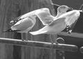
Sure or Unsure?by jmleliiComment: You probably did not have too many chances to retake this one, but if the angle was just a bit better to show more of the rear bird, the photo would have been much better. |
| Photographer found comment helpful. |
| 12/02/2004 12:39:00 AM |
Yuck, Grass!by KonadorComment: I'm not sure about the choice for b/w here. As the title mentions grass, i must imagine that most of the background is green... might have been better in color. |
| Photographer found comment helpful. |
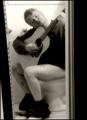
| 12/02/2004 12:37:31 AM |
Inspiration!by parrotheadComment: The white (wall?) in the bottom left of the photo draws attention unnecessarily, and should have been cropped out (or, since this may not have been possible because of the top left, maybe rotating slightly clockwise and then cropping would have made this shot even better. |
| Photographer found comment helpful. |
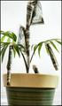
| 12/02/2004 12:33:43 AM |
... Oh, But It Doesby jamminjjComment: Very nice! I think that cropping out a piece of the bill at the very top was unnecessary. Also, the pot appears to be leaning to the right. I can see how straightening it would have effectively leaned the plant (tree:) to the left, but that's what I would prefer. Hence only 7. |
| Photographer found comment helpful. |
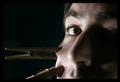
| 12/02/2004 12:30:34 AM |
Ouch !by soupComment: It seems that, while the photo and idea are great, it could have been cropped differently. E.g. if less of the left side of the face (viewer's right side) was showing, that would have improved the composition.(imho) |
| Photographer found comment helpful. |
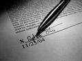
| 11/24/2004 11:30:04 AM |
Fingertip Authorityby bigfishComment: Very nice composition, and good choice for b/w photo. A recommendation: hand holding the pen might have been better here, as that would have reduced the shadow of the pen on the paper |
| Photographer found comment helpful. |
Home -
Challenges -
Community -
League -
Photos -
Cameras -
Lenses -
Learn -
Prints! -
Help -
Terms of Use -
Privacy -
Top ^
DPChallenge, and website content and design, Copyright © 2001-2024 Challenging Technologies, LLC.
All digital photo copyrights belong to the photographers and may not be used without permission.
Current Server Time: 04/18/2024 11:42:18 PM EDT.